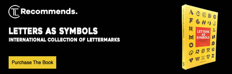
Letters As Symbols by Christophe De Pelsemaker & Paul Ibou published by Stockmans Art Books and contains an international selection of trademarks, logos and symbols created by talented and reputed designers, agencies and worldwide respected pioneers of logo and brand design, some of whom have given shape to the industry as we know it today.
We often hear the term “less is best” and “the simple ideas are always the most powerful”. In my opinion simple is never weak! On more occasions the simplest solution is often the most appropriate, and the most powerful in communicating visually the quickest, making it more memorable in the viewers eyes.
Each logo within this book is beautifully presented in monochrome black on each page based on a letter of the latin alphabet (A-Z) and forms an excellent source of inspiration for designers, artists, agencies, teachers, typographers, students of design, and many more.
If you are a regular reader of my book reviews you will know the drill by now, so before we jump into this book and marvel over some great Letters As Symbols let’s take a look at the cover design.
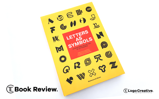
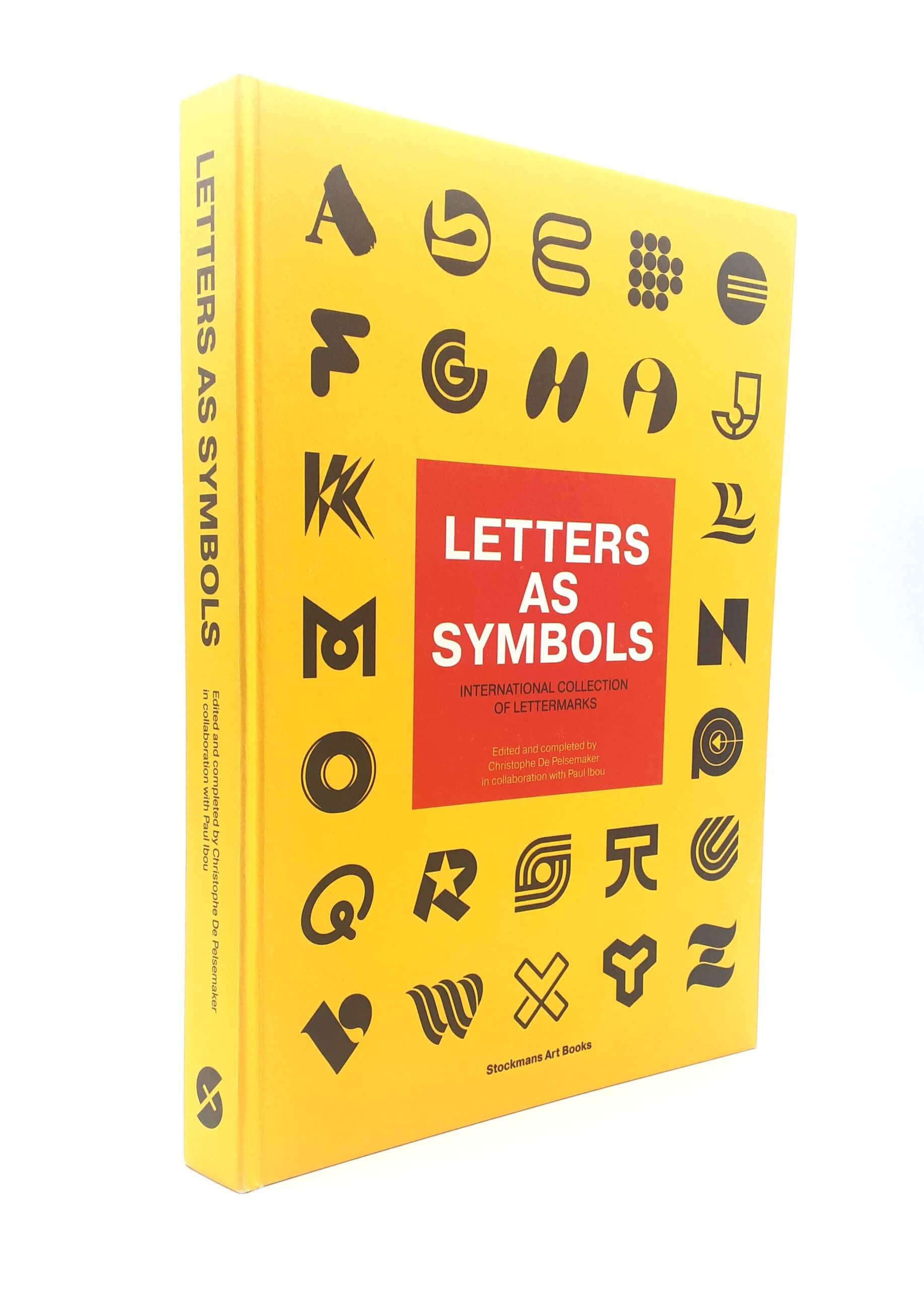
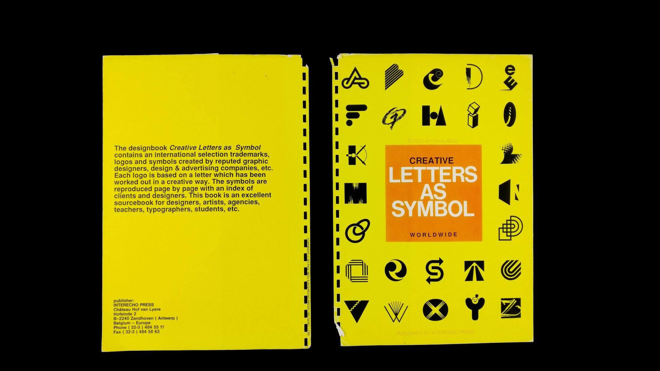
The first striking thing about this book is indeed the cover design!. The cover is the first element of the book you visually engage with, and i must say that a very good job has been done to the cover design.
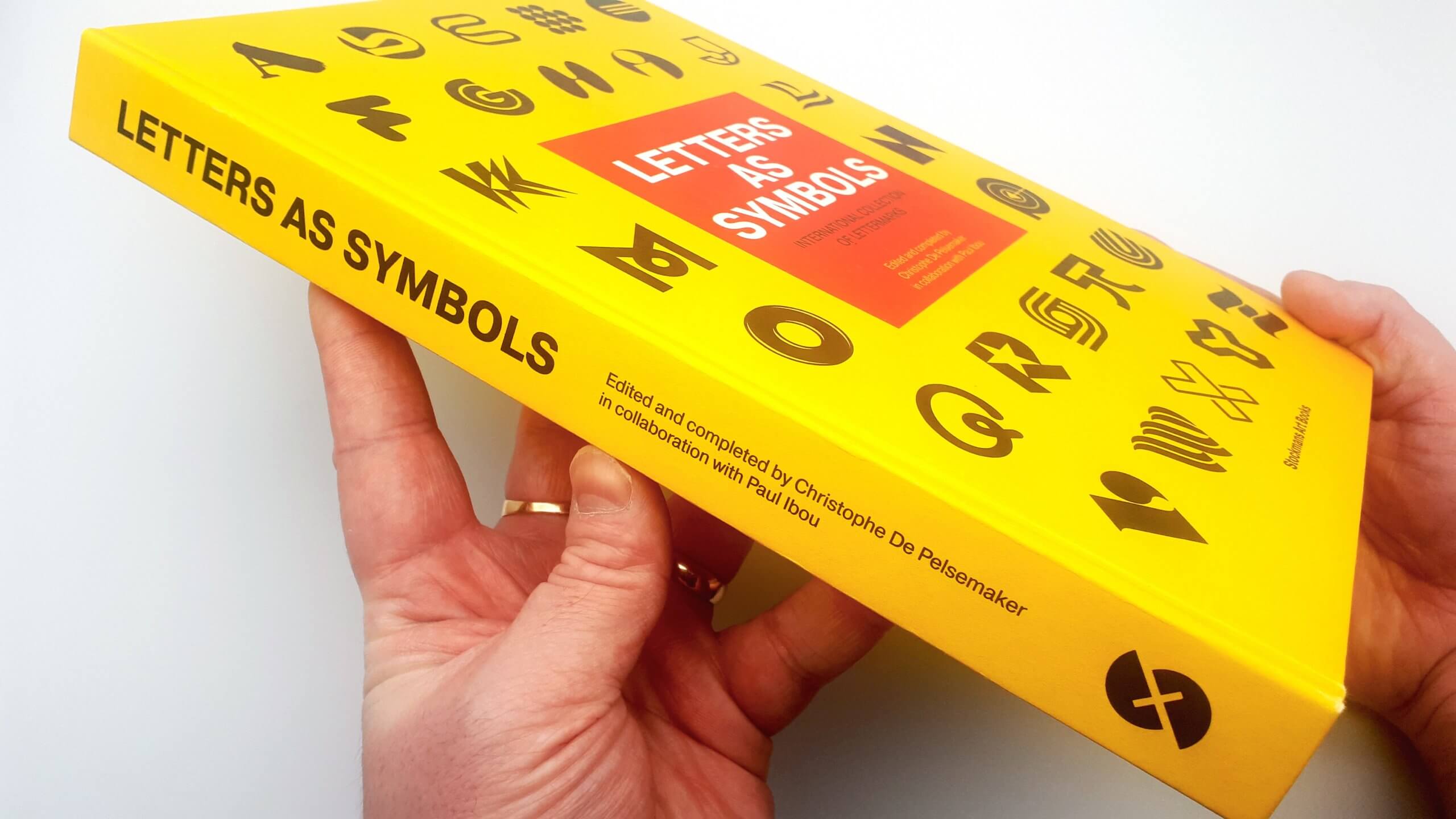
What hits you first is the bright yellow colour that makes the book design stand out from a distance, and the red in the middle that features the books title really compliments that bright yellow colour.
The black logos featured on the cover from various submissions by designers really sell the books content, and just by looking at the front cover you know exactly what this book is all about! Simple but effective which goes back to what i mentioned earlier about the simplest solution being the most appropriate and communicates very powerfully in seconds!
When first opening the book you’re greeted with a list of the 26 logos, and their designers featured on the cover, followed by an introduction to the author of the book, a good friend, Christophe De Pelsemaker who is featured in our designer interviews & the Belgium legend himself Paul Ibou. The table of contents is clearly and nicely laid out in alphabetical order from (A-Z) which is nice from an inspiration standpoint as for instance if you’re looking for “C” Letter Symbols you go to page 40 which shows the Chromoscope Pictures logo created by another friend of mine Chris Logsdon plus many other C based symbols.
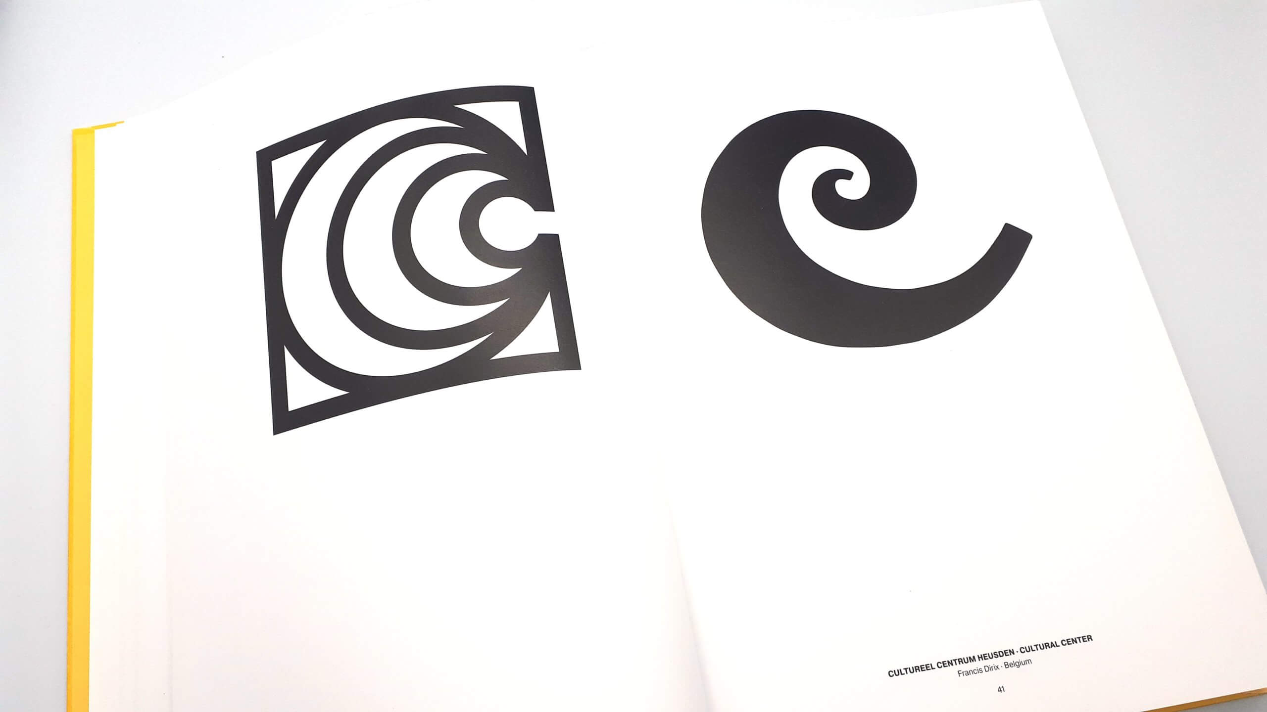
The pages of Letters As Symbols are clean and simple showing the logos based on a single letter in alphabetical order displayed in pure black and white which if you know me well you will know i love black and white monochrome logos, There are 306 trademarks, logos and symbols, and as De Pelsemaker describes with each of them “a celebration of breaking and pushing boundaries of typography”
There are a number of Letters As Symbols in the book from international countries, Belgium has been the obvious spotlight with 75 in total and the majority been designed by Paul Ibou himself. And other countries are as follows.
- Japan – 44
- USA – 40
- Canada – 28
- Switzerland – 14
- UK – 13
- Italy – 10
- Cuba – 9
- Austria – 7
- The Netherlands – 7
- India – 5
- Spain – 4
- Mexico – 4
- Poland -3
- Slovenia – 3
- Sweden – 3
- Venezuela – 3
- Ireland – 2
- France – 2
- Australia – 2
- Finland – 2
- Brazil – 2
- Hungary – 1
- Czech Republic – 1
- Portugal – 1
- Columbia – 1
- Ukraine – 1
- Estonia – 1
- Argentina – 1
- Russia – 1
- Bulgaria – 1
- Georgia – 1
- Luxembourg – 1
- Turkey – 1
Christophe adds: “Looking purely at the aesthetics of the featured logos, they are all equal and have the qualities a good logo must have… With Letters As Symbols, we did not want to make a distinction between famous and non-famous designers.
For that reason, the decision was made to arrange the logos in a non-specific way. The only order that is used is the alphabetical order per letter. The non-specific arrangement gives the viewer the possibility of being surprised when seeing the same level of quality between some of the most respected leaders and the lesser known designers.”
Under the logos featured on each page states the company and industry plus the year it was created, the designer who created it and where they are from. You can expect to see logos from some of the greats including Saul Bass, Alan Fletcher, Yasaburo Kuwayama, Ivan Chermayeff, Tom Geismar, Stefan Kanchev, DixonBaxi, Landor Associates to name a few
This book has a very interesting back story. The original idea for the book first came to light in 1991 thanks to Belgian design legend Paul Ibou who has not really been given the recognition he truly deserves.
His work can be found in a variety of graphic design books and magazines including 1977’s Trademarks & Symbols of the World by Yasaburo Kuwayama and Yusaku Kamekura, Logo Modernism by Jens Muller and R. Roger Remington, published in 2015, and many editions of Idea magazine.,
During 1991 Paul Ibou had already designed a concept layout for the book cover that would feature various submissions of logos by brand identity designers around the world. Unfortunately, the book was never released until now, through a collaboration established in 2017 between Paul himself and a younger generation of fellow Belgian graphic designer Christophe De Pelsemaker.
Both men must be really proud that the book has finally been published after an unsuccessful kickstarter fell short on August 23rd 2018, but 6 months after Christophe announced that Paul had been in contact with Belgian publisher Stockmans Art Books who said they were interested in publishing the book which i’m sure was great news for the two of them, and to add to the good news the book was going to be published with a hardcover and the interior pages would be improved with a perfect soft cotton feel. I was super happy for them when i heard the good news.
What is also impressive is how active Paul is still in the industry at 80 years old, it’s very inspiring to see the passion he has for his work and profession. As Christophe mentioned
“Paul is still an active man in his field and continues carrying fire and passion for constructivist art and graphic design”
I highly recommend to all logo design lovers, Typographers, and Graphic Designers including those learning about design and the seasoned pros it’s well worth having on your bookshelf in arms reach for a great inspirational resource.