2021 is set to be an explosive year in typography as there is a great variety in styles with the main theme being movement. In this article we share 15 Typography Design Trends For 2021
Table of Contents
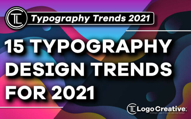
15 Typography Design Trends For 2021
We see typography everywhere and it’s often overlooked as it’s something we are all used to seeing and interacting with.
Although it’s going to be a creative year in 2021 for typography styles with experimental typeface and destructive typography plus let’s not forget big bold shadows and gradients clean, calm, and simplified styles are still popular.
Simplicity is still very much a big deal in typography with the use of simple sans serif typefaces combined with gradients, standout letters and cut out effects.
Typography is alive in all shapes and sizes, and depending on the area your working in whether it be graphic design or digital design there is something for everyone.
We have been researching designers who we have interviewed in our designer interviews to see what styles have been popular last year and what we believe will be popular in 2021.
Experimental Typefaces
![]()
Experimental typography was on the rise last year and it’s very popular at the moment so we will continue to see more of it in 2021.
This type of typography is great for expressing emotion with very unique styles that add a lot of brand personality.
Styles of experimental typography come in many shapes and forms including simple geometric shapes, vibrant and gradient colours and cool strokes to add depth and style to your type.
By experimenting with typography a designer can really instil unique and very specific vibes into their typography.
Alternating Baseline
![]()
Applying all caps to text can be very effective, and by effective I don’t mean by applying to give the impression that you’re “SHOUTING AT SOMEBODY OVER THE INTERNET!”
No, not like that, as a lot of old people do, but they don’t mean to shout at you.
It’s very effective in crucial-context for instance a title, main heading or even a brand name where it’s very likely to be used.
All Cap headlines are visually bold and eye catching, they make you take notice as opposed to lower case text.
All caps make words feel more important and must read this is why they are used in news headlines.
There is a downside to the use of uppercase text from a design perspective, as it does form a more square and box-like shape and feel, which can look less visually pleasing than the height variation that lower case text forms.
By taking advantage of alternating the cap height and baselines of capitalised letters designers can break the rules of typography design in 2021 by giving a variety in their types display.
There is so much more that can be achieved designers can also intensify this by changing the thickness between letters and even tilting their axes.
The result is a full cap letterform that is full of surprises while maintaining its capital uniform.
Outline Typography
![]()
The outline font style is such a huge deal right now. This style of typography is mostly showcased in the hero areas of webpages for the main headline copy.
There are quite a few uses for this type of style but there are elements that you will find in almost every instance.
- It’s used as an oversized text element
- It’s capitalised in most cases
- It’s nearly always a sans serif typeface
- It’s paired with filled letters, never alone
It’s certainly a fun and creative way to add more depth and style to your hero text.
Always bear in mind its readability and the background it’s been displayed take note of colour, contrast and placement.
Such as on as lighter contrasts will make it difficult to read and the text will become lost and overshadowed, while darker backgrounds will give it a better feel and make it easier to read.
Don’t go to crazy with outline typography as its main use is to place emphasis for individual words not your entire text.
Solid Shadows
![]()
When it comes to something you can’t touch such as website graphics, shadows have such a strong visual power that makes you take notice.
Even a really simple design will be launched into a third dimension, getting your type ready for lift off in 2021 with some extra weight shadows.
Strong solid shadows embed type to the canvas while the angled projection gives the type the appearance of flight adding more visual dimension to really catch the eye of the viewer.
Adding bright or vivid colours can add a sense of happy vibe and a feeling of freedom.
It’s a positive style which is what the world needs right now. This style can be quite popular with logo design, expect to see more solid, bright and colourful shadows on custom hand drawn typography in 2021.
Disruptive Typography
![]()
Squashed, stretched, twisted it’s been one of the fastest rising typography trends and style to emerge last year and the rise of distorted types will continue on its uphill path to popularity within typography design.
Distorted type as it’s also known as were designers, will disrupt letterforms, sometimes beyond readability, a trend that was inspired by early digital design created alongside the rise of punk and new wave music in the early 80s.
It’s the perfect fit for alternatives and independent bands. The style has been used for logo design, packaging and music album artwork.
It really does add chaos to your design work, and we are all used to chaos in today’s world so it seems fitting.
Extra Sharp Angles
![]()
We have seen the rise of type with extra sharp angles adding to the overall sharpness of the wordmark design.
Adding sharp angles to type really adds to the effect of rebellion and pairs well with darker colours that highlight their super sharp edges.
It’s a popular style for type-based logos for tattoo studios, martial arts dojos, and breweries.
Highlighted Type
![]()
Highlighter-style emphasis over type to create emphasis!
From a simple highlight to separate underlines and even animated highlights, there are plenty of unique ways to use the highlighted text style.
The sound of highlighted text sounds old fashioned and outdated but for such a simple technique the end results can be visually stunning and very effective.
The highlight technique is best used for single words or short phrases that you really want the user to take notice of.
It’s also effective for shorter blocks of text so the highlighted effect does not overwhelm and take over the entire design.
Kinetic Typography
![]()
It’s the technical term for moving type, and an animation technique for mixing motion and type to express ideas using video animation.
The text is presented over time in a manner intended to convey and evoke a particular emotion.
You might think this is a new type of typography style, but you might be wrong as it has historic roots and was used by legendary graphic designer Saul Bass, whose opening title sequence for Hitchcock-directed movie North by Northwest (1959) contained animated text, featuring credits that “flew” in from off-screen, and finally faded out into the film itself. This brought the type to life for 1960s cinema viewers.
A similar technique was also employed by Bass in the 1960s film Psycho and since then the use of Kinetic typography has become common in the film industry in introductory titles and also television advertisements.
Today, Kinetic type has found its way to the internet as designers have rediscovered its power to help minimise bounce rates on websites and video content, especially on YouTube.
The use of sans serif fonts is better suited as this type of style remains clearer and more legible for animation.
Animated typography holds the attention span of a viewer for a longer period of time. An incredible tool for creating compelling narratives for brands.
Rounded Sans Serifs
![]()
This style is so simple any graphic designer can apply this to their typography. In fact it’s so simple it’s often overlooked, but if you pay close attention to rounded sans serif typefaces you will notice the clean rounded corners.
This particular type of typography works well with pretty much everything and it’s quite versatile to the advantage of.
Rounded sans serif typefaces are regarded as the clearest of typefaces to read. Most graphic designers using rounded sans serif type also use it with medium to thick uniformed strokes with adequate letter spacing as well.
Rounded sans serif type use is centred on maximum readability, and it pairs great with other styles of type for a clean, unique, modern look and feel.
Rounded Block Fonts
![]()
While we are on the subject of rounded type, another style that is increasing in popularity is Rounded Block Fonts.
Sometimes this style of type design can be too much and it’s not for everyone, but we are seeing an increase in use as designers are being more aggressive with blocky types for logo wordmarks and poster headings.
This style is mainly also used with sans serif fonts and when applied makes the type look as solid as stone, giving it an immovable feel but with rounded corners for that softer retro look.
Rounded corners are a staple in graphic design for both print and digital, and convey a modern esthetic also when they are paired with thicker letterforms make the subject feel more bold and approachable at the same time.
Glitch Type
![]()
TikTok has not only influenced the way people and businesses market themselves and businesses on social media it’s also influenced the rebirth of a typography style that being Glitch typography. Looking for ways to gain followers on tiktok?
An art form known as glitch art and this visual esthetic can be traced back to the beginning of the 20th century through distorted forms in cubist paintings, abstract short films and pixel-like rug designs akin to 8-bit video game landscapes.
If you have been living under a rock Glitch type is now trending! Although not for everyone’s taste these effects can be really fun to incorporate but at the same time be quite technical to master.
![]()
Most glitch typography is designed as an artistic element rather than readable typography, and that’s the way it should be created as the high use of glitch effects cause some serious readability issues and let’s not forget bad eye strain!
Caution: use it in moderation!
Standout Letters
![]()
As dull as this may sound, type is designed to fade into the background of a design, it’s what allows text to be read well, and puts the meaning of the text ahead of the overall design as the first impression to get the message across.
Basically the text is what most viewers read first, they understand what they are looking at, and at this moment the rest of the design takes centre stage and the text has achieved its purpose fading into the background while the rest of the design visually stands out.
Last year we saw the rise of letters that standout within wordmarks by incorporating a single standout letter that stands out over other letters.
![]()
For example, in the image above the letter “R” has been used to represent the word it’s communicating as a “Rabbit” very clever don’t you agree!
This type of style manages to break the mould without breaking the readers attention.
In other examples above this style can also be more pronounced for a more empathetic logo design focusing on a visual focal point for the viewer.
You can get really creative with the method of design by creating objects and even introducing negative space.
Gradient Typography
![]()
Some decades back gradients were a popular way of adding colour and depth to graphic design.
They stayed popular until late 2000s, and took a backseat to the flat design style.
Since they came back in a huge way in 2018 they don’t seem to be going away anytime soon, as we see them all the time in logos, typography, packaging and web design.
Dynamic Lettering
![]()
Professional copywriters and typographers understand that words have a life of their own, but in the graphic design industry this is becoming a tangible reality through the dynamic lettering style.
Dynamic lettering creates the visual illusion of movement through fluid shapes, action-lines, textures, and shading.
Dynamic lettering is an analog complement to kinetic type we mentioned earlier, demonstrating that the use of technology is not needed to create a moving design style.
The great thing about this style is that not only does it transition into well as animated typography, at first glance it will give the impression and effect that it already is animated which is a really cool effect.
It may be cool to look at, but it does have its downside and that is readability. Sometimes this style of typography can be on the difficult side to read, requiring more visual work by the viewer to understand what it says.
The style of dynamic lettering is quite popular with hand-lettering artists and the movement of this trend is defiantly rising.
Retro-Futurist Fonts
![]()
Contemporary design inspires our imagination to wonder while pushing boundaries, futuristic typography is always breaking the mould in amazing ways.
A futuristic look and feel is a great way to give the design a more optimistic feel to it.
Retro-futuristic fonts combine futuristic elements with retro and vintage-inspired styling.
Think of the movies Blade Runner, Tron, Ready Player One, Elysium, Oblivion, Dune you get the idea.
![]()
These typefaces all have a cinematic feel that translates really well as headlines, on posters and as a wordmark logo design.
Nobody knows what the future is going to be like designers don’t need to go full on science fiction, but using your imagination and the right amount of treatment you can convey a futuristic feel, even some retro type can be made to feel futuristic.
This type of style and really results in some really eye-catching typography designs.
For further trends we will be seeing in 2021 checkout:
- Top 20 Logo Design Trends For 2021
- Top 17 Brand Design Trends We’ll See in 2021
- 6 Graphic Design Trends That Will Be Huge in 2021
Join The Logo Community
We hope you have enjoyed these 15 Typography Design Trends For 2021. If you would like more personal tips, advice, insights, and access to our community threads and other goodies, join me in our community.
Learn from our Founder Andrew who personally writes our community newsletter. You can also comment directly on posts and have a discussion.
*TIP – Are you looking to Learn Adobe Illustrator CC? Look no further.
This Illustrator CC MasterClass course will set you up with a solid foundation to become a confident Illustrator CC designer. Join over 900 students who have already signed up for this course.
Normally £125 – Now only £25 for a limited time. Don’t wait – Claim Your Seat!