2020 has not been the best year for a lot of people and businesses around the world. There have been so many large scale changes happening all over the globe and it’s been difficult for brands to take any risks with their design. In this article, we discuss the Top 17 Brand Design Trends We’ll See in 2021.
Brands around the world are really going to be relying on old favorite design trends such as muted colour palettes, minimalist design, and simple data visualisation for simple clear and transparent communication as this matters more than ever in today’s world.
With such an uneasy and uncertain feeling surrounding most people in this chaotic world brands must pay attention to invoking a sense of calm, understanding, and positivity in their brand designs and touch points.
The bold colours, eccentric typefaces and in-your-face marketing tactics will not be the way to go now and for some time to come. We need to tone it down and focus more on minimal design, brand storytelling, authenticity and bringing back some classic design styles.
Most trends are those of last year that have evolved, in 2020. We also have some new trends worth taking note of as we predict they will become more and more popular in 2021.
This is a chance to educate and convince our brand audience of the value our brand has through, minimal design, colour transitions and telling the brands story that evokes authenticity. Being transparent and gaining trust is of the highest priority.
The world of graphic design is an ever-changing field, the word “trend” is not something we are fond of as it comes and goes, but most of these are here to stay. In this article, we will discuss all the design trends that will be the foundation of 2021.
Table of Contents
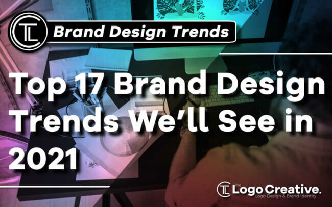
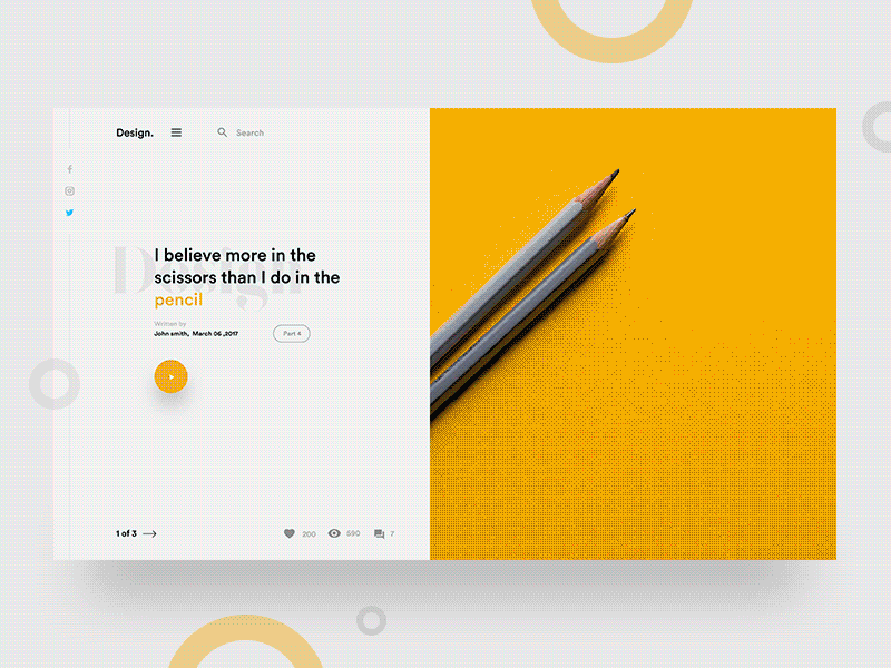
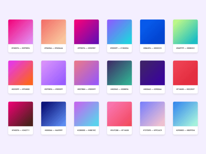
Muted Colors
The times when neon colors were getting all the attention have longed to pass, giving the spotlight for muted, pastel colors with softer hues mixed with either a black-and-white base taking the edge off as to not appear so bright.
LinkedIn, for example, has been using muted colours really well. Not only do they look professional, but they have also incorporated clean illustrations and geometric shapes.
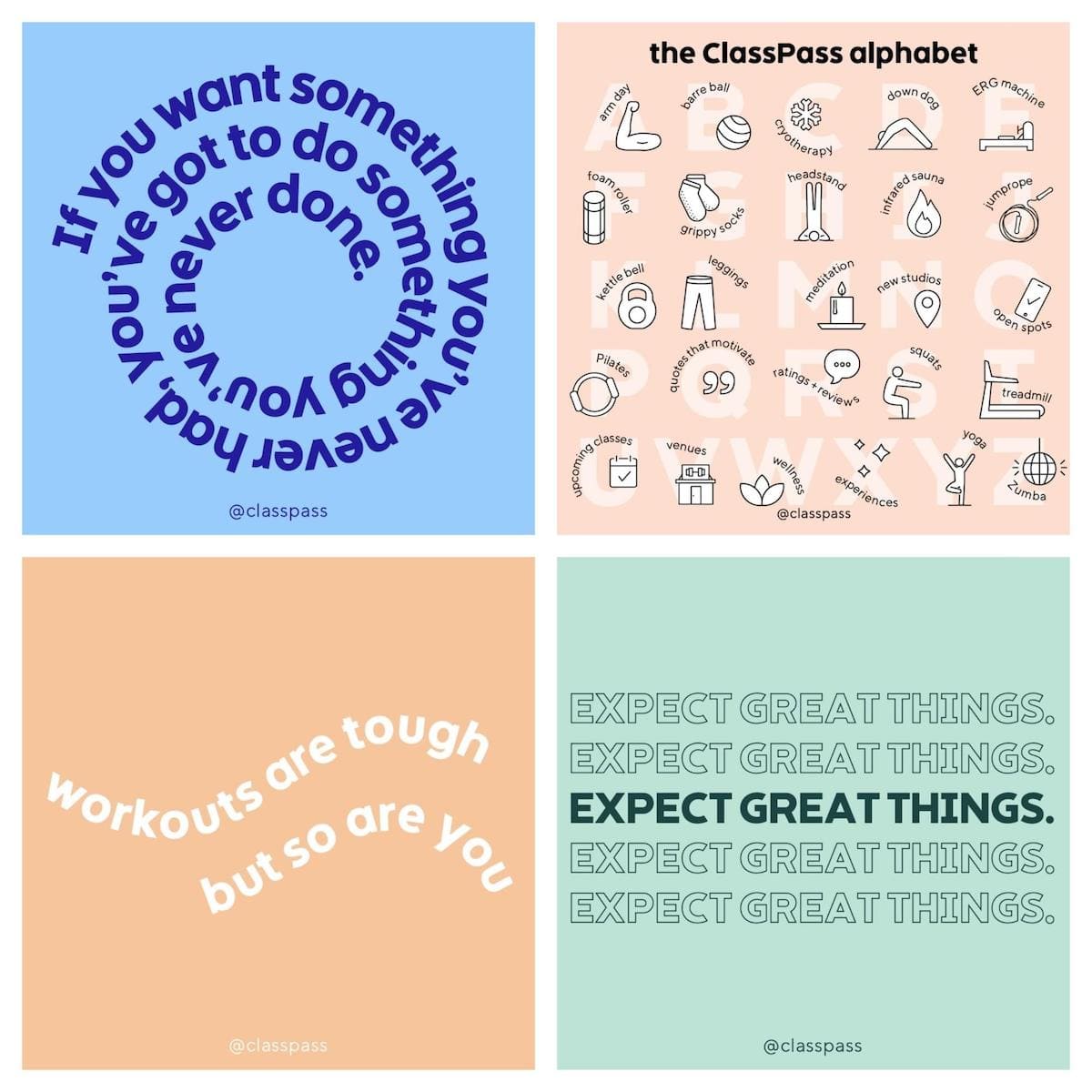
Muted colours give the design a natural look, and even Health, Wellness, Lifestyle, Beauty, and fitness brands are taking notice.These examples below are from a company called Classpass and although simple in their design they really make you take notice as the muted colours really sand out.
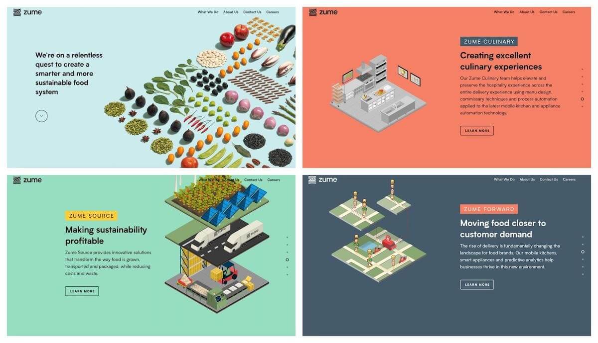
One final example is a company called Zume whose mission is to eliminate food waste around the world. As you can see from the images below they have also incorporated illustrations.
They are designed in a way to highlight the content. The color palette doesn’t change, what does change is the sharpness. You can incorporate as many colors as you want creating some really nice muted colour palette combinations that look really authentic and attractive.
Asymmetry
Grids and strict straight lines are going out of design tendencies. Instead, designers tend to use asymmetry in brand design and logos. Asymmetric designs are outstanding and memorable.
The tendency for asymmetry allows designers to add creativity to muted colors and the pure minimalism of the site, making it recognizable and accentuating the shape rather than bold color.
Moreover, a designer is given more space for creativity. Not following the grid format allows them to move elements around and create more white space.
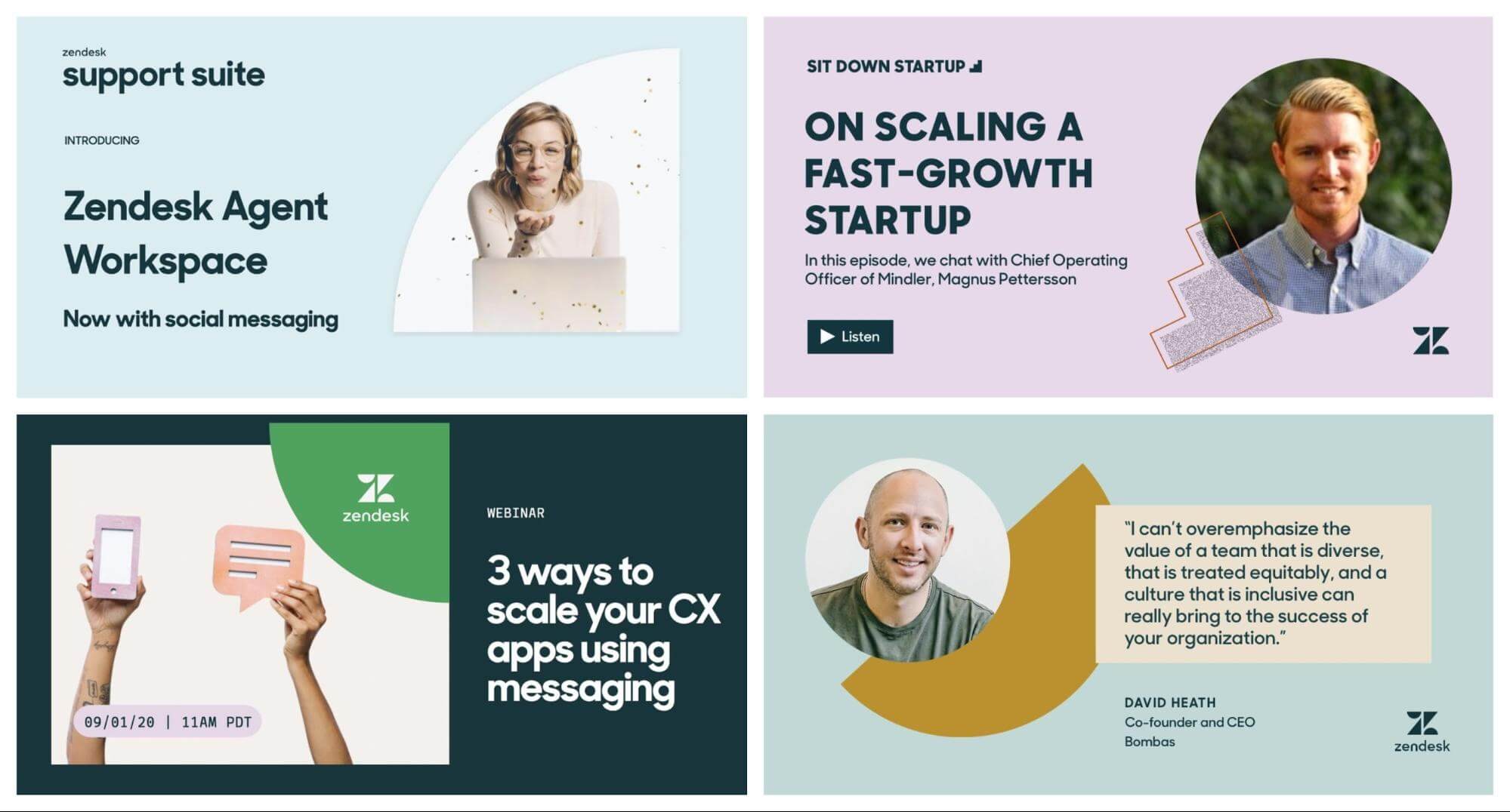
Data Visualization
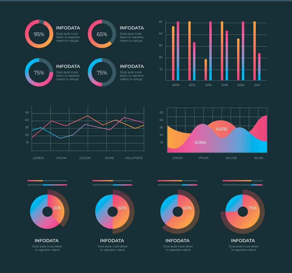
Big Data is a new section of innovation. Each sphere is so strongly oversaturated with information that a simple transmission in numbers or images is no longer possible.
More and more companies pay attention to data availability, encouraging potential customers to become real customers. The exchange of raw data is of little value to the viewer.
Nobody wants to look at a bunch of numbers. You need to make it visually appealing and easy to absorb. From the example above other trends such as gradients, geometric shapes can all be presented in a minimalistic fashion.
In 2021, people will be drawn to simple visualizations.
Accessible Designs
Speaking of information and data, Accessibility is a trend that is not particularly snazzy or sexy to look at, but it’s very important when it comes to people accessing your website to find out information. A user shouldn’t have to jump through hoops to access it. Usability is a key factor when it comes to a websites, UX Design.
A lot of web designers are striving towards an accessible design approach, its even a law in some parts of the world to allow people with disabilities to understand, perceive, navigate, interact and contribute on the internet.
Technology moves fast and it does not slow down for anyone, and nobody wants to be left behind because of their disabilities. Accessible Design benefits a much larger audience and a design is only useful if it is accessible by any user.
By any user we mean everyone and not just people with disabilities, being accessible means for any user, anywhere at any time. So we should always design in such a way that no matter what it is, it should be useful and serve its purpose.
Minimalism
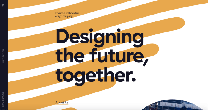
It’s excellent if this sounds obvious to you. It means your brand looks up-to-date and can confidently march to the future. Minimalism has penetrated every part of modern life including home design, gadgets, advertising banners, and clothes.
There has been a significant shift into minimalism over the last few years and this tendency will continue to grow in 2021. The more customers will view your brand website content on mobile screens, the stronger the trend for minimalism is going to become.
But it’s not only about digital design, minimalist design has impacted a number of fields from the internet to user interfaces, video games, movies, and the influence of minimal design can be seen in most places you look.
Minimal design is less of a visual style and more of a design principle. It only uses the most essential design elements that include basic shapes and a limited colour palette to create a design that is simple but memorable to the viewer.
Flat Icons and Illustrations
![]()
When developing a website design, designers often use stock images and photos. If your brand is already prospering on the market, then keep it up. The user is used to your style so don’t go make drastic changes thinking you need fancy illustrations to replace the images you already have. This can work against you and hinder your brand style.
If you’re starting a new project or planning to rebrand an old one radically, then pay more attention to simple, drawn illustrations rather than to 3D esthetics. The flat look is going to be a real big trend in 2021.
First, you can add more diversity. Second, you will make a customer love a product. The thing is, viewers will be more likely to address stock images to already existing brands while the newly-created may be stigmatized for lack of creativity. The above image by NickleFox is a great example as it’s a clean minimal style, that really highlights the dog illustration.
Classic Fonts and Swiss Design / Bauhaus
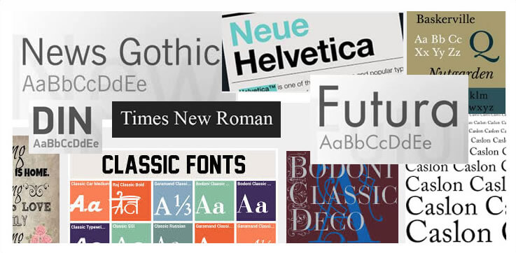
Classic fonts as well as vintage trends are making a comeback. Fashion, health and wellness, clothing street brands and even tech startups are all under the influence of the trends of the past. This will definitely be trending in brand design in 2021.
The most important movements of the 20th century in graphic design are always the inspiration for the best designers. These classic styles are worth mentioning because they are always current and following the rules imposed by them is almost impossible to make mistakes in design.
In general, these movements emphasize typography, sans serif fonts (Helvetica was created in the Bauhaus stage in 1957) geometric shapes, simple lines, volumes and colors.
Immerse a viewer into decades of classic graphic design, evoke nostalgia, elegance, and reliability. The world and graphic designers can use some of these classic qualities right now.
Reminiscent of Swiss design, it’s a simple minimalist design that’s clean and colourful, designs that use basic shapes, large headings and subheadings that really pack a punch! Throw in some muted colours and bam! People will pay attention.
Classic Serif Font Use
Speaking of classic fonts, Serifs will be used a lot more in impactful headlines.
Fun fact that some designers who have been in the industry for years still get sans and sans serif fonts confused.
An easy way to remember that has always worked for me, is to remember that sans fonts are curved and sans-serif have the small added features on the ends of strokes known as “Serifs.” in most fonts. If you remember Sans are curved you’ll be fine!
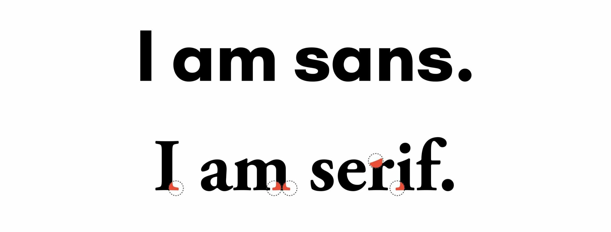
Serif fonts are one of the world’s oldest font styles dating back to the 15ht century, and a typeface that is still in use today. Due to this serif fonts are associated as a classic font that is not only elegant to look at but also trustworthy.
Serif fonts evoke the feeling of nostalgia for a lot of people who come into contact with this typeface on a daily basis.
It is no wonder that more and more brands are starting to adopt the use of serif typefaces. Mailchimp is a great example as they have adapted to using serif fonts throughout their designs, but what really stands out is the use of it on their website landing pages its really powerful combined with the illustrations and muted colours.
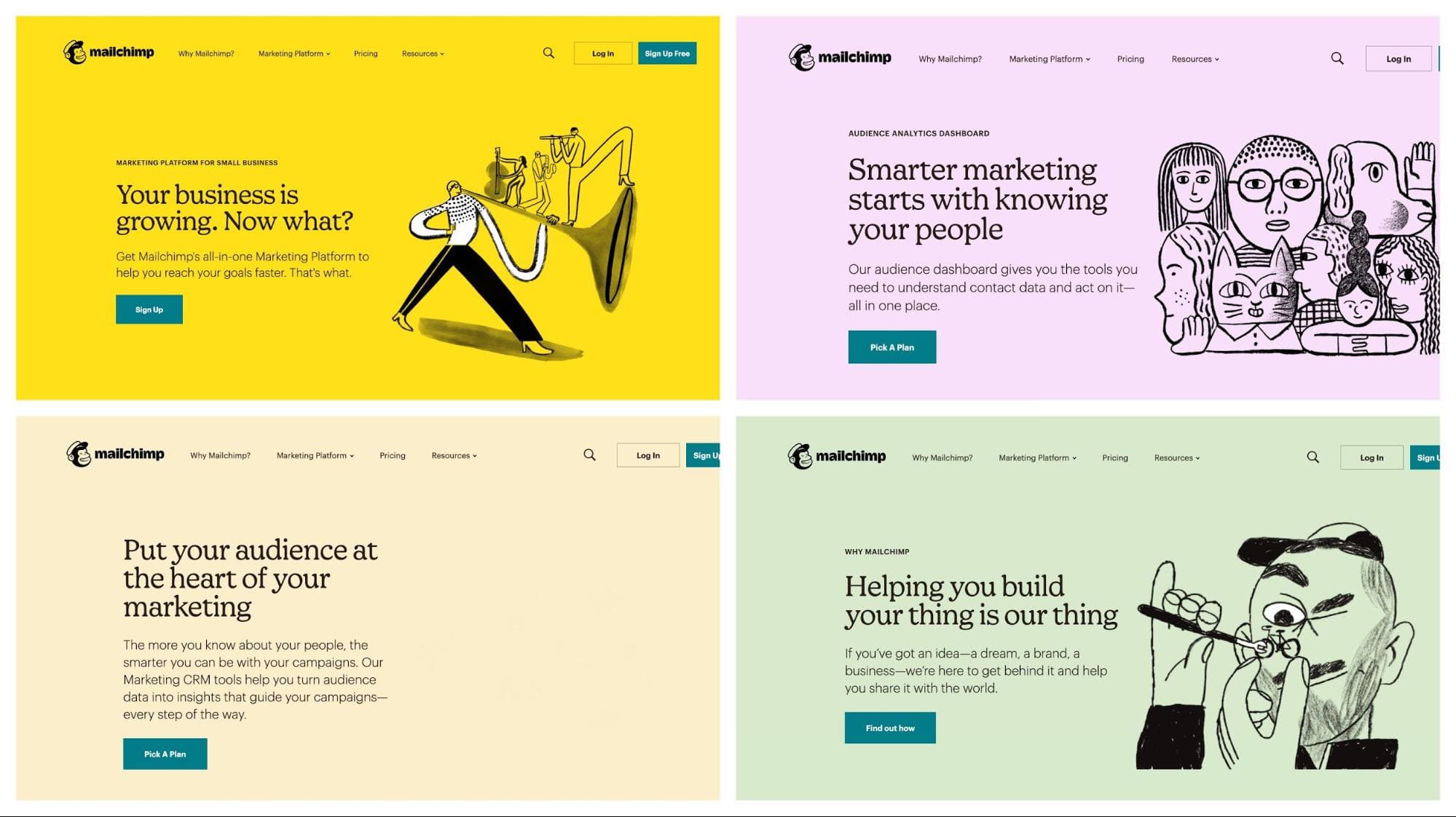
Each of Mailchimp’s landing pages targets a pain point that business owners may be facing. The use of the serif font is very authentic and positions them as a “trustworthy” leader in their field that people can rely on to help them succeed.
Motion Logos
![]()
What is brand design all about? Why do companies pay so much attention and costs for developing a unique image of their brand? Have you ever thought about that?
The thing is, the design and appealing picture are the factors that will make a user remain on the same page for years to come. The longer they engage with a brand, the more likely, they will interact with a brand.
Same with the brand logo. This is an integral part of the brand’s identity. This is how people recognise the brand. Apple, Starbucks, McDonald’s, Microsoft, and Google are all recognized everywhere around the globe.
Check out the below examples from Ebay and PayPal whose services are used by most people on a daily basis. Motion logos are a way to add modernity to your logo and make it look presentable in the upcoming year.
![]()
![]()
Social Slide Decks (Carousels)
View this post on Instagram
Social slide decks, also known as carousels, are created to be shared on social media and spread brand awareness. They are mainly used on Instagram and Linkedin because of the way these platforms handle the pictures. and the algorithms on both these platforms seem to promote these carousels a whole lot more than singular posts.
In addition, the algorithms on Instagram and LinkedIn seem to be promoting these slide decks far better than a single image. Big brands who have been sharing slide decks on their Instagram accounts have been getting plenty of views as a result.
Carousels have become so saturated and overused, not to mention copied by others. I seem to find myself reading the same information just presented differently. I believe they will still continue to be popular in 2021, but they will not last long and will fade out in time.
Overlapping Designs
We are going to continue to see overlapping designs more and more in 2021 for several reasons.
First, they add more depth to the image. Second, overlaps help designers to group more elements on a page and still leave plenty of white space on it. Third, they help to create associations between elements because of their proximity to each other. The correct use of overlaps and overlays makes the content more effective.
The image above was created by our fellow designer friend Anthony Gribben, he’s created more over on his Dribbble profile, and I love them.
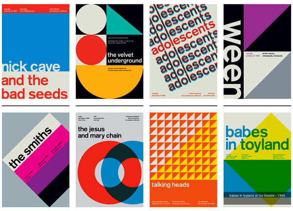
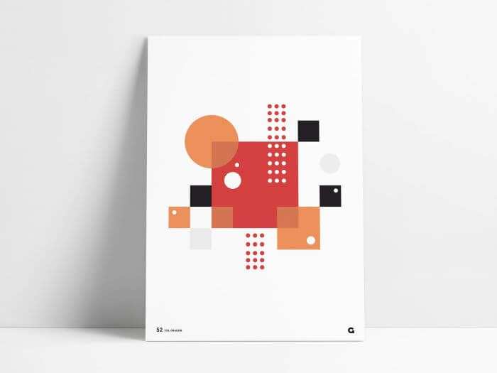
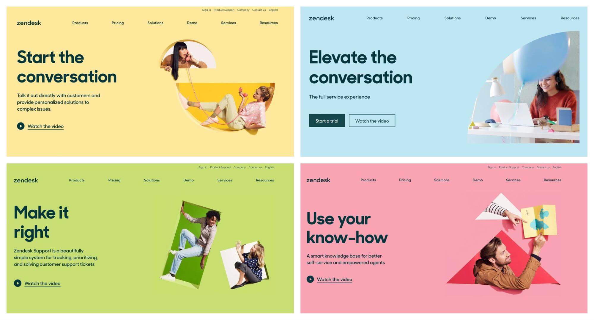
Geometric Shapes
The years 2020 and 2021 is an Epoque of prevailing minimalism. 2019 brought us flowing “liquid” shapes that weren’t easy to recreate. Thus, the following year is proclaimed to be the year of geometric shapes that are easier to create and establish consistency across a brand’s visual content.
Last year there was a huge plethora of designs that incorporated flowing abstract shapes within their design work, this has now been replaced with pretty rigid, straight-headed geometric shapes.
This is great as it’s further adding to the minimal design theme, and looking at other brand design trends this year, this shift makes a lot of sense.
As you can see from what Zendesk has achieved with their designs, that when using geometric shapes it can order, consistency and structure to the visual design. This has now become a recognisable element of their brand through the consistent use of simple geometric shapes. Below showing the incorporation on their website.
Dark Mode
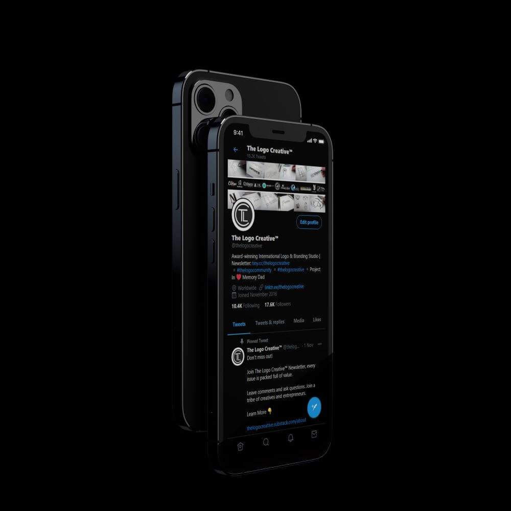
Dark mode has gained popularity this year and it’s not going to fade in 2021 and continue to impact design for years to come.
Apps, social networks, and operating systems have options available for the dark mode option for their user-interface.
It’s a modern, sleek and stylish look that accentuates design elements and helps to reduce eye strain, and anything that is healthy for your body is always a good thing.
Apps like Twitter, YouTube, and Instagram have already adopted this trend and for 2021 a dark mode will be a must. As you can see from the image above we use dark mode for our twitter account and other social media networks and its made me want to use it more especially Twitter.
Gradients
Even though muted colours are becoming more and more popular, gradients are not going away anytime soon and I believe their is always a place for a nice eye-catching gradient.
Designers recognize and come into contact with hundreds of shades of every colour you could possibly think of on a daily basis. Every year such variations of colours are used more and more actively when creating a more attractive eye-catching design.
Gradients have been a trend in graphic design for the past three years. As polls and expert comments show, so far no one intends to forget this trend.
Why are gradients so popular? First, they provide more room for creativity. Second, the user is ambiguous. Third, the gradient creates a sense of movement which is analogous to motion design, but without animation.
The great thing about gradients is they can be used as part of a minimalistic design, used with classic typefaces. used with geometric shapes and data visualisation, and incorporated with digital trends, the possibilities are endless.
Text Videos
View this post on Instagram
Text videos are something that can’t be ignored. Why? Because of the pandemic and the changes it brought in the way we work, create, and perceive content. Remote work has become the norm and so it will be in 2021. Sure, producing video content is much harder but it’s the way to attract billions of viewers daily.
Authenticity & Authority
Every year there is more and more talk about pretense in advertising. The user sees the act and simply does not believe everything that is shown to him or her. Therefore, when creating your brand and product, think about transparency and simplicity, honesty is the best policy as it gains trust and loyalty.
Just because something is good, does not give a brand the right to make it look better than what it is. This is a false advertisement and an unrealistic impression of what the consumer is paying for.
It’s about honesty and transparency, not just visual appearance.
Don’t blow something up or stretch it out to make it look better, instead spend more time putting it together. Pay more attention to real conditions and natural colour, Use all the elements that can be in harmony with real life and nature. After all, nature is the best association of pure and sincere design.
No need to deny that authenticity and authority will become a focus for many companies’ brand strategy in 2021.
Brand Storytelling
We are all aware of brands using and delivering personalised content to consumers. This is also important for user experience (UX) and products, now more than ever consumers are looking to purchase from the brands they relate to, who are transparent, approachable, and relevant to what they are looking for, but most importantly who they trust.
For a brand to create an emotional and genuine connection with consumers, it must use storytelling in everything it does.
By creating a brand story around a product of service is an excellent way of captivating users as this gives the brand the opportunity to immediately engage with its users by touching the emotional side and creating a personal connection.
A good example is the Nike equality campaign, as Nike has always been on point with its brand storytelling even before brand storytelling was a thing. One of its best campaigns was Equality, which made a strong statement about the company as a force for positive social change, offering something different to athletes than just a pair of shoes or branded fitness gear.
This is a great example of using brand storytelling to connect with an audience, inviting them to be a part of a collective movement by wearing Nike products, or getting those people to engage on social media, such as sharing one of the Nike brands inspiring videos.
There are other great examples by big brands we love such as:
Apple: They tell a story that makes the customer a hero, a creative individual who thinks differently. “You’re different. You’re a creative individual who challenges the status quo”
Starbucks: They tell a story that makes their customers feel more sophisticated and enthusiastic about their life. “You deserve a sophisticated place for conversation, where you’re always welcome”
Telsa: They position their customers as early adopters and tech geeks who are audacious and care about the environment. “You’re an early adopter of new technology, a tech geek who saves the world”
Rolex: They tell a story of abundance, being an exceptional human being and having unlimited possibilities. “You’re an exceptional human being and you deserve to be wealthy and successful.”
Final Verdict
Graphic design and digital design provide benefits that go beyond the visual comprehension of the brand. In the fast-flowing world, it’s essential that graphic designers and digital designers are acquainted with the latest trends of the sphere they’re working in.
Having read this article, you’re now aware of what changes will come in 2021 and why it’s so important to adopt them.
Join The Logo Community
We hope you have enjoyed the Top 17 Brand Design Trends We’ll See in 2021. If you would like more personal tips, advice, insights, and access to our community threads and other goodies, join me in our community.
Learn from our Founder Andrew who personally writes our community newsletter. You can also comment directly on posts and have a discussion.
*TIP – Looking for the best quality design mockups? We use and recommend Mr Mockup they are great for all your fonts, mockups and design bundles.