Here’s an exciting story about Typography Fonts: in July 2012, Errol Morris conducted an experiment titled ‘Are You an Optimist or a Pessimist?’ Where he presented an excerpt from a book by David Deutsch (The Beginning of Infinity). Morris wasn’t bothered with what people thought they were. He wanted to know how typography fonts influence perception, how typeface affects the credibility of the text. He used 6 fonts (Baskerville, Comic Sans, Helvetica, Georgia, Computer Modern, Trebuchet) and text in Comic Sans and Helvetica had the most negative responses while Baskerville was the clear winner. In this article, we take a look at 4 Typography Designs with Awesome Font Selection.
Well, we can safely say that Typography, Fonts has an immense influence on perception and when applied to brands, it can make or break a campaign, website, etc. Do you know why Baskerville won? As psychologist David Dunning said, “Fonts have different personalities. I think one thing you can say about Baskerville is that she feels more formal or looks more formal” Thus, typography has immeasurable value to your website.
Table of Contents
What is Typography?
Wherever art meets text, is called typography. In essence, typography is text arrangement. It originated in the 15th century and it is a tool with which you can give your text style and personality.
The first things visitors see when they land on your page is how you present the content and how your text looks. After this, they judge your page unconsciously and choose to explore your page further, just based on the appearance of words. And all of this happens under seconds! Therefore, you cannot dismiss typography as an essential tool for your website design.
Key Components of Typography
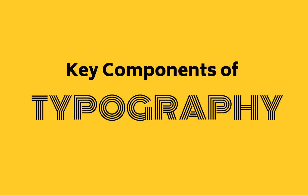
Many elements make up the description of typography. Let’s look at the fundamental aspects:
Typeface
Font and typeface are not the same things. A typeface is a selection of characters, numbers, and letters that have similar designs. For instance, Times, Arial and Garamond are typefaces and not fonts. This is a widespread misunderstanding.
Fonts
The art of designing font is an involved and lengthy process. Fonts are developed by craftspeople meticulously, and they spend a lot of time on it. They are talented individuals who come up with designs of various styles to create a complete family of characters, numbers, and letters. Regarding the argument of font vs typeface, designers comment that fonts are delivery mechanisms and typefaces are the creative work.
Additional Helpful Resources:
Want to Convert Sketch File to PSD? Here are Some Things to Consider
Making Your Logo Creative and Meaningful
From Logo Design Trends To Styles What’s Here To Stay In 2019
Line Length
This applies to the range occupied by the text that exists between the left and right margins in a single line.
Leading
Leading defines the vertical gap between every line. It is so called due to the usage of metal typesetting in the earlier days where the first strip was used to segregate sequences. For readable text that is easy to read, a common custom is that the value of your leading must be anything from 1.25 to 1.5 times bigger than the size of the font.
Kerning and Tracking
The process of modifying space between the characters for harmonious visuals is called kerning. Tracking is similar, yet kerning and tracking are not the same thing. The method of adjusting character spacing in a word is called tracking.
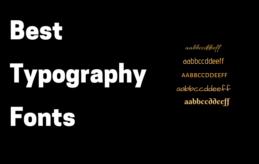
Best Typography Fonts
 Bodoni
The Bodoni font is a popular serif typeface group that has had a rich history of applications by several design houses. The multiple font styles start with Bodoni’s first Didone modern font in the 1700s to the American Revival by ATF at the beginning of 1900s and towards the technological age.
Usage
Bodoni’s use can be traced back to La Vita Nuova in the 1920s to Poster Bodoni by Chauncey H. Griffith that is most commonly applied in neon signs. You may have seen this for the movie posters of Mamma Mia! and Black Dahlia. You can find this font in advertising too, most notably in brands like Calvin Klein, Giorgio Armani, Guerlain, and Elizabeth Arden. Magazines such as Metropolis and Harper’s Bazaar use this font as well.
Calson
Calson is among the oldest serif font that is still operational. It was first created in 1722 by William Caslon and employed widely everywhere in the British Empire in the 1700s. Even though its usage fell out of fashion, it has been restored at different times following then, especially at the time of the British Arts and Crafts movement. After this, Calson underwent a redesign for technical modifications. It remains as a norm in typography still.
Usage
This is such a multifaceted font that it can be seen in an extensive assortment of situations. Benjamin Franklin made use of Calson aplenty, and even the Declaration of Independence was written with it. Famous playwright George Bernard Shaw had all his plays set in the Calson font. In modern times, Les Miserables used this font for the play literature.
Rockwell
The Rockwell font group is a slab serif typeface first fashioned following a font called Litho Antique in 1910. Reproduced by Morris Fuller Benton in the 1920s, the font was re-formed and printed in 1934 by Monotype Design Studio in a plan initiated by Frank Hinman Pierpont.
Usage
Distinguished modern users of the Rockwell design comprise of the Docklands Light Railway and the Guinness Book of Records.
Helvetica
The Helvetica typeface is among the most popular now. It’s been applied to every typographic design possible, not only because it is found on practically all computers. Helvetica is omnipresent because it matches like nothing else. The design embraces the notion that a typeface must completely back the process of reading—clear information is the principal aim of typography.
Usage
Helvetica is used by companies like BMW, American Apparel, Toyota, Microsoft, Orange, Motorola and Lufthansa, among others. Apple also integrated Helvetica in its iOS platform.
Gotham
The creation of this typeface is shrouded in mystery. Its origin story is as the old saying goes “an enigma wrapped in a riddle”. However, the font is widely used and makes for some fantastic typography designs. It is mostly used in architectural signage after its revival in New York in the 1920s. The typeface is very masculine, classic and modern at the same time. Gotham appeals the most to media designers due to its clear readability and contiguity in graphical conditions and headlines.
Usage
In contemporary times, Gotham was used GQ in 2000, you have seen it on Coca Cola bottles, on Twitter, Spotify and Netflix, on television shows like Saturday Night Live and CONAN, and in movies such as The Lovely Bones and Inception among others. In short, Gotham is everywhere.
Best Examples of Typography in Web Design
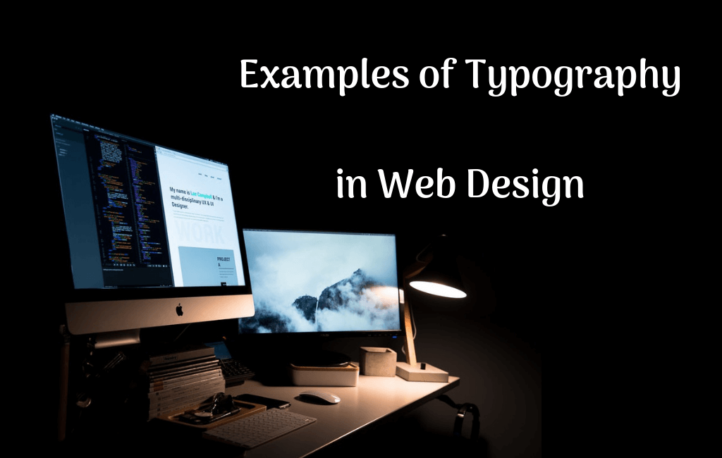
Let us now look at some brilliant uses of typography in 4 websites.
Pittori Di Cinema
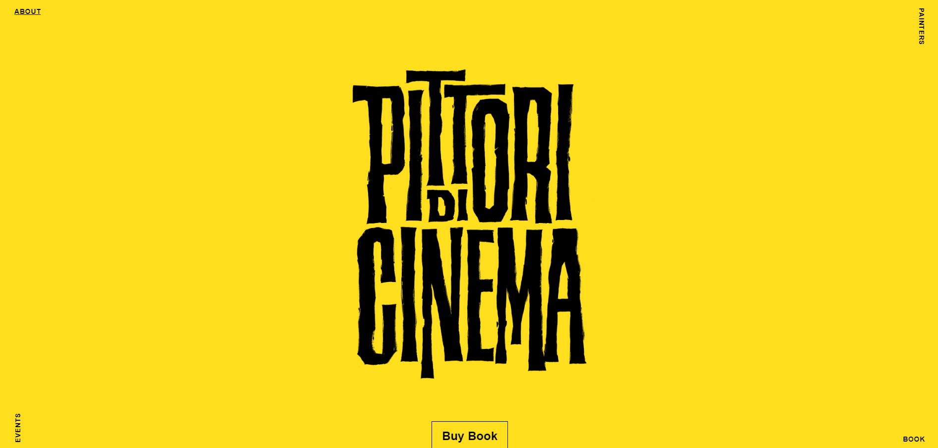
Pittori Di Cinema is an illustration and art website designed by Bunker, and its highlight is its large style of typography design, which is also known as “large typography” in the world of web design. Great typography captures attention more effectively and highlights the contents of the website better. This is why large typography has been such a consistent Trending Design For Typography recently.
This website teaches designers that bigger the typefaces, the more attractive your website is. So, it is a good thing to apply this style in your design. Also, decorating your typography with dynamic effects, emojis, color contrasts, icons, etc., can create an impact.
Reflektor Digital Website
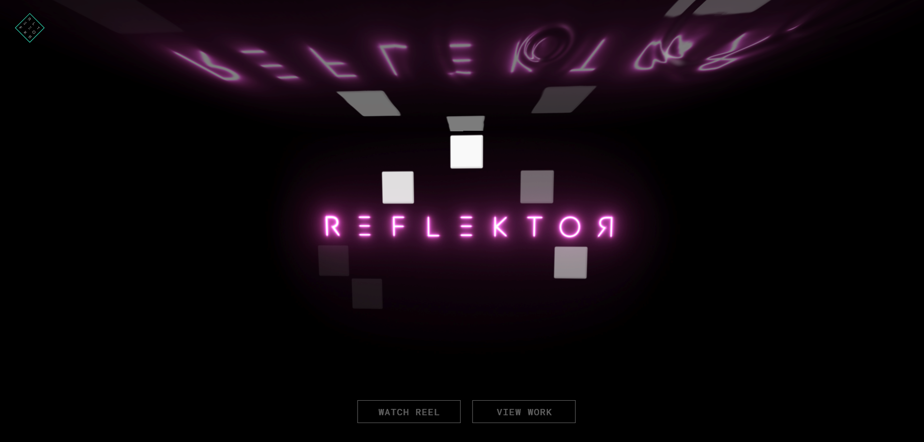
This design agency site highlights glowing and fluid impact along with the audio. The design is very modern sci-fi (reminds of the Netflix original series of Black Mirror). They use 3D tech, a unique font, glow and fluid effects, and the interactive design blended with the embedded sounds creates an aesthetic and enhanced experience. In layman’s words, this website design is easily the most cooling web design ever.
Eleven Plants for Dums Dums
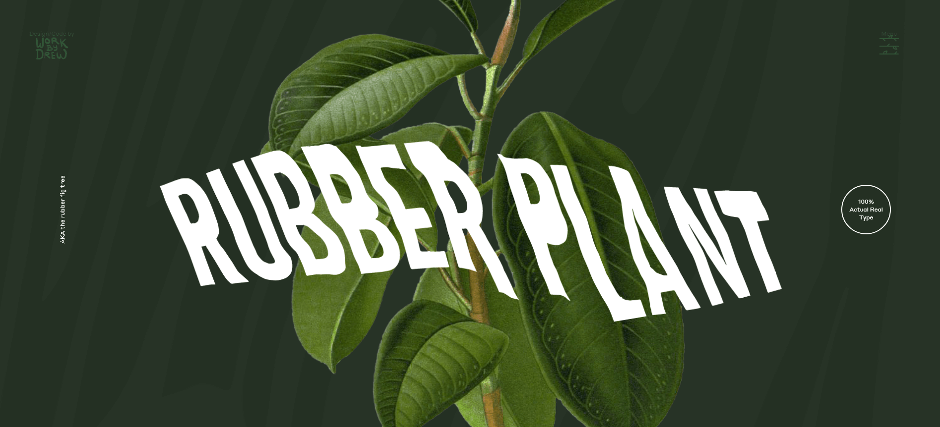
This simple, single page website for plants, designed by Drew Marshall has much to teach, especially lessons in the hierarchical design of typography. Using simple texts is among the best methods at a designer’s disposal. They can create a fantastic minimalist site with it. This website for plant takes this method and develops stunning hierarchical typography by applying words in various colors, fonts and sizes.
Tens
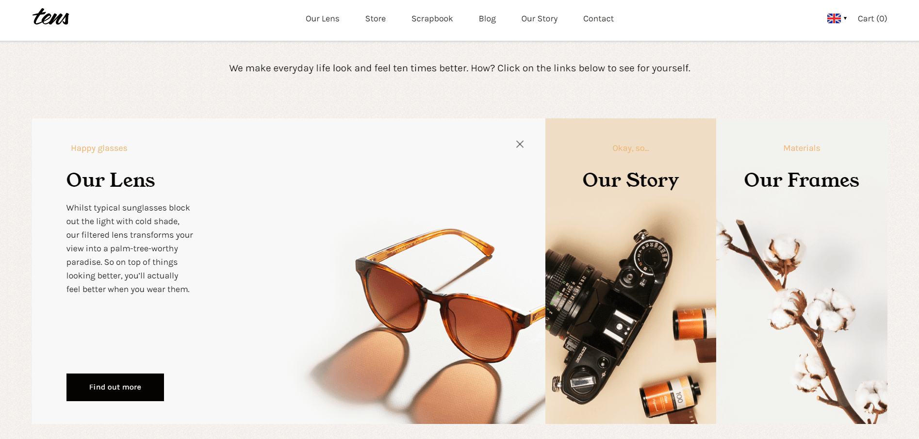
Tens is an e-commerce website designed by Tens & Superb. They use amazing typography design combined with usual patterns of web scanning and dynamic background. Naturally, users apply many patterns of scanning like the Z or F pattern when browsing pages. Tens consider such patterns and order its information by following the visual flow of the user. Moreover, the dynamic pattern displays the products clearly and helps to boost sales.
Conclusion
The world is made up of words; therefore, Typography Website Design is so essential for so many brands and companies. It is the first thing consumers associate with a brand, after all. And a stunning typography design for your website can enhance the UX and visual appeal of your site considerably. Just remember to take into considering the themes and features when designing your website. Good typography design should not only quickly attract users but also display products vividly and help you increase sales or traffic.
We hope this article about 4 Typography Designs with Awesome Font Selection has been helpful, and as always be sure to leave your comments below.
 Author Bio
Manan Ghadawala is the founder of 21Twelve Interactive which is one of the best mobile app development company in India and the USA. He is an idealistic leader with a lively management style and thrives raising the company’s growth with his talents. He is an astounding business professional with astonishing knowledge and applies artful tactics to reach those imaginary skies for his clients.