Visual design makes all the difference when presenting information and promoting a message to your audience. In this article we share a Design Guide for a Knockout Pitch Deck.
We all understand that design makes a real difference when it comes to sales. In such a fast-paced world, achieving impact, striking visuals, and using well-crafted text copy in your pitch deck or presentation will make the difference between someone brushing over it, or stopping to read, digest its contents.
This guide will address each step of the pitch document design process. We will cover everything from creating and designing a pitch deck, including information on the optimal number pages, text copy through to design, look and feel.
Table of Contents
Quantity of Pages
Readers can easy loose concentration with large documents, yet with too little information the reader doesn’t gain enough information to convert to a sale. The sweet spot for a pitch deck is around 5 – 10 pages.
You want to present a digestible amount of information, the key is not to overwhelm the reader, less is more. You want to spark a conversation with potential leads, not tell them every single detail surrounding your business.
Don’t blow it all on the pitch deck, leave some room for a conversation. Also worth noting, if your idea is concise and reduced, then associations with organisation and clear thinking will be related to your brand.
An Investment Memorandum (IM) document is a good example of a deck which is often over 100 pages. In cases like this, a Teaser Document can be supplied prior to supplying the IM.
The Teaser Document is basically a very condensed version – allowing the reader to get a brief understanding before they commit and dive further into the detail.
Canvas Size & Setup
Because most pitch decks are sent by email, as a PDF, they are typically best to be designed to view in a standard monitor size, which is 1080×1920 pixels.
You can add a margin of 100px to give yourself a rough guideline. The margin line will aid by giving you a guideline. Anything outside the guide will be too close to the edge.
This will help frame your document from page to page, creating a boarder of negative space around the page.
Once you are familiar with the document setup, you can get creative and design endlessly scrolling documents which will act and feel like a scrolling website, this can be a good way to make your document appear more modern.
The Structure
Page structure is fundamental to keeping the viewer engaged. A great starting point would be to introduce the reader with a front cover, and end on a contact page.
Everything in between needs to take the reader on a journey and flow smoothly from beginning to the end. The internal structure can vary, depending on the document, but as a starter for ten, here is a rough guide:
- Front cover
- Introduction
- About
- Overview
- Why choose us?
- Detail information
- FAQ’s
- Market data
- Team
- Contact page
Generally speaking, for generic overview documents they will follow a simple structure like this, always ending on a contact or thank you page.
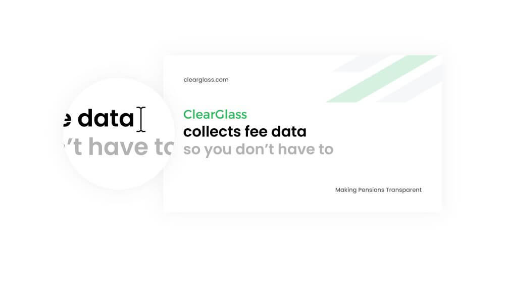
Front Cover Example
A front could should contain key information or insight; a logo design, title, subtitle, website link and a nice cover image to bring the cover to life. This is the first thing the reader will see, so keeping things impactful is key.
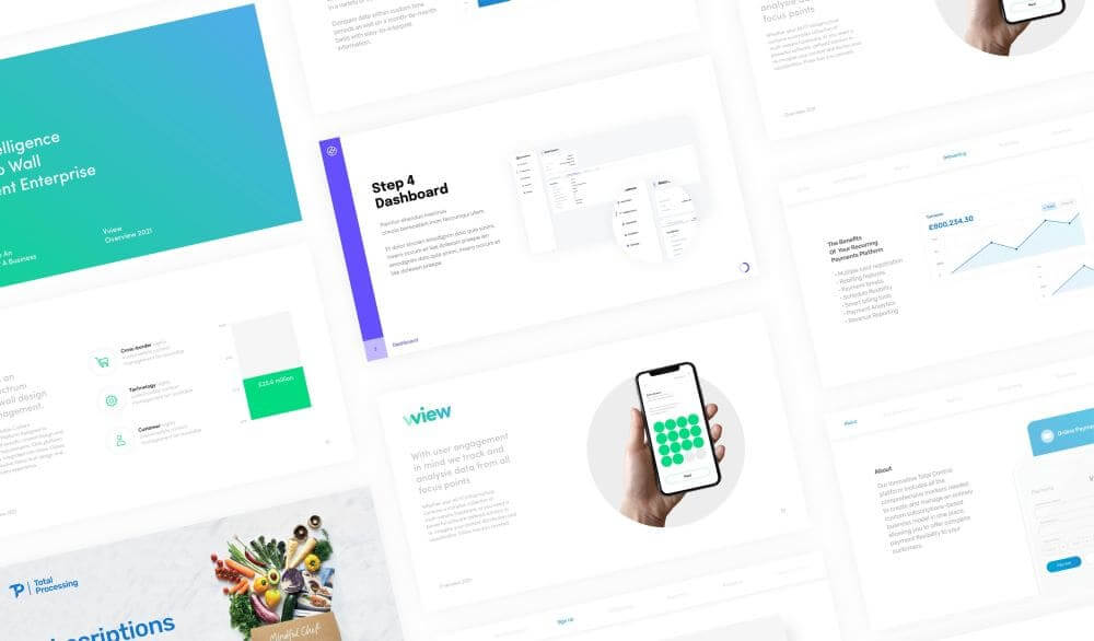
Body Pages Example
Here we have the opportunity to outline the introduction, keep the titles short and snappy and outline each feature page in the document. It’s great to include infographics, different imaginary and different style options to break up the content. We’ll go more into depth on this further in this article.
Contact Page Example
The contact page is like the front cover, the aim is to provide a nice page to bring the presentation to an end and provide the reader with the necessary information to get in touch or find out more.
You can make contact pages generic or personal depending on who you are sending it to, it sometimes works well if the contact page features the person sending the email, to add that personal touch.
People are more likely to reach out and speak to someone if they see a face, it adds life to the document and is an honest display with nothing to hide, building up reliability and trust.
Text Copy
Short, snappy, concise text copy which sums up what you’re saying in one sentence will help the reader. As a rough guide, 100 characters is the ideal amount of text per page.
Depending on the industry, you can be playful with text. If your deck is based around Law and Litigation for example, its best to address the copy in a formal manner, instilling trust, and confidence.
Tone of voice will depend on the brand and what you’re trying to achieve, if you can use a subtle sense of humour, you can grab your audience, but this wouldn’t be appropriate for all businesses.
Style, Images & Infographics
Style
Consistency is key. Images and infographics throughout the pitch deck design will need reflect the style of writing and information to further reinforce the message and idea.
Colours should also be in-line with the brand, shapes can take form from the brand too, further inspiration can be added from typography.
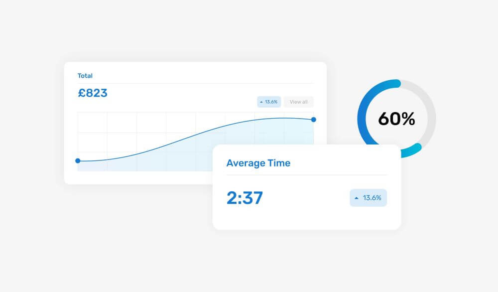
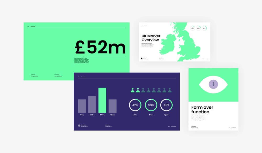
Infographics
Infographics help illustrate complicated messages. When compared to photography, vector graphics can take the life away from the document a little. In return they will give the reader an imitate cognitive understanding of what you’re trying to say.
It’s a trade off from boring the reader with a really in-depth and length explanation in writing. A mix of both lifestyle image shots and infographics is ideal.
Images
Use of images will really brighten up your pitch deck and bring elements to live. Stock images can look cheesy and fake. Taking the time to take real life shots and lifestyle images always pays off.
If you don’t have the resource to take real life shots, abstract images of landscapes, buildings, etc, can really bring life to the design.
Layout
There are a number of tricks that can be used for the page layout. Switching up each page helps keep the document from being boring and lacking in variety. Alternative colours can be used to bring some more life from page to page.
Branding each page is important, so it’s good to create a branded footer section at the bottom of each page, you can also add some interactive elements with sections like page numbers.
This could be a loading bar, or a loading wheel, anything to help people keep track of what page they are on in an interactive way, encourages people to reach the end of the document.
Alignment
Take time to add guidelines and rulers to aid the alignment of the elements within the document. Making sure your titles are solid and consistent and don’t jump around on the page is key to making your message seem grounded and genuine.
If your typography is stable and consistent, then people will also think the same around your business and idea, helping build up reliability and trust.
Links / Buttons
You can also include hyperlinks or buttons to link to any specific website landing pages, this will help make you look modern and adds an element of interactivity to the document.
You should be linking up and websites or emails so that when they are clicked, they open up the relevant email or website page for you to either contact or view.
Software
There is a whole host of various software options for creating pitch decks, Figma and Canva are partly free, PowerPoint is cheap, Adobe is expensive.
Most business owners and people will feel comfortable using PowerPoint because its familiar to them.
PowerPoint is a great piece of software to create pitch documents, however, designers won’t feel comfortable using this as it is made for people outside of the design world. For designers, Adobe InDesign is the best piece of Software for the job of creating pitch decks, a lot of designers prefer to use Illustrator but using Illustrator to create a pitch deck is bad practice.
As a guide for designers, InDesign should be used for designing and layout. Illustrator should be used for illustration and Photoshop should be used for editing photos.
If you stick to these principles when designing, you will be a well-rounded designer who uses the right software for the right job.
Tracking
There are also various online pitch document services which allow you to track page by page what people are clicking on.
Qwilr is a good example, track when the viewer opens it so you can see how many people have viewed it, and if they haven’t opened it or looked at it you can follow up with a call to confirm.
It’s a great way to see what pages people are focusing on and which pages are working. You can A B test various designs and drill down what is and isn’t working with your pitch.
After you have designed your pitch document it may be worth uploading it to software like Qwilr to track and monitor how the audience responds to the design.
Join The Logo Community
We hope this Design Guide for a Knockout Pitch Deck has been helpful. If you would like more personal tips, advice, insights, and access to our community threads and other goodies, join me in our community.
Learn from our Founder Andrew who personally writes our community newsletter. You can also comment directly on posts and have a discussion.
*TIP – Are you looking to Learn Adobe Illustrator CC? Look no further.
This Illustrator CC MasterClass course will set you up with a solid foundation to become a confident Illustrator CC designer. Join over 900 students who have already signed up for this course.
Normally £399 – Now only £20 for a limited time. Don’t wait – Claim Your Seat!

 Author Bio
Joe Britch is the Creative Director and pitch deck designer at FullSphere, Design & Marketing agency.