
In this article we discuss How to Design a CTA Button That Boosts eCommerce Conversions.
When it comes to boosting your eCommerce conversion, one of the most important aspects to consider is the design of your call-to-action button.
A well-designed CTA button can drive website visitors into action. That’s why a good CTA button design can spell the difference between business success and failure.
In this blog post, we’ll discuss strategies for designing an effective CTA button that will help you drive more conversions for your eCommerce business.
Table of Contents
1. Choose the Right Color Scheme
Did you know that the use of color is so important in design that it can account for up to 85% of the consumer’s acceptance or rejection of a product?
The right color scheme in your button’s CTA design can help draw attention and inspire action from your audience, while the wrong color schemes may make them ignore your CTA button altogether. By understanding how colors can be used to evoke certain emotions, you can select the best color scheme for your button’s CTA design.
When choosing a button color for your CTA, consider ensuring there’s white space around it. White space creates a clear contrast between elements on a web page, making it easier for visitors to focus on the CTA and take action.
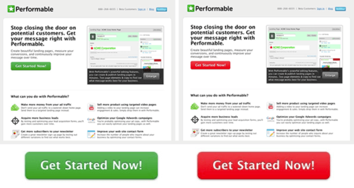
Consider the button color, too. In a research conducted by HubSpot comparing the performance of a red and green CTA button against a white background, it was revealed that 21% more people clicked on the red-colored CTA button than they did the green one.
This may also be because the red CTA button was in sharp contrast to the dominant color of the webpage.
Another factor to consider when choosing the right color scheme for your CTA is the brand identity and the branding guidelines for your business.
Choose colors that match the identity of your company, as this will help create a consistent look and feel across all of your online channels.
2. Use Action-Oriented Text
We know a call-to-action button for your eCommerce website is essential to ensuring customers take the next step in your sales funnel. However, you can only get your visitors to take your desired action if you use action-oriented text.
First of all, you want to make sure you use plain language. Avoid overly complex or technical terms and focus on simple, straightforward words that communicate the desired action.
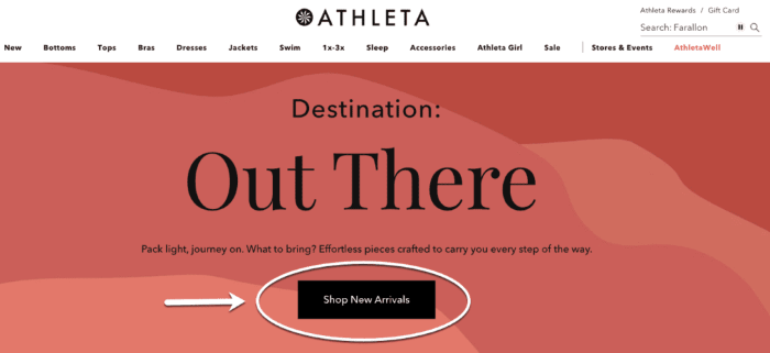
Examples of effective action-oriented phrases include: ‘Sign Up Now’, ‘Buy Now’, ‘Start Here’ or ‘Shop New Arrivals,’ like our example below.
The key is to make the text on your CTA button concise and direct so the user knows exactly what they need to do.
In addition, you want to ensure that your action-oriented text stands out from the rest of your page. We already mentioned that using a button color that contrasts with your background can help.
Another way is to use a button shape that stands out. So, if your page is filled with rectangular elements, don’t use a rectangular button.
The button’s CTA design might end up just blending with the rest of the elements on the page.
Rounded-edge buttons are also preferred because of how they guide the eye. Buttons with rounded edges tell the eye to look at the text inside the button. This is as opposed to buttons with sharp edges, which tell the viewer to look outwards.
3. Create a Sense of Urgency and Scarcity
Creating a sense of urgency in your CTA button is crucial to boosting your eCommerce conversion rates. A CTA button that communicates a sense of urgency will urge customers to take action quickly and click through, instead of procrastinating.
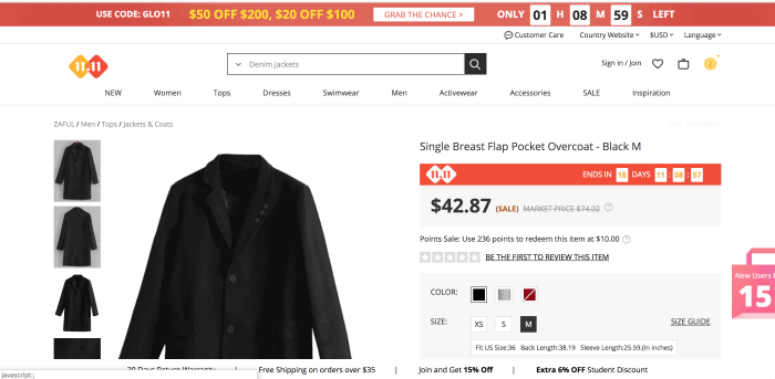
One thing you can do to create urgency is to highlight how much time is left until an offer expires in your CTA button complimentary copy. Use a countdown timer on your page.
Your website visitors will be more likely to push on the Buy button if they see they don’t have much time to avail of the opportunity to save.
You can also incorporate language like ‘Limited Quantity Left!’ into your CTA design to create scarcity. Whether you’re selling cakes for restaurants or online courses, if you communicate how limited or rare the product is at hand, you can push your website visitor to make that purchase.
Use specific numbers like ‘Only 9 Pieces Left!’ or ‘1 Day to Go!’ to create an even greater sense of scarcity.
Just be careful not to go overboard with false alarms; any form of communication should be genuine and authentic so that your potential customer doesn’t think you’re just trying to force them into buying something.
4. Place the CTA Above the Fold
Your CTA should also be in the right place on the page. It wouldn’t matter if your button’s CTA design had the right color and shape. If it’s hidden in your page, how else will your website visitors find it to click on it in the first place?
Placing your call-to-action button above the fold is one way to make your CTA button visible. This is the section of a page that’s visible to the user even without scrolling down. A page above the fold is the first thing website visitors see when they land on a page. Research shows that 80% of web visitors don’t scroll below the fold.
Although you’d think the ideal button position above the fold is the middle, it isn’t really your only option. It doesn’t matter where you put the button above the fold for as long as it’s seen on the page.
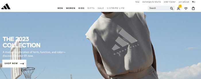
In the example above, for instance, Adidas opted to put its CTA on the left of the page and it still works because its white button color stands out against the blue background.
In Conclusion
Creating an effective CTA design can be the difference between achieving your eCommerce conversion goals and not. The good news is, there are tips you can follow to create an effective CTA button.
A good CTA design should have the right color scheme and should include action-oriented text. Your CTA button complementary text should create scarcity and urgency.
The button should be in the proper placement on the page.
Overall, your CTA design should consider the user experience in mind. If you follow these design tips, you’ll see those eCommerce conversions coming in. Good luck!
Richard Fowler is the Head of Sponge and has been with the business since its inception, working his way up the ranks to Managing Director.
He is responsible for leading and managing the operation of Sponge, from New Product Development, to baking, packing and trade operations – keeping quality and customer satisfaction at the forefront of our values.
Join The Logo Community
We hope this article about How to Design a CTA Button That Boosts eCommerce Conversions has been helpful. If you would like more personal tips, advice, insights, and access to our community threads and other goodies, join me in our community.
You can comment directly on the posts and have a discussion with Andrew, the Founder of The Logo Creative.
*TIP – We recommend Skillshare to learn online. There are tons of classes for everything including graphic design, web design, marketing, branding and business-related courses. Get a free trial with our link and you won’t regret it Trust us!
![]()