In this article we discuss Creative Graphic Design Tips for Your Brand.
No matter what you design for your brand—from simple images for blog posts to advertisements to simple Instagram posts —, maintaining an aesthetically pleasing and effective design can be quite tricky in this saturated digital marketing space.
Graphic design is now much more than simply creating beautiful content, but it’s also about storytelling and strategically communicating your message. A graphic designer should be able to tell the brand’s story and message with colors, fonts, layouts, and other graphic elements. And this is just to name a few things graphic designers should know.
On the one hand, each piece of design should be unique. On the other hand, you should be consistent with your brand identity and message, so as you can see, graphic design is much more than meets the eye.
Here, we will share six important tips in implementing effective, performance-focused graphic design for your brand, starting with the first one.
Table of Contents
1. Be Distinct and Purpose-Driven
The most important thing in executing any design project for your brand—whether it’s developing a brand identity or a simple social media post—, is to have a purpose or objective. Your design shouldn’t only be about creating something beautiful and aesthetically pleasing, but you have to figure out what it is you are trying to do with the design.
We can start by considering a few key factors:
- The purpose or objective of the design
- Who your target audience is
- Which platforms do they use
- What kind of reputation do you want to form?
- What is the unique value of your brand/product/service that can be emphasized?
Another important aspect of your design is to be unique. While it’s perfectly okay to research your competitors and other brands in their graphic design approaches, never copy their design. Being distinct and unique is very important here.
Study your ideal audience carefully, understand their preferences, needs, and habits. Your job is to create something unique that can meet your brand’s objective while catering to your audience’s preferences.
It’s better to focus on just one or two purposes with each graphic design. Although objectives are important, focusing on too many things at once can cause a busy design that might confuse your audience instead.
2. Effective Typography
Typography is an art of its own and can be a very deep subject. However, typography can make or break any design: no matter how good your graphics are, if you are using cheap-looking fonts that don’t match with your overall design, it will look bad.
On the other hand, using fonts wisely can enhance an otherwise mediocre design. So, it is very important to pay extra attention to your design’s typography.
Typography refers to the font (type) you use in your design, and your font should:
- Reflect your brand’s personality
- Fits the design’s purpose (i.e. don’t use playful fonts for serious messages)
In general, don’t use too many different fonts in a design. Even in designing a brand identity, you only need a maximum of three different fonts, in most cases. Fonts can project your design’s overall moods can be more powerful than the copywriting itself.
In general, there are four different categories or types of fonts:
- Serif: characterized by the ‘serif’, which is the little feet or anchors at the end of each letter. Considered a classic or traditional group of fonts (for example, Times New Roman), good for ‘serious’ and traditional design, but can look obsolete if you are not careful.
- Sans serif: fonts without (sans) the serif or the foot, like Helvetica. They have a more modern look with smooth edges and can provide a more sleek, minimalistic mood to your design
- Script: these fonts look like cursive handwritten letters, and these fonts (like Alura) can provide more playfulness and feminine feel to your brand. Also great for promoting luxury brands or to provide a luxurious feel overall.
Display/miscellaneous: each display font has a unique design to it like unusual letter shapes to outlines or even specially-designed elements.
Choose the right font(s) based on the overall feel of your design, and don’t forget the objective/purpose of your design.
If you are using more than one font (but again, limit your design to a maximum of 3 fonts), pair fonts that contrast each other, so you can get the right balance.
A common practice is to combine a serif font with a sans serif font. Remember that there are two things you’d need to consider: readability and aesthetic.
3. Copywriting and Text Elements
Now that we’ve discussed typography and how it can enhance your design, let us discuss the copywriting/text formed by these fonts.
Depending on the purpose of your design, the general objective of using text on our design is to deliver our message quickly and effectively.
Make sure your text is easy to read, and the general principle is to use as little text as possible. If your message can be conveyed with just one or two lines of texts, then don’t overcrowd your design with unnecessary blocks of text.
Another effective practice is to use the texts to create a sense of order in the overall design. For example, you can use the text as a separator for different elements/colors of your image design.
There are two main factors determining the readability of your text: font size and its color in conjunction with the background.
Use light-colored fonts with dark backgrounds, and vice versa to create contrasts that will help with readability and also in attracting the audience’s eyes.
4. Color Utilization
How you use and combine different colors is one of the most important aspects of any design. Colors can help set the overall mood of your design and can also help you in effectively communicating your message.
While color theory in design is a pretty broad subject on its own, choosing a great color palette or color scheme is one of the most important steps in starting a great design.
Fortunately, now we have many free and affordable tools to help us in choosing our color palettes, Adobe Color, for example, is a good place to start.
You can start choosing a color scheme for your design by:
- Consider what color represents your brand identity (which will be easier if you already have a brand guideline)
- The color scheme that suits your product or service
- Consider the colors used by your competitors
While there’s no one-size-fits-all approach in building your color scheme, use a color wheel and choose between the following ‘templates’:
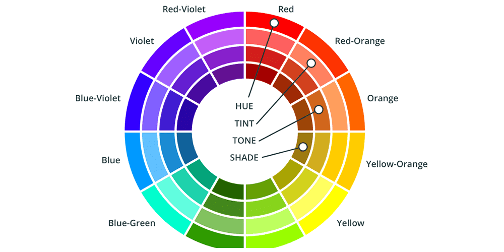
- Monochrome: use one color in many shades in your color scheme. This is useful if you have one message or trait you want to emphasize. However, using monochromatic shades can backfire since they can easily bore your audience if you are not careful
- Analogous: utilizing two or three colors next to each other on the color wheel. These colors usually have similar moods or psychological connotations, so they tend to be ‘safe’. However, this approach is not the best if you want to quickly draw attention
- Complementary: colors directly across the color wheel complement each other when paired. This is great in creating contrasts, as we will discuss below and great for creating high-energy visuals.
- Triadic: using colors forming a triangle on the color wheel (i.e. red, yellow, blue or green, orange, purple). They tend to be harmonious like analogous schemes but are more dynamic, so they tend to stand between analogous and complementary schemes. Using triadic colors are great in various graphic design implementations, but it can be hard to incorporate all three colors in a logo or brand identity.
Also, another very important factor is how we can combine different colors to create contrasts, which can be very useful in attracting our audience’s attention.
The idea behind this is quite simple: our eyes notice something that stands out, and this is why we can easily notice the blue “IKEA” logo over the yellow background.
To effectively contrast your colors, it’s very important to choose your ‘neutral’ color effectively. The neutral color will most likely be your background and is intentionally chosen to avoid attention.
Depending on your color palette, this color should be the ‘weakest’ one in your scheme. Then, simply choose an appropriate accent color to contrast this neutral color, and voila.
5. Less is More
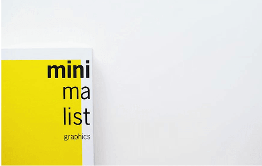
It’s no secret that the minimalistic design approach is the trend nowadays. And, even if minimalism is not your main design approach, you can always use the minimalist design principles to effectively communicate your message.
It’s very important that minimalism is not about the lack of design elements or laziness. Instead, it is about focus and purpose: only using elements that matter. Every design element must have an actual purpose of being there.
In general here are some important minimalist design principles you should consider:
Blank space
Using blank spaces is also useful in creating contrasts. Leaving empty, neutral-colored or even white space can be effective in highlighting a copy.
Be creative
While white is a good background to utilize blank space and minimalism in general, it doesn’t mean you can’t mix and match other colors. You can use various colors to create contrasts and to emphasize areas of importance.
Use your copy wisely, and choose the right fonts to effectively attract your audience’s attention. Typography is a very important part of a minimalist design, so be very careful in choosing your fonts.
Balance
The toughest part of using a minimalist design approach is finding the right balance. For every ‘heavier’ design elements, you’ll need to use lighter elements or even blank spaces to create balance.
A common mistake in a minimalistic design approach is to use too many texts (with the idea of pursuing blank spaces), but it can be counterproductive with dominating spaces.
It’s very important to always aim for a balance between all the incorporated design elements.
6. Aim for Consistency
In this day and age, it’s very important to have a consistent brand message and brand identity throughout your designs. Your published designs whether it’s an advertisement, a logo, or even a simple social media post, should all look and feel connected to each other.
If your design is inconsistent and feels ‘random’, then you might confuse your audience and you might miss the mark in communicating your brand message.
Again, having a clear purpose/objective in your branding and design approach will significantly help in giving your designs a consistent look and feel.
While posting the same design all over again can be boring and/or challenging, it’s very important to treat this as a long-term investment in building brand equity.
It is, however, very important to remember that consistency is not about using the same elements over and over again.
It’s a very common mistake for many designers to make their elements uniform so they look the same way. Consistency in graphic design is about using different elements, fonts, and even color schemes while maintaining the same feel.
To be effective in maintaining consistency, you might want to develop templates you can use for repetitive design items like promotions, announcements, sale offers, and so on depending on your brand’s needs.
While it can be easier said than done to maintain both uniqueness and consistency at the same time, this is undoubtedly the secret to design success if you want your audience to associate your style with your brand.
Also, don’t forget to maintain consistency on different platforms (i.e. when you are posting your content on Instagram and YouTube, they should have a consistent look).
End Words
Don’t be afraid to test every element of your design and don’t be afraid to experiment. While it can be easy to get lost with so many options from graphics, colors, and fonts to choose from, it’s typically better to keep things simple and reduce clutter as much as you can.
Make sure each design element is effective and useful in communicating your message. Always remember the purpose and objective of every design, and evaluate each design’s performance.
Join The Logo Community
We hope this article about Creative Graphic Design Tips for Your Brand has been helpful. If you would like more personal tips, advice, insights, and access to our community threads and other goodies join me in our community. You can comment directly on posts and have a discussion.
*TIP – We use and recommend DesignCuts for all your fonts, mockups and design bundles.

 Author Bio
Mike Khorev is an SEO consultant who helps SaaS, software, IT, technology, B2B and startup companies generate more sales and grow revenue online. He offers expert advice on marketing your company the right way through performance-based SEO, inbound marketing, conversion rate optimization, search engine marketing and many other online practices