Skip to content
Home
Menu Menu
  • Home
  • About
    • The Logo Creative
    • Logo Design
    • Our Process
    • What’s Included
    • Testimonials
    • FAQ
    • Terms of Service
  • Contact Us
    • General Enquiry
    • Hire Me
  • Case Studies
    • Logo Portfolio
  • Blog
  • Community
    • Contribute & Advertise
    • Mindful Creative Insights
    • Logo Design Resources
    • Shop
    • Designer Interview
    • Designer Spotlight
    • Book Review: Logo Design
    • Freelance & Marketing
    • Brand Spotlight
    • Famous Logos
    • Instagram
The Most Iconic Logos of The 20th Century

The Most Iconic Logos of The 20th Century

  • 16/03/202130/03/2021
  • by The Logo Creative
  • The phrase “a picture is worth a thousand words” is thought to go back to the 20th century and was coined by Frederick R. Barnard, who wrote a piece “commending the effectiveness of graphics in advertising” In this article, we share some of The Most Iconic Logos of The 20th Century.

    In today’s world of technology and smartphones, it is more important than ever to ensure a company’s main feature piece – their logo design or icon stands out among the crowd and is transferable into the digital world of smartphones, tablets and desktops.

    Below is a list (in no particular order of some of the world’s most iconic logo designs of the 20th Century. These logos are ones that have evolved throughout time whilst maintaining their instantly recognisable style and uniqueness.

    Table of Contents

    • Apple
    • Coca-Cola
    • Warner Brothers 
    • Mcdonalds
    • Good Year
    • Instagram
    • Kodak
    • Disney
    • FedEx
    • Visa
    • Nike
    • Google
    • Shell
    • Amazon
    • UPS
    • Mastercard
    • Michelin
    • Mobil
    • Fisher-Price
    • Lego
    • Starbucks
    • Adidas 
    • Microsoft 
    • IBM
    • Burger King
    • Baskin Robbins
    • Join The Logo Community

    Apple

    Apple - The Most Iconic Logos of The 20th Century

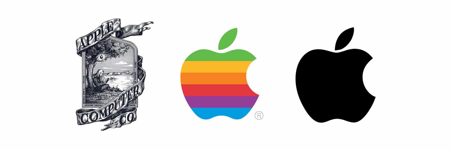
    Quite obviously the apple logo has to be one of the most iconic symbols of the modern era. Originally a picture of Isaac Newton sitting under a tree, the logo has developed and evolved into a symbol that resonates with practically anyone who uses a computer.

    It is clean, crisp and uncomplicated and is ironically a fruit which would seem to have nothing to do with technology. However, this logo is instantly recognisable.

    When we speak to people, we can instantly tell them the type of person they are by asking “do you use a PC or a Mac”

    Although it was originally Steve Jobs who came up with the name Apple and the original idea it was a chap called Rob Janoff who was a known specialist in corporate identity and branding who was brought in to give the icon a more corporate feel.

    Coca-Cola

    Coca-Cola Logo Design

    The Coca-Cola logo was created by Frank Mason Robinson, John Pemberton’s bookkeeper, in the Spencerian script typeface, which was the principal style of formal handwriting at the time.

    In 1890, the company re-designed the logo to be more complex, featuring swirls and what appear to be cherries hanging from the “Cs” of “Coca-Cola”. Of course, the logo did not stick, and we still see Frank Mason Robinson’s design on every Coca-Cola product for what has become one of the world’s most recognizable brands.

    Warner Brothers 

    The Warner Brothers Logo - The Most Iconic Logos of The 20th CenturyThis particular logo hails all the way back to at least 1927 where it can be seen at the beginning of a film called “The Jazz Singer”.

    There have been 13 main logos and over 200 variations of the Warner Brothers logo however the Giant W and B and Shield in the clouds has always remained consistent.

    The above logo is actually logo 11 and can be seen at the beginning of some of the batman movies. The Warner Brothers logo is absolutely timeless.

    Interestingly, it is reported that if you are involved in the production of a Warner Brothers film you can choose which logo you would like to utilise. Ben Affleck chose Saul Bass’s version number 10 for his film Argo.

    Mcdonalds

    Mcdonalds - The Most Iconic Logos of The 20th Century

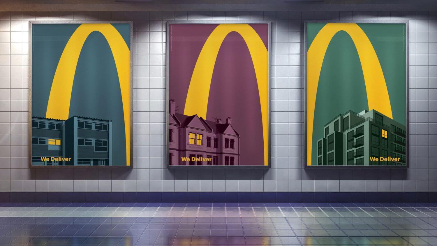
    Who can resist the golden arches? Instantly recognizable when speeding along the motorway on a road trip, the Mcdonalds logo is bright, and evokes a feeling of warmth and comfort.

    Although the brand portfolio has changed over the years the logo itself has always remained the same which is a testament to the clever design.

    Mcdonalds was one of the first logos which used a flat icon which we see trending in modern design – other logos using the same format are instagram and pizza hut.

    Jim Schneider was hired back in 1962 to make a logo again with a more corporate feel.

    Take a look at the most recent Mcdonalds marketing campaign recently seen in the uk which has maximised perfectly with the countries latest lockdowns! – great job Mcdonalds

    Good Year

    Good Year Logo Design

    In 1900, the Wingfoot symbol for the Goodyear company was chosen after the founder, Frank Seiberling, was inspired by a statue of the Greek god, Hermes.

    The idea of speed had a lot to do with Goodyear’s selection of the symbol, as well as the embodiment of many of the characteristics that Goodwill would be known for.

    The logo remains the same throughout the years, with the occasional color or font change.

    Instagram

    instagram gradient logo design


    Instantly recognisable and on the first page of billions of smartphones around the world, the Instagram logo has to be on the list of one of the all time favourite logos.

    The original polaroid has been transformed into a bright neon icon. It is said that the idea behind the retro polaroid camera was to bring back memories and nostalgia of childhood and times past.

    Kodak

    Kodak Logo Design

    The Kodak logo introduced in 1907 claims to be the first integration of a company’s name and look into a symbol.

    In 1935, Kodak unveiled a logo that features its now iconic red and yellow color scheme and a logotype of the brand name that went on to be used by the company until an image reinvention in 1987.

    In 1960, Kodak introduced the Corner Curl design, which was followed by the introduction of the Box K design in 1971.

    The 1971 design unveiled the now iconic “K” cut out from a rounded red square, with the brand name also cut out in yellow. With only a logotype update in 1987, the 1971 design essentially remained in use until 2006, when the company eliminated the square altogether, leaving a rounded logotype of red on a white background.

    Come 2016 and the “K” icon is back now with the brand name “Kodak” stacked down the right side within the “K” icon. Good move in my opinion!

    Disney

    Walt disney logo - The Most Iconic Logos of The 20th Century

    Family favourite – The Disney logo has to be one of the oldest and longest running Logos of all time and the signature of the Great Walt himself is still ongoing to this day.

    The Logo has changed and evolved over the years, however Walt’s signature remains.

    Again, the logo is not only recognisable but similar to some of the others on the list. It evokes a feeling of warmth and childhood memories. The castle in the background is said to be a silhouette of the famous Bavarian castle Neuschwanstein castle.

    FedEx

    Fedex Branding - Designer Interview With Rebecca Heinemann

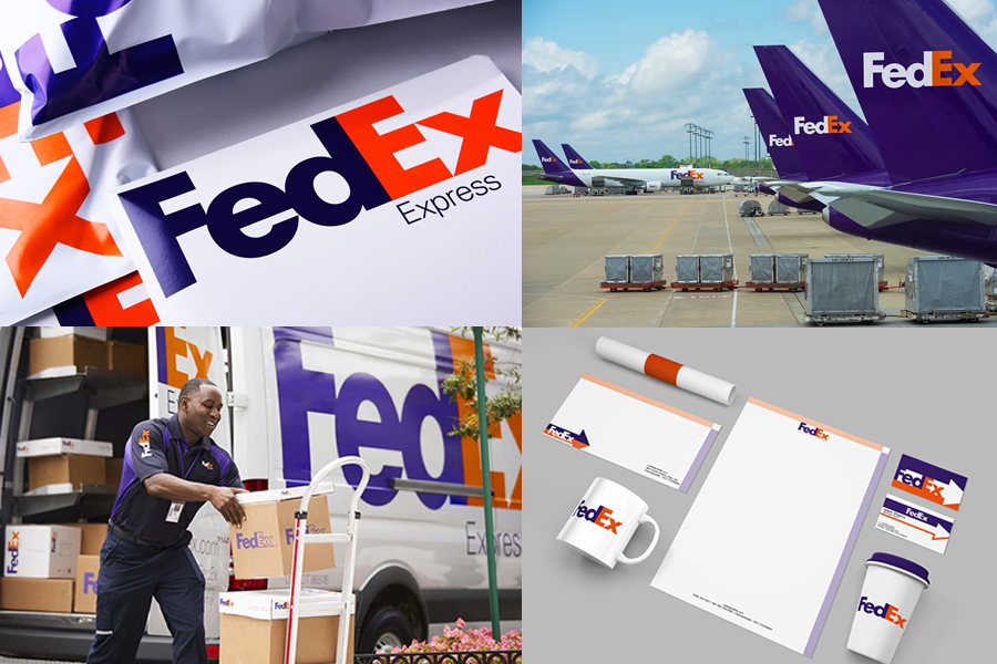
    Can you see it? The tiny little arrow in the middle of the E and the X?

    This clever addition to the new logo is meant to represent forward direction, speed and precision. The clever use of the negative space is why FedEx is on the list of iconic logo designs.

    This logo was created in 1994 by Lindon Leader a designer who famously liked to make use of “the white space”

    Visa

    11 Places To Use Your Business Logo

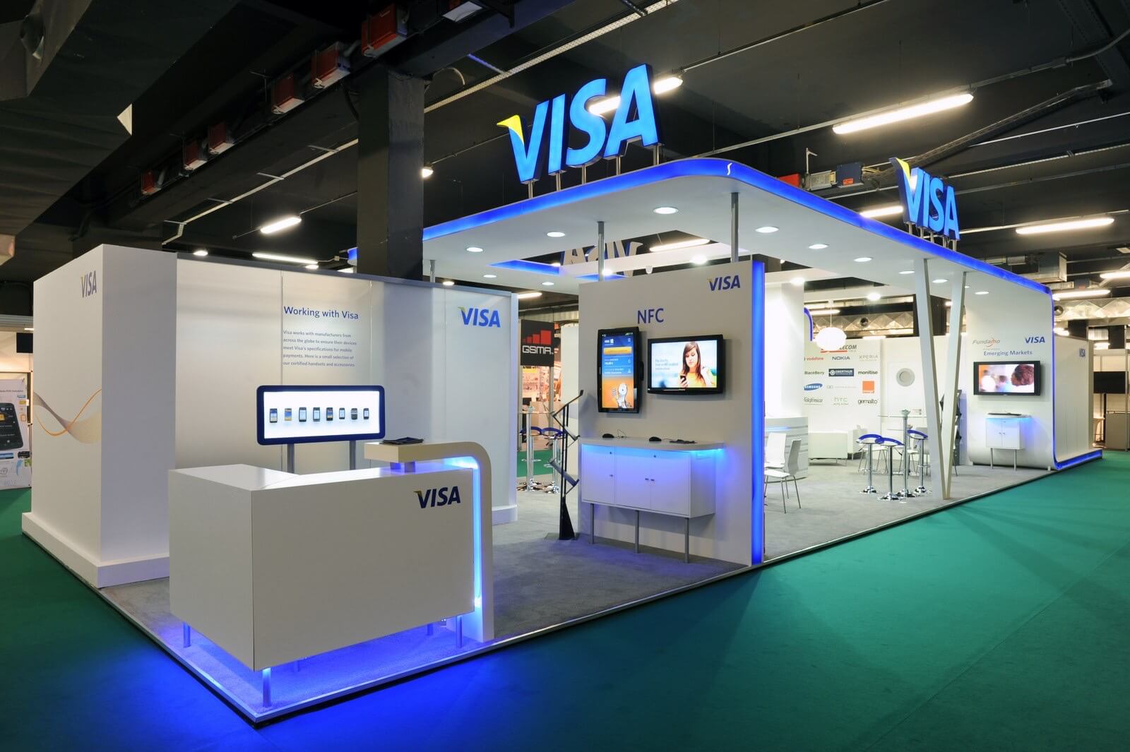
    Visa’s first logo appeared in the same year the company was founded, with the word VISA typed in the middle of two lines (blue on the top and a corn yellow on the bottom).

    The original design lasted until 1982 when the company chose a more visible and recognizable typeface and color scheme, with the “Visa” in the same blue and a small check of yellow on the left side of the “V.”

    The new logo was phased into the company in 2006, and by 2011, all of the company’s cards, marketing, promo materials, and other services carried this new logo.

    in 2014 the company introduced a new wordmark, dropping a small check of yellow on the left of the wordmark with a dark blue gradient

    Nike

    nike - slogan - tagline - just do it_1-min

    Of course we simply cannot pass by the famous nike tick or swoosh as it’s also known! This famous logo was designed by a lady called Carolyn Davidson, a young lady who was trying to make her way in the design world.

    The reason this logo works is because it is a modern creation of the greek goddess and her outstretched wings! This logo is one of the most simple, clean and unique logos we have seen in this era.

    Google

    Let me write you a new logo

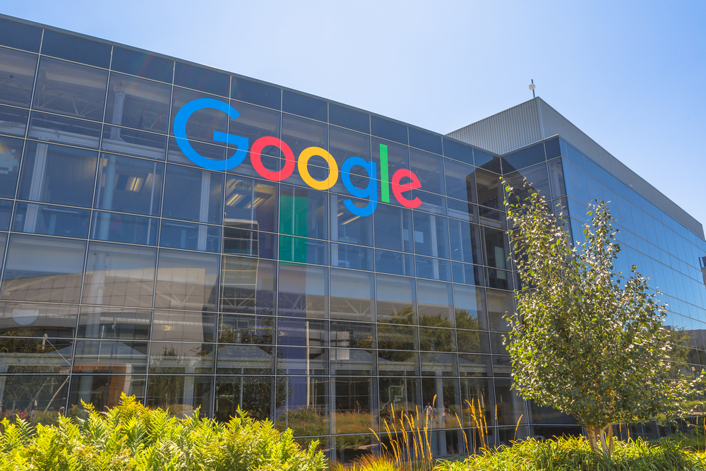
    A logo that most of us use every day, the Google logo is timeless. It’s bright and fun and synonymous with the world wide web.

    In 2015 Google implemented its “biggest update in 16 years” it was also the first time google became animated. Ruth Kedar is behind the Logo above, she was approached in 199a by the two founders who asked her to create a new version of the logo.

    In conclusion, there are billions of logos worldwide, however it takes a special few to really stand the test of time and manage to evolve throughout time while remaining consistent.

    Shell

    Famous Logos – Shell

    The logo for Shell has always, in fact, been a shell, becoming less and less realistic with each redesign.

    In 1900, the design was simply a black and white image of a shell, which lasted until 1948, when the red and yellow colors were added.

    The design hasn’t changed much from the original colour logo, the only thing this the wording “Shell” that has now been removed and was featured within the shell icon and beneath it.

    We have all come to recognise the Shell logo so the name is no longer needed much like Mastercard.

    The shell logo is definitely iconic and much like Nike, Apple, and McDonald’s I don’t think it will ever change and it shouldn’t.

    Amazon

    amazon - 10 Examples of Powerful Global Branding

    Amazon was founded by Jeffrey Preston Bezos (01/12/1964) in 1995 with the help of his parents who invested around $250,000 in the new business venture. Amazon as a company is said to be worth more than $1.7 trillion. With founder Bezos 11% share in the business, he’s become the first person in history to be worth over $200 billion.

    Amazon has become more than just a online store, it’s become a driving force behind many new technologies, including developing drones to deliver their packages and introducing the company’s voice-activated personal assistant, Amazon Alexa.

    The Amazon logo went through a few versions from its original version back in 1995 which was the black and white letter “A” with the Amazon river flowing through that lasted until 1997 when the slight change to include what looks like a water gradient within the letter “A” but this was short lived only lasting 12 months.

    In 1998 which saw a few logo design changes, Amazon switched it up by dropping the “A” and going with a wordmark style logo of “Amazon.com” with the slogan “Earth’s Biggest Bookstore.” and then introducing the yellow colour with a clearer all caps version featuring the yellow “O” circle.

    During the same year, the logo we have all come to recognise started to take some form, keeping the word mark “amazon.com” with a different font and a curved yellow line underneath, this version of the logo stayed until 2000.

    Amazon hired Turner Duckworth, who designed the logo that is present today, and they dropped the “.com” and added a yellow arrow smile underneath pointing from “A”to “Z”.  Genius!

    UPS

    11 Places To Use Your Business Logo

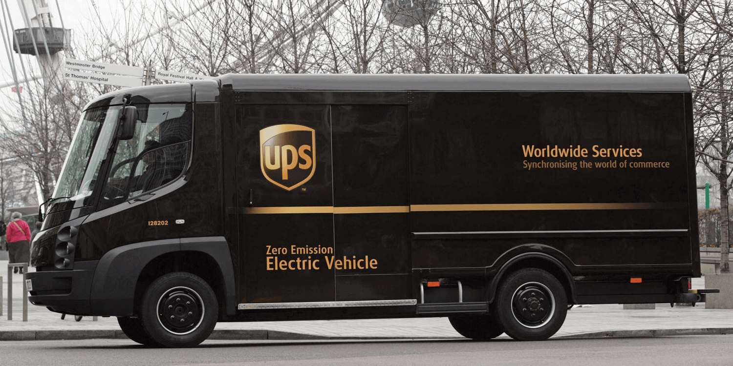
    Consumers nationwide eagerly waited for the arrival of the brown UPS vans with the shielded Logo on the side. The United Parcel Service delivers packages all over the world and is one of the most established and recognised delivery services today.

    In addition to their excellent parcel delivery service, their famous logo designed by the legend Paul Rand stands as a role model in iconic logo design.

    The UPS logo has evolved a great deal from 1916 to today. But can you spot one element that has remained the same?

    The UPS logo has always featured a shield. And in the years since, businesses desiring to instill trust, reliability, and security often choose shield-based logos as well.

    Mastercard

    Mastercard Logo Design

    Mastercard was created in 1966, when the very first MasterCard logo featured a logotype of “We Honor Master Charge: The Interbank Card” layered over two overlapping circles, one bright orange and the other a burnt orange.

    In the year 1979, Master Charge: the Interbank Card was renamed MasterCard, and the change was accompanied by a new logo for the company that featured brighter colors and a bolder logotype. During 1996, the logo was redesigned into the now iconic logo design, which features a 3D logotype. The overlapping circles are depicted through stripes of each color rather than a third orange color.

    Michelin

    Michelin Logo Design

    The logo design for the Michelin company has always been the Michelin tire man, who’s shape, level of intensity, and size originated from the company’s early days.

    As obvious as it sounds, the Michelin tire man was inspired by a pile of tires that Édouard Michelin imagined to be a man when they were attending the Lyon Universal Exhibition. In 1989, the Michelin man was created by O’Galop.

    Mobil

    Mobil Logo Design

    The Mobil Oil company began in 1911 but also has roots in several oil companies that preceded it, such as Aladdin Standard Oil Co. and Gargoyle, a Mobil product line of lubricants for industrial refrigeration systems.

    In 1911, the pegasus was introduced with the founding of the company and has been modified slightly over time, until 1964, when Chermayeff & Geismar simplified the logo to only include the company name with the signature red “O.”

    Fisher-Price

    Fisher-Price Logo

    Who doesn’t remember the Fisher-Price logo as a kid? I know i certainly do!

    The toy company was founded in 1930 following a successful reception to their products at the American International Toy Fair in 1931.

    The first logo, which had text within an orange box with the company’s location, was used until 1955. In 1956, The FP was added (Fisher Price Toys shortened to Fisher Price), and the FP lasted until 1984, when the full name was brought back inside of a red banner.

    Pentagram is currently responsible for the latest redesign of the logo which has not changed much, which is a good thing, and is now simpler having 3 dips on the red banner, the “F” flows into the dot of the “I” and a lower case “P”.

    Lego

    Lego Logo Design

    Another logo that brings back childhood memories, with so many of us being Lego fans as kids, as a kid i dedicated the entire floor space of the spare room to my Lego city.

    Logo was introduced in 1932 with a simple black and white logotype of the word “LEGO.” In 1946, the company paid homage to its hometown of Billund, Denmark, which also employed a simple logotype.

    In 1936, LEGO added colour to the logo design, representing the company’s name and looking almost like one of their boxed toys. In 1950, LEGO turned to a simpler logo, which integrated the company’s name within a circle and featured “Billund Danmark” in an outer ring.

    Three years later, in 1953, LEGO unveiled the white bubble lettered logo which has become iconic of the brand and remained in use by the company since 1953.

    In 1959, the word “System” was added below the brand name in yellow logotype, while “LEGO” received a bolder black outline to draw attention.

    In 1973, “System” was dropped and “LEGO” got a yellow border outside the black outline. The current LEGO logo has been in use since 1998, and is an image bringing happiness to millions of children worldwide.

    Starbucks

    Starbucks - 10 Examples of Powerful Global Branding

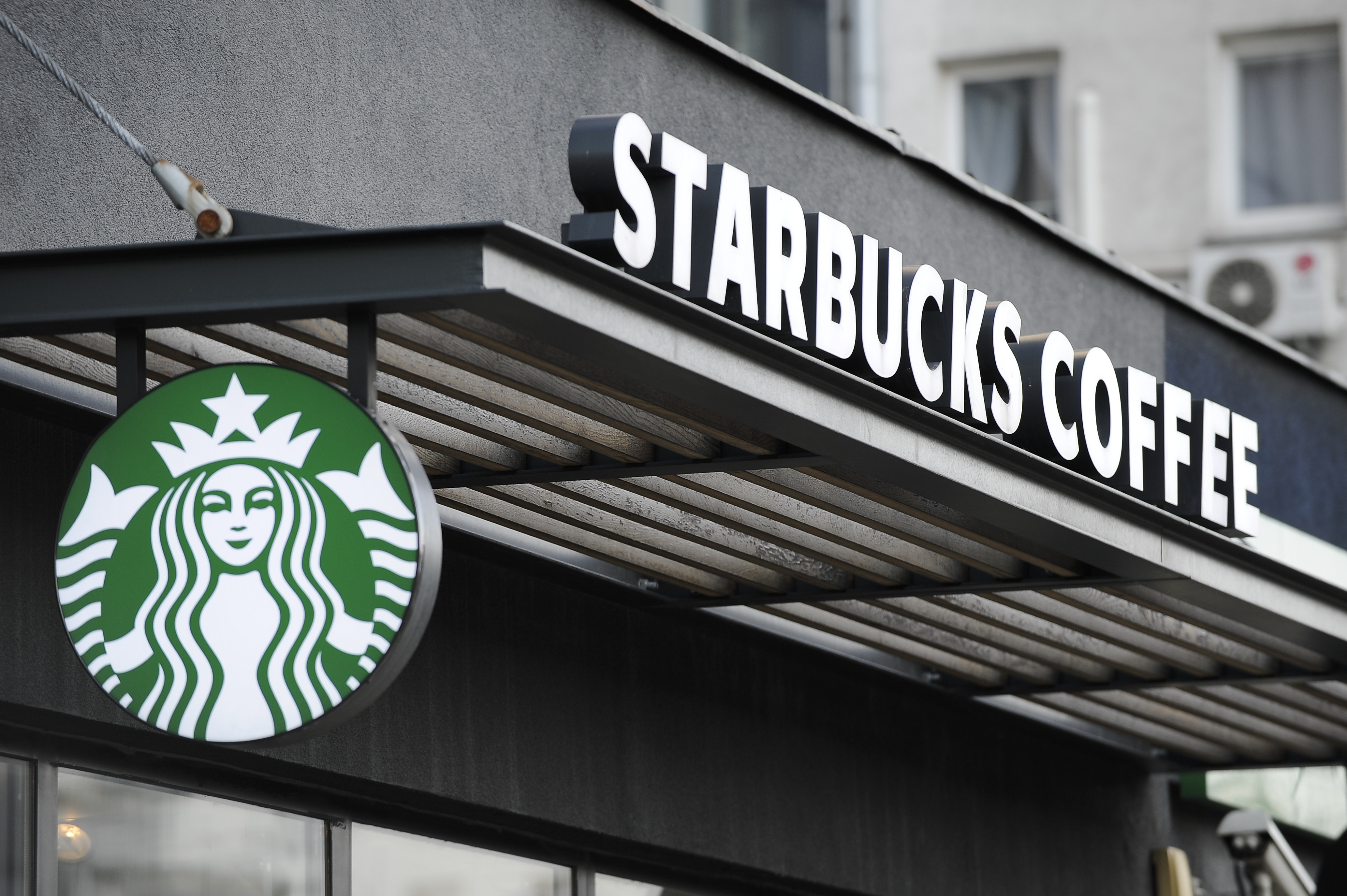
    During 1971, while in search of inspiration for a logo design, the founders of Starbucks came across a Norse 16th century woodcut which featured the now famous two-tailed mermaid or siren.

    Designer Terry Heckler was recruited to design the logo for what was then “Starbucks Coffee, Tea, and Spices,” which incorporated the bare-chested siren with an intricate crown and tail.

    Heckler was invited back to update and censor the design in 1987, at the time of the II Giornale and Starbucks merger. In 1992, Heckler returned to revise the logo into the now iconic and further censored version, which features a demure and smiling mermaid with a simple crown and tail.

    Drawing on Heckler’s 1992 design, the latest revision occurred in 2011. The design team removed the outer circle of the logo, keeping only the mermaid illustration, while changing the black to the trademark Starbucks green.

    The bold move to rely only on the siren’s image reflects the iconic status of the brand, achieved through 40 years of foundation work.

    Adidas 

    Adidas Logo

    The adidas logo was designed and created by founder, Adi Dassler, who first used the three stripes on adidas footwear, making the company instantly recognizable.

    The stripes have not changed over the years; they’ve only changed in form. In the ’60s, Käthe and Adi Dassler created the Trefoil logo as an additional mark of the adidas brand, to be used on apparel.

    It later became the company’s corporate symbol. In 1997, Adidas introduced the slanted three bars as an integrated corporate design, and it was made to look like the shape of a mountain to symbolize challenges to be faced and goals to be achieved.

    Microsoft 

    Microsoft logo design

    Microsoft first introduced a logo design in 1975, and it remained in use until 1979. The 1975 logo was designed following contemporary trends and is a logotype which has been described as “groovy.”

    In 1980, Microsoft stepped away from the more complex logo to become an angular, sleek logotype that read “Microsoft” and which placed the entire word on a straight line.

    1982 saw the rise of the “blibbet,” Microsoft’s logo which featured an intricate “O,” a feature that would gain a cult following and one that was mourned when it retired in 1987.

    The iconic Microsoft logo came to replace the blibbet in 1987. The simple “Pacman Logo” of 1987 was designed by Scott Baker with one defining slash between the “o” and “s” that is supposed to symbolize speed.

    Microsoft conquered the technology industry in the 1990s and early 2000s, allowing the simple, not very distinctive, logotype to achieve iconic status.

    In 2012 Microsoft changed their logo design to the current logo which can be seen above, I believe the icon represents a window to represent their operating system “Windows” and the playful colours representing the office suite of software.

    IBM

    IBM logo design

    The IBM logo was first introduced in 1924 when the Computing-Tabulating-Recording Company was renamed as International Business Machines.

    The renaming of CTR to IBM was the company’s attempt to modernize; following this, the IBM logo introduced in 1924 was an updated version of the 1911 CTR logo used by the company.

    The intricate, entwined design of CTR was replaced by bold lettering of “International Business Machines,” configured to mimic a globe, emphasizing the “International” in IBM. In 1947, with the modernization of the company’s technology, the globe logo was replaced with a simplistic “IBM,” which remains the symbol of the company.

    In 1956, Paul Rand transformed the outlined logo into a solid black “IBM” to impress stability and balance. In 1972, Rand returned to update the image of the company from solidity and stability to “speed and dynamism” (that was supposed to be implied by the striped logo).

    Burger King

    Burger King Rebrand - Logo Design & Packaging

    Definatly my favorite rebrand this year, I was hoping for years that they would brand back this version of the logo design and they finally did!

    As the second largest hamburger fast food chain in the world, the Burger King logo has developed a recognisability second only to that of the McDonald’s “Golden Arch.”

    Starting with a simple logotype of “Burger King” in 1954, the company introduced the complex logo of the Burger King character sitting atop a burger the following year.

    The character of the King remains in use in the brand’s advertising for years, though the logo faced a monumental evolution in 1969 with the introduction of the “Bun Halves” design.

    Now instantly recongnisable, the Bun Halves design of 1969 remains a key element in the Burger King brand image.

    When the king was dropped from the logo in 1969, the first version of the “Bun Halves” was introduced, and slighly revamped in 1994 used until 1999.

    In 1999 the “Bun Halves” logo of 1998 incorporated an encompassing blue ring and added dimensionality to the one used until 2000.

    Burger King Rebrand - Logo Design

    In 2021 Burger King brought  back a cleaner version of the 1994 “Bun Halves” Logo,  which was a great move!

    Baskin Robbins

    Baskin Robbins - Logo Design

    Although not as famous as some of the others on the list, we couldn’t pass this logo by. Similar to the previous logos on the list, it has a hidden meaning inside the logo .

    If you take a look a little closer it denotes the number 31 which is exactly the amount of ice cream flavour Baskin Robbins has – genius!

    Join The Logo Community

    We hope you enjoyed this article about The Most Iconic Logos of The 20th Century. If you would like more personal tips, advice, insights, and access to our community threads and other goodies, join me in our community.

    Learn from our Founder Andrew who personally writes our community newsletter. You can also comment directly on posts and have a discussion.

    *TIP – Are you looking to Learn Adobe Illustrator CC? Look no further.

    This Illustrator CC MasterClass course will set you up with a solid foundation to become a confident Illustrator CC designer. Join over 900 students who have already signed up for this course.

    Normally £399 – Now only £20 for a limited time. Don’t wait – Claim Your Seat!

    Learn Adobe Illustrator CC Masterclass - Online Learning - Learn Graphic Design Online


    Author Bio
    Lara Blake is a Marketing Coordinator for Media Shark based on the Gold Coast of Australia, App development and digital exposure is Media Sharks speciality.

    Posted in Logo Design, Logo Design History
    20th centuryBrandBrandingDesignfamousiconicidentitiesidentityLogoLogo DesignLogos

    Post navigation

    How to Protect Your Information Online
    BrandFix by Kady Sandel

    cropped-The-logo-creative_logo-design_Brand_Identity_Yorkshire_UK-1

    Award-Winning Studio & Graphic Design Blog Creating Daily Content For The Design Community.

    Categories


    Interactive Email With Insights

    Weekly Blog Digest

    Branding Design Blogs


    The Logo Creative Amazon Influencer Store_2

    SkillShare - Online Learning, Learn new creative design skills.

    Designcuts - Graphic Design Font, Fonts, Mockups and design bundles

    eRESONAID - The Brand Strategy Framework - Online Course by Fabien Geyrhalter.

    brand-style-guide-template

    The Logo Package Express - Create, export, and sort hundreds of logo files in under 5 minutes!

    High-Profile Logo Awards Competition - Logo Wave Awards

    The Ultimate Guide to Logo Design eBook

    Latest Logo Design News

    My Tweets

    thelogocreative

    thelogocreative
    Check out the latest Designer Interview with Micha Check out the latest Designer Interview with Michael Cherkashin and award-winning graphic designer and creative director @hugagency

It was a great pleasure to feature Michael who shares some valuable insights into logo design  and live as a graphic designer and creative director.

The interview is also featured on today's newsletter, including the book by @made.by.james
what I have been up to, and more insights. 

Join me, let's chat! 👋

tiny.cc/thelogocreative 
_________________________________

#logodesigner #creativecommunity #positivevibes #logodesigner #logodesigns #logoprofesional #logo #logoinspirations #designer #designthinking #creativeideas #creativeidea #thoughtoftheday #creativemind #creativemindset #logoideas #logoidentity #identitydesigner #creativeproject #creativethoughts #logotips #logoinspirations #logoinspiration #designdaily #inspirepeople #humanfirst #bemore
    In his New York Times best seller Steal Like an Ar In his New York Times best seller Steal Like an Artist, Austin Kleon gave readers the key to unlock creativity. Now comes the next step in the journey: how to get known.

SHOW YOUR WORK! puts an end to the destructive myth of the long genius by showing artists and writers, makers and creative entrepreneurs how to join the new ecology of talent. It is about found by being findable, about using the network instead of wasting time networking.

The key is process, not product. Share something new every day but don’t turn into human spam.) Keep and amateurs mind where the possibilities are limitless. Be a connector, a teacher, an open node. Don’t horde.

In ten vital new priciples, SHOW YOUR WORK! shows that you have to be open, generous, brave - an artist that other artists will steal from.

Full review can be found on our website link in bio under the book review section.

If you would like your own copy of Show Your Work by Austin Kleon it’s available online. 

If you purchase through the links below, I do get a small commission that i put back into The Logo Creative project, for instance by purchasing new books like these that i can share with you the reader. 

Show Your Work by Austin Kleon. 

Amazon - https://amzn.to/3jh4p0h 

Wordery - https://tidd.ly/2VmUJt9 

Bookshop - https://uk.bookshop.org/a/7810/9780761169253 

Looking for more creative content? Check out our website. 

Checkout our website book review section: 
https://www.thelogocreative.co.uk/book-review-logo-design/ 

Read Our Daily Blog Articles: https://www.thelogocreative.co.uk/blog/ 

Join The Community Newsletter Group: https://thelogocreative.substack.com/subscribe 

We have recently partnered with Mr Mockup: https://mrmockup.com/ref/thelogocreative/

_________________________________

#thelogocreative #thelogocommumity #design #graphicdesign #bookblog #booklover #BrandIdentity #bookclub #bookshelf #bookreviewer #bookworm #bookaholic #bookpic #booksbooksbooks #bookstagram #bookreader #branding #storyategy #brandstorytelling #brandstrategy #business #book #books #steallikeanartist #showyourwork #austinkleon
    "Never underestimate white space! Space is an inv "Never underestimate white space!

Space is an invisible design element most can't see, and it's often ignored.

Whits space is an element That controls all other elements.

You can't design when you can't see"

- Andrew Marriott - The Logo Creative™

👉 Join my personal newsletter: tiny.cc/thelogocreative 
👉 Follow @thelogocreative and turn on post notifications. 
👉 Leave a comment, let's chat!

_________________________________

#positivity #entrepreneurmindset #businessquotes #growthmindset #growth #scaleyourbusiness #mindset #businessgoals #designquote #motivation #entrepreneur #lifestyle #motivationalquotes #marketing #positivity #designinspiration #designquote #quotesondesign #designerquote #designquotes #designpassion #positivevibes #thoughtoftheday #inspirepeople #humanfirst #bemore #branding #creativemind #creativemindset #creativethoughts
    Overcome Creative Block 👇 We've all been there Overcome Creative Block 👇

We've all been there, sketchbook open ready to capture ideas, but nothing is flowing. 

💡 Solution: 

▶️ Set a routine
▶️ Take a step back 
▶️ Go for a walk 
▶️ Change scenery 
▶️ Keep a notebook handy 

What are your methods? 👍

👉 Join my personal newsletter: tiny.cc/thelogocreative 
👉 Follow @thelogocreative and turn on post notifications. 
👉 Leave a comment, let's chat!

________________________________________________

#positivity #entrepreneurmindset #businessquotes #growthmindset #growth #scaleyourbusiness #mindset #businessgoals #designquote #motivation #entrepreneur #lifestyle #motivationalquotes #marketing #positivity #designinspiration #designquote #quotesondesign #designerquote #designquotes #designpassion #positivevibes #thoughtoftheday #inspirepeople #humanfirst #bemore #branding #creativemind #creativemindset #creativethoughts
    "Be vigilant and always check your client’s agre "Be vigilant and always check your client’s agreement for design services word for word, and twice over before signing. 

I recently rejected a client who was a big design news site. Let’s just say there were things in there I did not like! 

Money is not everything! Protect yourself!"

- Andrew Marriott - The Logo Creative™

👉 Join my personal newsletter: tiny.cc/thelogocreative 
👉 Follow @thelogocreative and turn on post notifications. 
👉 Leave a comment, let's chat!

_________________________________

#positivity #entrepreneurmindset #businessquotes #growthmindset #growth #scaleyourbusiness #mindset #businessgoals #designquote #motivation #entrepreneur #lifestyle #motivationalquotes #marketing #positivity #designinspiration #designquote #quotesondesign #designerquote #designquotes #designpassion #positivevibes #thoughtoftheday #inspirepeople #humanfirst #bemore #branding #creativemind #creativemindset #creativethoughts
    Austin Kleon’s books have been on my bookshelf f Austin Kleon’s books have been on my bookshelf for quite some time, I finally got round to reading “Steal Like an Artist” and i could not wait to jump in and read his second book “Show Your Work”
 
If you would like to read my full review its on the book review section of our website.

https://www.thelogocreative.co.uk/show-your-work-by-austin-kleon/ 

If you would like your own copy of Show Your Work by Austin Kleon it’s available online. 

If you purchase through the links below, I do get a small commission that i put back into The Logo Creative project, for instance by purchasing new books like these that i can share with you the reader.

Show Your Work by Austin Kleon
Amazon - https://amzn.to/3jh4p0h 
Wordery - https://tidd.ly/2VmUJt9 
Bookshop - https://uk.bookshop.org/a/7810/9780761169253 

Looking for more creative content? Check out our website.

Checkout our website book review section: 
https://www.thelogocreative.co.uk/book-review-logo-design/ 

Read Our Daily Blog Articles: 
https://www.thelogocreative.co.uk/blog/ 

Join The Community Newsletter Group:
https://thelogocreative.substack.com/subscribe 

We have recently partnered with Mr Mockup:
https://mrmockup.com/ref/thelogocreative/ 

___________________________________________

#thelogocreative #thelogocommumity #design #graphicdesign #bookblog
#booklover #BrandIdentity #bookclub #bookshelf #bookreviewer #bookworm
#bookaholic #bookpic #booksbooksbooks #bookstagram #bookreader
#branding #storyategy #brandstorytelling #brandstrategy #business #book #books #steallikeanartist #showyourwork #austinkleon
    It was a pleasure to feature Simon Charwey @simonc It was a pleasure to feature Simon Charwey @simoncharwey In our 4th interview back in 2017. 

Simon is a Asanteman-based brand identity designer based in Kumasi, Ghana.

In this interview Simon shares his design journey, first ever logos he designed, his design process and insights into the logo design industry.

Be sure to check out the interview, link in bio under the designer interview section.

_________________________________

#logodesigner #creativecommunity #positivevibes #logodesigner #logodesigns #logoprofesional #logo #logoinspirations #designer #designthinking #creativeideas #creativeidea #thoughtoftheday #creativemind #creativemindset #logoideas #logoidentity #identitydesigner #creativeproject #creativethoughts #logotips #logoinspirations #logoinspiration #designdaily #inspirepeople #humanfirst #bemore
    Stealing is bad, taking things that don’t belong Stealing is bad, taking things that don’t belong to you is wrong unless you learn to steal like an artist. This book includes 10 things nobody told you about being creative. 

Steal Like an Artist by Austin Kleon does not support plagiarism, let’s get that straight from the start. 

It’s more about unlocking your creativity, and getting into the minds of the artists you admire by understanding why and how they did what they did.

This small square 140 page book was published in 2012 and is a New York Times best seller, and for good reason it’s a fantastic book! - Well Done @austinkleon and @workmanpub

Check out the first look video we posted.

Join Newsletter: tiny.cc/thelogocreativve

If you would like a copy of your own it’s available on Amazon, Wordery and Bookshop:

Amazon UK: https://amzn.to/3jh4p0h 
Wordery: https://tidd.ly/2VmUJt9 
Bookshop: https://uk.bookshop.org/a/7810/9780761169253 

__________________________________

#thelogocreative #thelogocommumity #design #graphicdesign #bookblog
#booklover #BrandIdentity #bookclub #bookshelf #bookreviewer #bookworm
#bookaholic #bookpic #booksbooksbooks #bookstagram #bookreader
#branding #storyategy #brandstorytelling #brandstrategy #business #book #books #steallikeanartist #austinkleon
    Check out our latest Designer Interview with Micha Check out our latest Designer Interview with Michael Penda @peanutfreepanda a talented graphic designer from Wichita, KS. 

It was a great pleasure to feature Michael, he shares his insights into working as a graphic designer.

The interview is also featured on today's newsletter, including a new book, what I've been up to, and more insights.

join me, let's chat! 👋

tiny.cc/thelogocreative 

_________________________________

#logodesigner #creativecommunity #positivevibes #logodesigner #logodesigns #logoprofesional #logo #logoinspirations #designer #designthinking #creativeideas #creativeidea #thoughtoftheday #creativemind #creativemindset #logoideas #logoidentity #identitydesigner #creativeproject #creativethoughts #logotips #logoinspirations #logoinspiration #designdaily #inspirepeople #humanfirst #bemore
    "If you have anxiety you're probably worried about "If you have anxiety you're probably worried about the future, if you have depression it's more than likely pain from your past. 

Live in the moment, and be here and now!

It's tough trust me I know, I have been there.

But just like me you got this!"

 - Andrew Marriott - The Logo Creative 

👉 Join my personal newsletter: tiny.cc/thelogocreative 

👉 Follow @thelogocreative and turn on post notifications. 

👉 Leave a comment, let's chat!

_________________________________________

#positivity #entrepreneurmindset #businessquotes #growthmindset #growth #scaleyourbusiness #mindset #businessgoals #designquote #motivation #entrepreneur #lifestyle #motivationalquotes #marketing #positivity #designinspiration #designquote #quotesondesign #designerquote #designquotes #designpassion #positivevibes #thoughtoftheday #inspirepeople #humanfirst #bemore #branding #creativemind #creativemindset #creativethoughts
    "Always focus on what you are putting into your bu "Always focus on what you are putting into your business, and not what you can get out of it.

Too many are fixated on results and personal gain instead of putting in the work and providing value. 

Tip - Start looking at business from the outside in! 

You get what you put in!" 

- Andrew Marriott - The Logo Creative 

👉 Join my personal newsletter: tiny.cc/thelogocreative 

👉 Follow @thelogocreative and turn on post notifications. 

👉 Leave a comment, let's chat!

________________________________________________

#positivity #entrepreneurmindset #businessquotes #growthmindset #growth #scaleyourbusiness #mindset #businessgoals #designquote #motivation #entrepreneur #lifestyle #motivationalquotes #marketing #positivity #designinspiration #designquote #quotesondesign #designerquote #designquotes #designpassion #positivevibes #thoughtoftheday #inspirepeople #humanfirst #bemore #branding #creativemind #creativemindset #creativethoughts
    "It's one thing to be creative, but are you innova "It's one thing to be creative, but are you innovative? 

Creativity is thinking up new ideas and innovation is doing new things. 

Always be open to trying new things and moving in different directions. strive to be both." 

- Andrew Marriott - The Logo Creative™

👉 Join my personal newsletter: tiny.cc/thelogocreative 

👉 Follow @thelogocreative and turn on post notifications. 

👉 Leave a comment, let's chat! 

_________________________________________

#positivity #entrepreneurmindset #businessquotes #growthmindset #growth #scaleyourbusiness #mindset #businessgoals #designquote #motivation #entrepreneur #lifestyle #motivationalquotes #marketing #positivity #designinspiration #designquote #quotesondesign #designerquote #designquotes #designpassion #positivevibes #thoughtoftheday #inspirepeople #humanfirst #bemore #branding #creativemind #creativemindset #creativethoughts
    It was a pleasure to feature Ian Paget In our 3rd It was a pleasure to feature Ian Paget In our 3rd interview back in 2017. 

Ian is logo and brand identity designer working and living in the UK.

In this interview Ian shares his first logo he designed, his favourite logos and a glimps into his process. 

Be sure to check out the interview , link in bio under the designer interview section.

_________________________________

#logodesigner #creativecommunity #positivevibes #logodesigner #logodesigns #logoprofesional #logo #logoinspirations #designer #designthinking #creativeideas #creativeidea #thoughtoftheday #creativemind #creativemindset #logoideas #logoidentity #identitydesigner #creativeproject #creativethoughts #logotips #logoinspirations #logoinspiration #designdaily #inspirepeople #humanfirst #bemore
    Stealing is bad, taking things that don’t belong Stealing is bad, taking things that don’t belong to you is wrong unless you learn to steal like an artist. This book includes 10 things nobody told you about being creative. 

Steal Like an Artist by Austin Kleon does not support plagiarism, let’s get that straight from the start. It’s more about unlocking your creativity, and getting into the minds of the artists you admire by understanding why and how they did what they did.

This small square 140 page book was published in 2012 and is a New York Times best seller, and for good reason it’s a fantastic book! - Well Done @austinkleon

Check out the first look video.

Join Newsletter: tiny.cc/thelogocreativve

If you would like a copy of your own it’s available on Amazon, Wordery and Bookshop:

Amazon UK: https://amzn.to/3jh4p0h 
Wordery: https://tidd.ly/2VmUJt9 
Bookshop: https://uk.bookshop.org/a/7810/9780761169253 

__________________________________

#thelogocreative #thelogocommumity #design #graphicdesign #bookblog
#booklover #BrandIdentity #bookclub #bookshelf #bookreviewer #bookworm
#bookaholic #bookpic #booksbooksbooks #bookstagram #bookreader
#branding #storyategy #brandstorytelling #brandstrategy #business #book #books
    Check out the second Designer Interview from 2016 Check out the second Designer Interview from 2016 with our good friend David Airey.

It was a great pleasure to feature David as he has been an inspiration to so many designers over the years me included.

David shares his favourite logo design, his logo design process and steps he has taken in his design journey.

Join our newsletter we share, new designer interviews, new books, insights and what I have been up to.

join me, let's chat! 👋

tiny.cc/thelogocreative 

_________________________________

#logodesigner #creativecommunity #positivevibes #logodesigner #logodesigns #logoprofesional #logo #logoinspirations #designer #designthinking #creativeideas #creativeidea #thoughtoftheday #creativemind #creativemindset #logoideas #logoidentity #identitydesigner #creativeproject #creativethoughts #logotips #logoinspirations #logoinspiration #designdaily #inspirepeople #humanfirst #bemore
    Awhile back I purchased all three of Austin Kleon' Awhile back I purchased all three of Austin Kleon's books @austinkleon as they had been on my reading list for so long, and never got around to reading them 

I can now say I have finally got around to reading them.

The review for "Steal Like an Artist" is already on the book review section of the website, and if you're subscribed to the newsletter you will have received the newsletter regarding this awesome book.

The review for "Show You Work" is coming this Wednesday, there will also be a newsletter on the way.

I have nearly finished "Keep Going" and again I'm really impressed by all three book I highly recommend them they are well worth the read.

Have you read these books? Let me know your thoughts in the comments. 

👉 Join the newsletter: tiny.cc/thelogocreative

_________________________________________

#thelogocreative #thelogocommunity #design #creative #creativity #austinkleon  #austinkleonbook #austinkleoninspired  #bookstagram #bookrecommendations #book #books #inspiration #booklover #bookclub #bookshelf #bookreviews #bookaholic #booksbooksbooks #bookagram #steallikeanartist #showyourwork #keepgoing #bookworm #bookreader #bookreview
    "It's not the things that happen around you that d "It's not the things that happen around you that determines you're success. 

It's what happens inside of you!

Remember that you're unable to control life around you, but you can control yourself! - 

Take Action!". 

Andrew Marriott - The Logo Creative™ 

👉 Join my personal newsletter:
tiny.cc/thelogocreative 

👉 Follow @thelogocreative and turn on post notifications. 

👉 Leave a comment, let's chat!

_________________________________

#positivity #entrepreneurmindset #businessquotes #growthmindset #growth #scaleyourbusiness #mindset #businessgoals #designquote #motivation #entrepreneur #lifestyle #motivationalquotes #marketing #positivity #designinspiration #designquote #quotesondesign #designerquote #designquotes #designpassion #positivevibes #thoughtoftheday #inspirepeople #humanfirst #bemore #branding #creativemind #creativemindset #creativethoughts
    "Never compare your behind the scenes with other p "Never compare your behind the scenes with other people's greatest hits, never compare yourself to other people. 

Keep yourself in the game, and take control of it. 

If it’s been done before it can be done better. 

Be confident and figure it out. 

You got this!"

Andrew Marriott - The Logo Creative™

👉 Join my personal newsletter: 
tiny.cc/thelogocreative

👉 Follow @thelogocreative and turn on post notifications. 

👉 Leave a comment, let's chat! 

_________________________________

#positivity #entrepreneurmindset #businessquotes #growthmindset #growth #scaleyourbusiness #mindset #businessgoals #designquote #motivation #entrepreneur #lifestyle #motivationalquotes #marketing #positivity #designinspiration #designquote #quotesondesign #designerquote #designquotes #designpassion #positivevibes #thoughtoftheday #inspirepeople #humanfirst #bemore #branding #creativemind #creativemindset #creativethoughts
    "Each night when i get in bed i remind myself I'm "Each night when i get in bed i remind myself I'm ok, I'm doing a good job, and that good things take a lot of patience and consistency. 

I'm not a religious man but i give thanks for everything i have. 

I worked hard for it!".

 - Andrew Marriott - The Logo Creative™

_________________________________

#positivity #entrepreneurmindset #businessquotes #growthmindset #growth #scaleyourbusiness #mindset #businessgoals #designquote #motivation #entrepreneur #lifestyle #motivationalquotes #marketing #positivity #designinspiration #designquote #quotesondesign #designerquote #designquotes #designpassion #positivevibes #thoughtoftheday #inspirepeople #humanfirst #bemore #branding #creativemind #creativemindset #creativethoughts
    Check out our very first Designer Interview from 2 Check out our very first Designer Interview from 2016 with Jacob Cass @justcreative it was great pleasure to feature Jacob as the first. 

Jacob has been an inspiration to so many designers over the years  me included.

Jacob shares his first ever logo he designed, his journey as a designer and more insights.

Join our newsletter we share, new designer interviews, new books, insights and what I have been up to.

join me, let's chat! 👋

tiny.cc/thelogocreative 

_________________________________

#logodesigner #creativecommunity #positivevibes #logodesigner #logodesigns #logoprofesional #logo #logoinspirations #designer #designthinking #creativeideas #creativeidea #thoughtoftheday #creativemind #creativemindset #logoideas #logoidentity #identitydesigner #creativeproject #creativethoughts #logotips #logoinspirations #logoinspiration #designdaily #inspirepeople #humanfirst #bemore
    Load More… Follow on Instagram

    The Logo Creative - International Strategic Logo and Brand Identity Design Studio

    The Logo Creative™
    Logo & Brand Identity Studio

    Part of The AJR Group™

    International Design Studio
    info[at]thelogocreative.co.uk
    Phone: +44 (0) 1709 527 200
    Mobile: +44 (0) 7807 085 003

    INSIGHTS FROM THE BLOG

    • Why Having a Good Website is So Important? 23/06/2022
    • Famous Beer & Cider Brand Logos 22/06/2022

    Logo Design News

    • Process for Choosing a Good Brand https://t.co/Febqu6NPrg #logodesign #branding #graphicdesign #design #thelogocreative #thelogocommunity5 hours ago
    Copyright © 2022 The Logo Creative | International Logo Design & Branding Studio | ♡ In Loving Memory Dad (Ray Marriott) | The Logo Creative.
    Scroll to top
    Interested In Writing an Article To Be Featured On The Logo Creative™ ? Contribute!
    Coming Soon - Designer Interview With Von Glitschka View Previous Interviews