Discover the captivating journey of famous logos and how they evolved over time, reflecting brand identity and societal trends. Explore the importance of logo evolution for brands with our informative article about Logo Evolution: How Famous Logos Evolved Over Time.
Table of Contents
What is Logo Evolution?
Logo evolution refers to the process of changing a brand’s logo design over time to stay relevant and appeal to the target audience.
Brands often redesign their logos to keep up with changing consumer preferences, modernise their image, or simply to maintain their competitive edge in the market.
Similarly, students facing challenges in updating or improving their technical projects might find that coding assignment help is essential to stay relevant in their academic or professional fields.
Importance of Logos for Brand Identity
Logos play a crucial role in shaping a brand’s identity and creating a lasting impression on consumers. A well-designed logo helps to establish brand recognition and sets the tone for the brand’s communication and marketing efforts. It conveys a sense of professionalism, reliability, and quality, and helps to establish a brand’s credibility in the market.
Brief Overview of Logo Evolution: How Famous Logos Evolved Over Time
In this post, we will delve into the evolution of some of the world’s most recognizable logos, including:
- Apple
- Nike
- Coca-Cola
- McDonald’s
- Adidas
- Pepsi
- Amazon
- Starbucks
- FedEx
- Mastercard
- Shell
- UPS
- BP
- IBM
We will examine the history of each logo, explore how it has evolved over time, and discuss its significance in the context of the brand’s identity and values.
Get ready to take a journey through time and explore the fascinating evolution of these famous logos!
Apple
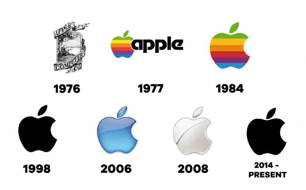
The Apple logo has become one of the most recognizable logos in the world, but it hasn’t always looked the way it does today. Here is a brief overview of the logo’s evolution:
Explanation of the First Apple Logo and its Meaning
The first Apple logo was designed in 1976 by co-founder Ronald Wayne, who was a graphic designer. The logo featured Sir Isaac Newton sitting under a tree with an apple dangling above his head. The phrase “Apple Computer Co.” was written on the border surrounding the image. The logo was meant to represent knowledge and creativity, with Newton representing the discovery of knowledge and the apple representing the fruits of knowledge.
Evolution of the Apple Logo over Time
In 1977, the company hired Rob Janoff to design a new logo. The new design featured a rainbow-colored apple with a bite taken out of it. The colors of the logo were meant to represent the creativity and innovation that the company was known for. The bite out of the apple was added to make it clear that the logo represented an apple, not a tomato or another fruit.
In 1998, Apple introduced a new logo design, known as the “Aqua” logo. The logo was more simplistic than the previous version, featuring a monochrome apple with a subtle 3D effect. This logo was designed to reflect the company’s new focus on design and aesthetics.
In 2001, Apple introduced another new logo design, known as the “Chrome” logo. This version of the logo featured a shiny, metallic apple, which was designed to reflect the company’s new emphasis on hardware and technology.
Explanation of the Current Apple Logo and its Significance
The current Apple logo, which was introduced in 2017, is a modernized version of the “Chrome” logo. The design features a flat, monochrome apple with a slightly rounded shape. This logo was designed to be more versatile and adaptable, and to reflect the company’s ongoing commitment to simplicity and elegance in design.
The evolution of the Apple logo shows how the company’s brand has evolved over time, from its early focus on knowledge and creativity, to its current emphasis on simplicity and innovation.
The logo has become an iconic symbol of the company’s brand identity, and is instantly recognizable to people all over the world.
Nike
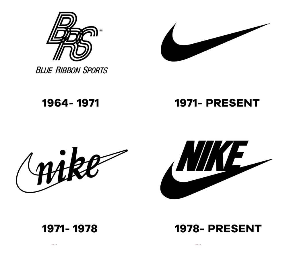
Nike is one of the most recognizable athletic brands in the world. The company’s logo has undergone significant changes since its inception in 1971, but it has always been an iconic symbol of the brand. Let’s take a closer look at the evolution of the Nike logo.
Explanation of the First Nike Logo and its Meaning
The first Nike logo was created in 1971 and featured a simple, yet powerful design. The logo, which was designed by Carolyn Davidson, was inspired by the Greek goddess of victory, Nike. The logo consisted of a simple swoosh design, which represented the movement and speed of an athlete in motion.
Evolution of the Nike Logo over Time
Over the years, the Nike logo has undergone several changes, each time becoming more refined and recognizable. Here’s a brief overview of the changes:
- 1971: The original Nike logo featured a simple swoosh design with the word “Nike” in bold letters.
- 1978: The word “Nike” was removed from the logo, leaving only the iconic swoosh.
- 1985: The swoosh was given a more stylized look, with sharper lines and a more dynamic appearance.
- 1995: The Nike logo was given a 3D appearance, with the swoosh appearing to jump off the page.
- 2019: The latest iteration of the Nike logo features a simplified swoosh design, with a more modern and streamlined appearance.
Explanation of the Current Nike Logo and its Significance
The current Nike logo, which was introduced in 2019, features a simplified swoosh design. The new design is meant to be more modern and streamlined, while still maintaining the iconic look and feel of the brand. The new logo is part of Nike’s effort to modernize its brand and stay relevant in an ever-changing market.
The Nike logo is an excellent example of how a brand can evolve while still maintaining its core identity. The swoosh has become synonymous with Nike and is instantly recognizable around the world.
Coca-Cola
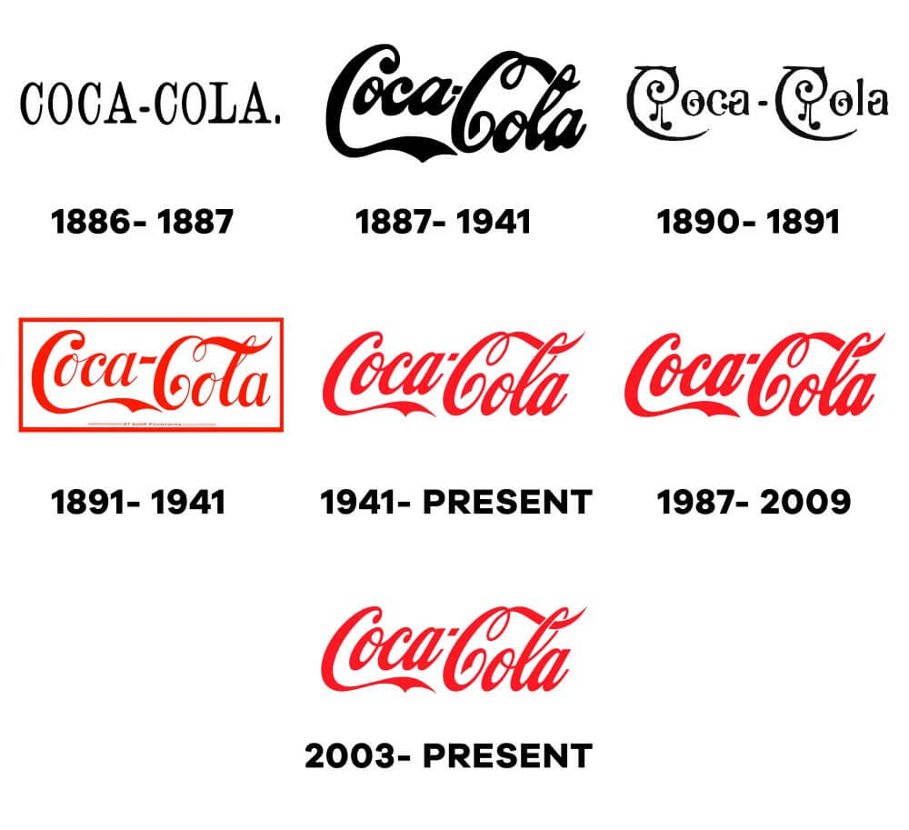
Coca-Cola is one of the most recognizable brands in the world, and its logo is an iconic symbol of American culture. The Coca-Cola logo has undergone several changes over the years, reflecting the company’s evolution and changing trends in design.
Explanation of the first Coca-Cola Logo and its Meaning
The first Coca-Cola logo was created in 1887, just two years after the company was founded. It featured the Spencerian script, a popular style of handwriting in the late 19th century, and included the phrase “Delicious and Refreshing” underneath the logo.
The Spencerian script gave the logo a sense of elegance and sophistication, which was intended to appeal to the middle and upper classes. The red and white color scheme was chosen to represent purity and wholesomeness, as well as to make the logo stand out on advertising materials.
Evolution of the Coca-Cola Logo over Time
Over the years, the Coca-Cola logo has undergone several changes. In 1890, the company added a trademark symbol to the logo, and in 1891, the phrase “Trademark Registered” was added as well. The logo was updated in 1941 with a new typeface that was bolder and more modern.
In 1958, the famous Coca-Cola script that is still used today was introduced. This script was created by the graphic artist Frank Mason Robinson, who worked for the Coca-Cola Company. The script was designed to be easily recognizable and to convey a sense of friendliness and warmth.
In 1969, the logo was updated again in 19 with a more modern and streamlined look. The white wave was added, giving the logo a dynamic and energetic feel. This wave has become an integral part of the Coca-Cola logo and is still used today.
Explanation of the Current Coca-Cola Logo and its Significance
The current Coca-Cola logo is a refined version of the 1969 design, with the wave modified slightly to give it a more contemporary look. The typography of the logo has also been updated to a more modern sans-serif font.
The Coca-Cola logo has become an enduring symbol of American culture, representing not just a soft drink but also a way of life. The logo’s red and white color scheme has become synonymous with happiness, joy, and good times. The logo’s evolution over time reflects the company’s commitment to staying current and relevant while remaining true to its heritage and values.
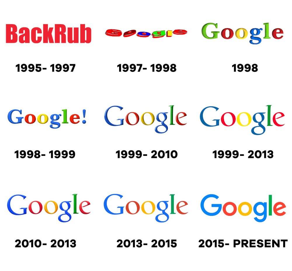
Google is one of the most well-known and used search engines in the world. Its logo has become synonymous with the company, and it has undergone several transformations over the years.
First Google Logo and Its Meaning
The first Google logo was created in 1998 by Sergey Brin, one of Google’s co-founders. It was a simple, colorful logo with a stylized wordmark, featuring the word “Google” written in lowercase letters. The logo used the primary colors of blue, red, and yellow, which were chosen to evoke a sense of fun and playfulness.
Evolution of the Google Logo over Time
Over the years, Google’s logo has undergone several significant changes, reflecting the evolution of the company’s brand identity and visual style. Some of the notable changes are:
- 1998-1999: The first Google logo featured a serif font with a distinctive drop shadow. The font was eventually changed to a more modern, sans-serif font in 1999.
- 2010: Google celebrated its 12th birthday with a special logo that featured a cake with the number “12” on it.
- 2013: The logo underwent a significant redesign, with the colors and letter shapes updated to create a flatter, more modern look. The logo also became more colorful, with a brighter shade of blue and green added to the color palette.
- 2015: Google introduced a new logo that was simpler and more geometric. The new logo featured a sans-serif typeface called “Product Sans,” which was designed to be more legible on smaller screens.
- 2018: Google updated its logo once again, this time making it even simpler and more streamlined. The company removed the drop shadow and gave the letters a more rounded look.
Current Google Logo and Its Significance
The current Google logo is a minimalist, sans-serif wordmark that uses the colors red, blue, green, and yellow. The logo is instantly recognizable and has become an iconic symbol of the company’s brand identity. The use of bright colors and a clean, modern font conveys a sense of innovation, creativity, and friendliness. The company’s decision to remove the drop shadow and make the logo more streamlined reflects its commitment to simplicity and user-friendliness.
Overall, the evolution of the Google logo reflects the company’s focus on innovation, simplicity, and user experience. Each iteration of the logo has been carefully designed to reflect the changing needs of the company and its users, making it a great example of how a logo can evolve over time to stay relevant and effective.
McDonald’s
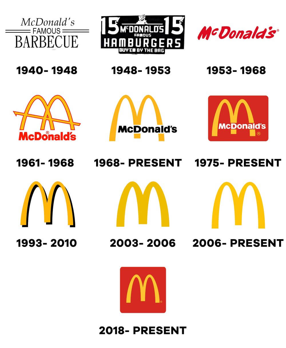
McDonald’s is one of the most well-known fast-food chains in the world, and its logo has gone through a number of transformations throughout the years. Let’s take a closer look at its logo evolution:
First McDonald’s Logo and its Meaning
The first McDonald’s logo was introduced in 1940 and featured the word “McDonald’s” in black lettering on a white background, with a single yellow arch over the top. The arch was intended to represent the golden arches of the restaurant’s architecture.
Evolution of the McDonald’s Logo over Time
Over the years, the McDonald’s logo has undergone a number of changes. In 1953, the company added a red background behind the arches, and in 1961, the logo was updated to feature a more modern-looking design with a more stylized M.
In 2003, McDonald’s introduced a new look for its logo, featuring a more three-dimensional appearance and a subtle change to the colouring of the arches. The company also began to use the slogan “I’m Lovin’ It” in its advertising campaigns, which was prominently displayed alongside the logo.
Current McDonald’s Logo and its Significance
The current McDonald’s logo features the iconic golden arches that have become synonymous with the fast-food chain. The arches are now slightly curved, and the company has removed the word “McDonald’s” from the logo altogether, allowing the arches to stand on their own.
The new design was intended to be more modern and simple, while still maintaining the recognizability and iconic nature of the golden arches. The company also introduced a new tagline, “Good food, fast”, which is intended to convey the idea that customers can get quality food quickly at McDonald’s.
Overall, the McDonald’s logo has evolved over the years to reflect the changing times and the company’s desire to stay relevant and modern while still retaining the core elements that have made it such an enduring and successful brand.
Adidas
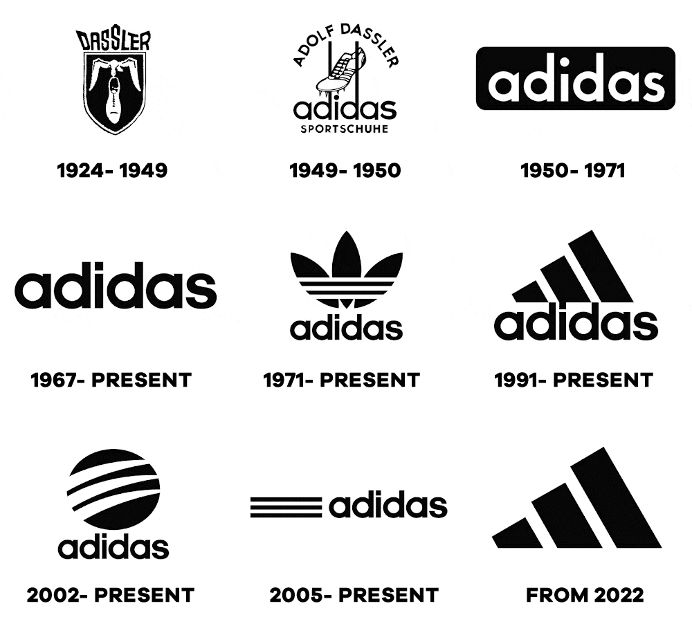
Adidas is a German multinational corporation that designs and manufactures shoes, clothing, and accessories. It is one of the largest sportswear manufacturers in the world, and its iconic three-stripe logo is recognized worldwide.
Explanation of the First Adidas Logo and its Meaning
The first Adidas logo was created in 1949 by founder Adi Dassler. The logo featured three stripes arranged in a slanted pattern, with the word “Adidas” written in bold lettering above it. The stripes on the logo represented Dassler’s vision of the company’s focus on making shoes that were lighter, more flexible, and had better grip.
Evolution of the Adidas Logo over Time
The Adidas logo has undergone several changes since its inception in 1949. Here’s a brief overview of its evolution:
- The first Adidas logo featured three stripes and the word “Adidas” written in bold lettering above it.
- In 1967, the company introduced a new logo, which featured the three stripes enclosed in a triangle shape.
- In 1971, the company introduced a new logo, which featured the same three stripes, but they were now arranged in a parallel pattern.
- In 1990, the company introduced a new logo, which featured the word “Adidas” in lowercase lettering, with the three stripes placed diagonally behind it.
- In 1997, the company introduced a new logo, which featured the word “Adidas” in lowercase lettering, with the three stripes placed diagonally behind it. The logo was updated to give it a more modern and dynamic look.
- In 2014, the company introduced a new logo, which featured a simplified design that emphasized the three stripes. The new logo was designed to be more flexible and adaptable for use across different media and platforms.
Explanation of the Current Adidas Logo and its Significance
The current Adidas logo was introduced in 2014 and features a simple yet iconic design. The logo consists of three stripes that are arranged in a diamond pattern, with the word “Adidas” written in bold lettering below it. The logo is designed to be more modern and adaptable, with a focus on creating a more seamless and consistent brand experience across different media and platforms.
The three stripes on the Adidas logo represent the company’s focus on making shoes that are lighter, more flexible, and have better grip. The diamond shape represents the company’s focus on innovation and forward-thinking, while the bold lettering represents the company’s strength and confidence. The current logo is designed to be versatile and adaptable, making it easy to use across different media and platforms while still maintaining a consistent brand identity.
Pepsi
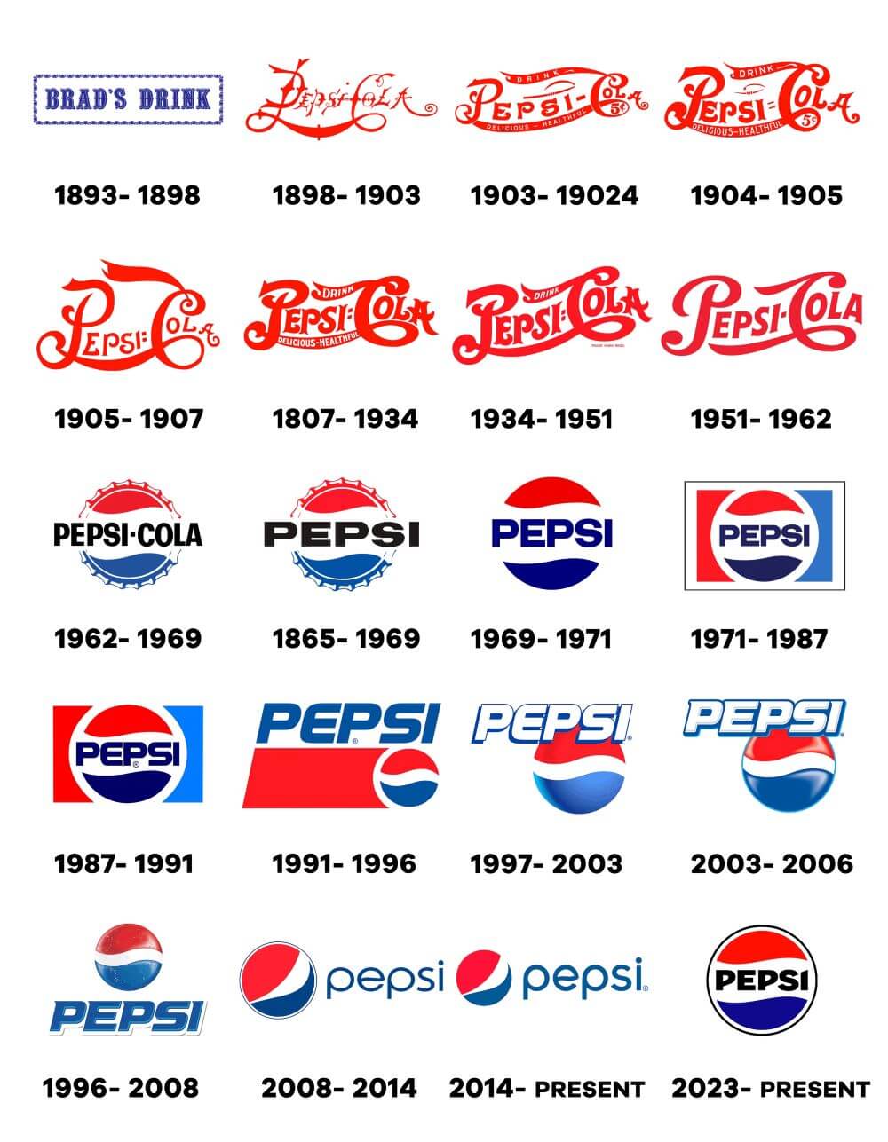
Pepsi, a refreshing carbonated beverage. Known for its iconic blue logo and memorable advertising campaigns, Pepsi has been a beloved choice for quenching thirst and enjoying moments of refreshment. Let’s take a look at the Pepsi brands logo evolution.
First Pepsi Logo and Its Meaning
The first Pepsi logo was introduced in 1898 and featured a simple, script font with the word “Pepsi-Cola” in red and blue. The logo was designed to reflect the beverage’s refreshing taste and energizing properties. At the time, Pepsi was marketed as a “healthy” alternative to Coca-Cola, which contained caffeine and cocaine.
Evolution of the Pepsi Logo over Time
Over the years, the Pepsi logo has undergone numerous changes, reflecting shifts in the company’s marketing and branding strategies. Here are some of the major milestones in the evolution of the Pepsi logo:
- 1950s: The Pepsi logo was updated to feature a more modern design, with the script font replaced by a bold, sans-serif typeface. The red and blue colors remained, but the word “Cola” was dropped.
- 1960s: The Pepsi logo was updated again, this time with a circular shape and the word “Pepsi” in white on a red background. The logo also featured a stylized wave design, meant to evoke the carbonation and bubbles in the beverage.
- 1970s: The Pepsi logo underwent another major redesign in the 1970s, with the wave design enlarged and the word “Pepsi” appearing in bold, all-caps letters. The logo was also updated with a more modern color palette, featuring shades of red, blue, and white.
- 1980s-1990s: In the 1980s, the Pepsi logo was updated again with a sleeker, more minimalist design. The wave design was simplified and the word “Pepsi” appeared in a bold, sans-serif font. The logo also featured a new color scheme, with a darker shade of blue and a red stripe running through the center.
- 2000s-2010s: The Pepsi logo was updated again in the early 2000s, with the wave design removed and the word “Pepsi” appearing in a new, stylized font. The logo also featured a new color scheme, with shades of blue and silver.
Current Pepsi Logo and Its Significance
The current Pepsi logo was introduced in 2014 and is a further simplification of the design introduced in the 2000s. The word “Pepsi” appears in a bold, sans-serif font, with the blue color palette retained. The red stripe from the previous design was removed, leaving a clean, minimalist design.
The current Pepsi logo is meant to reflect the company’s focus on simplicity, modernity, and innovation. The removal of the wave design and red stripe was intended to create a more streamlined and iconic logo that would be instantly recognizable to consumers. Overall, the evolution of the Pepsi logo reflects the changing tastes and preferences of consumers, as well as shifts in the company’s marketing and branding strategies.
Amazon
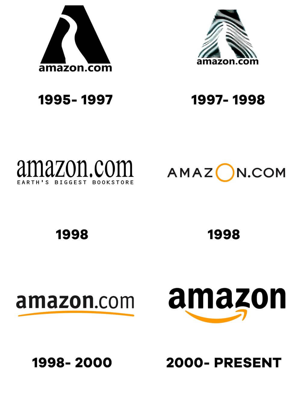
Amazon is one of the most recognizable brands in the world, known for its massive online marketplace, fast shipping, and numerous other services. The company’s logo has evolved significantly since its inception, reflecting changes in the company’s brand identity and business focus.
The first Amazon Logo and its Meaning
The first Amazon logo, introduced in 1995, was a simple design consisting of the company name written in black uppercase letters with a stylized river running through it.
The river represented the company’s early focus on selling books, as the founders wanted the marketplace to be as large as the Amazon River.
Evolution of the Amazon Logo over Time
Over the years, Amazon has updated its logo to reflect changes in its business and branding strategy. Here is a brief overview of the evolution of the Amazon logo:
- In 1997, Amazon updated its logo by adding a yellow swoosh under the company name, which represented a smile and suggested customer satisfaction.
- In 1998, the company added an arrow to the logo, starting from the letter “A” and ending at the letter “Z,” indicating that Amazon sold everything from A to Z.
- In 2000, Amazon updated its logo with a more modern font and removed the river graphic.
- In 2002, the company changed the colour of the arrow to orange, and made it look more like a smile.
- In 2011, Amazon updated its logo again by removing the yellow swoosh and making the arrow more subtle.
- In 2013, the company introduced a new logo for its mobile app, which featured the Amazon arrow wrapped around a shopping cart.
The current Amazon Logo and its Significance
The current Amazon logo, introduced in 2019, features a simple, modern design that reflects the company’s focus on innovation and technology. The logo consists of the company name written in lowercase letters with a curved arrow starting from the letter “a” and ending at the letter “z,” suggesting the idea of the company having everything from A to Z. The arrow also forms a smile, which is a nod to the company’s customer-centric philosophy.
Overall, the evolution of the Amazon logo reflects the company’s growth and evolution over the years. As Amazon has expanded its services and product offerings, its logo has become simpler and more modern, reflecting the company’s focus on innovation and customer satisfaction.
Starbucks
Explanation of the first Starbucks Logo and its Meaning
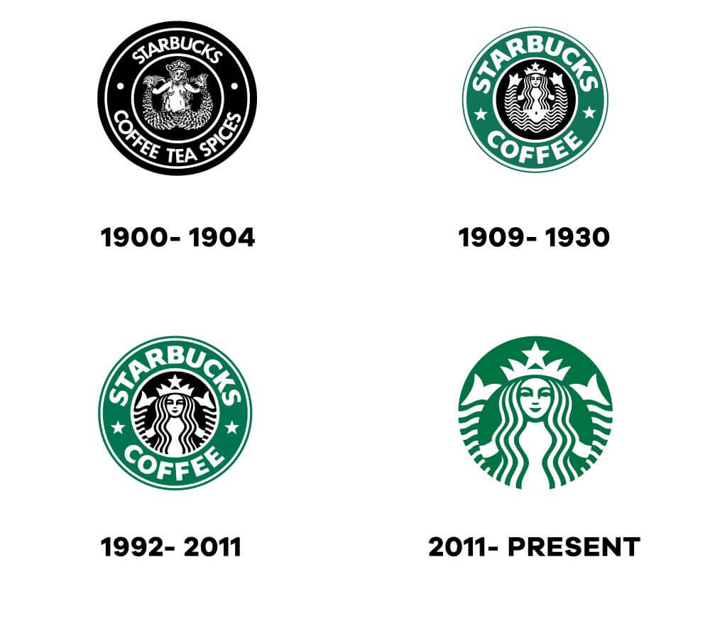
The first Starbucks logo was created in 1971 and featured a brown siren with long hair, resembling a mermaid. The logo was inspired by a 16th-century Norse woodcut, and the siren was intended to represent the company’s love for the sea. The original logo included the words “Starbucks Coffee, Tea, and Spice,” which reflected the company’s initial focus on selling coffee beans and tea leaves.
Evolution of the Starbucks Logo over Time
Over the years, the Starbucks logo has undergone several changes. The company simplified the logo in 1987, making the siren larger and removing the outer circle and the words surrounding the siren. In 1992, the siren was cropped so that only her face and torso were visible, and the colour of the logo was changed from brown to green. In 2011, the company made further changes to the logo, removing the word “Starbucks” and leaving only the image of the siren.
Explanation of the Current Starbucks Logo and its Significance
Today, the Starbucks logo consists solely of a green, twin-tailed siren. The green colour represents growth, freshness, and renewal, while the siren symbolizes the company’s connection to the sea and its commitment to providing high-quality coffee and other beverages. The siren also represents the company’s emphasis on the human connection, as it was designed to be a friendly and inviting figure. The removal of the word “Starbucks” from the logo was a bold move, indicating the company’s confidence in its brand recognition and the strength of its visual identity.
Fedex
Explanation of the First Fedex Logo and its Meaning
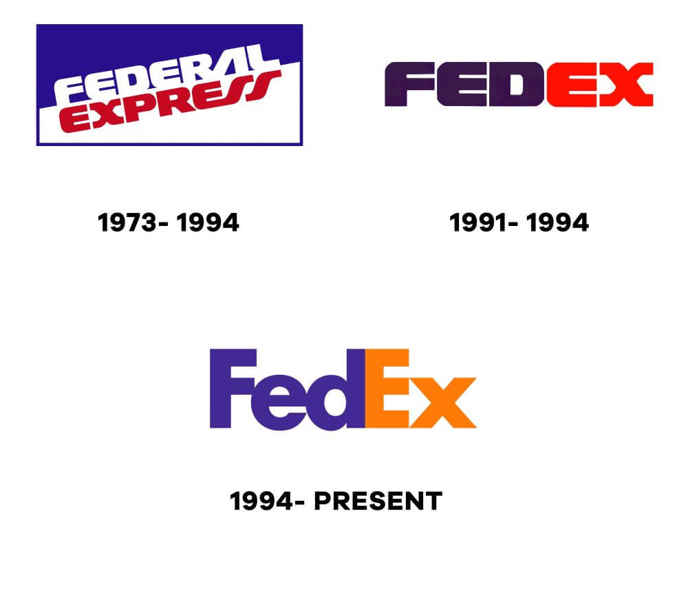
The first Fedex logo was designed in 1971, shortly after the company was founded. It featured the full name of the company, “Federal Express,” written in bold, sans-serif letters in purple and black. The logo had an arrow hidden within the negative space between the “E” and the “X,” which symbolized speed and efficiency. The arrow was meant to convey the idea that packages sent through Fedex would be delivered quickly and reliably.
Evolution of the Fedex Logo over Time
Over the years, Fedex has undergone several logo redesigns. In 1994, the company shortened its name to “FedEx” and changed its logo accordingly. The new logo featured the name in all caps, with a bold, purple and orange colour scheme. The iconic arrow was also made more prominent, with a curved shape that made it look like it was moving forward.
In 2000, Fedex unveiled a new logo that was more modern and streamlined. The purple and orange colour scheme was replaced with a simpler purple and white palette, and the arrow was simplified to a straight line that ran through the “Ex” in the company name. The font used for the company name was also changed to a more rounded, friendly typeface.
Explanation of the Current Fedex Logo and its Significance
The current Fedex logo, which was introduced in 2016, features a simplified design that puts more emphasis on the iconic arrow. The company name is written in all caps, with a bold, sans-serif typeface. The arrow is still hidden within the negative space between the “E” and the “X,” but it has been rotated so that it now points forward, symbolizing the company’s focus on moving forward and embracing change.
The new design also features a more vibrant purple colour, which is meant to convey energy, creativity, and innovation. Overall, the current Fedex logo is a more modern and streamlined version of the previous designs, with a focus on simplicity, speed, and reliability. It is a testament to the company’s commitment to innovation and its ability to adapt to the changing needs of its customers.
Mastercard
Mastercard is a multinational financial services company headquartered in New York, United States. The company is known for its popular credit and debit cards, which are widely accepted globally. Like many other companies, Mastercard has gone through several logo changes since its inception in 1966. Let’s take a closer look at the evolution of the Mastercard logo and its significance.
Explanation of the First Mastercard Logo and its Meaning
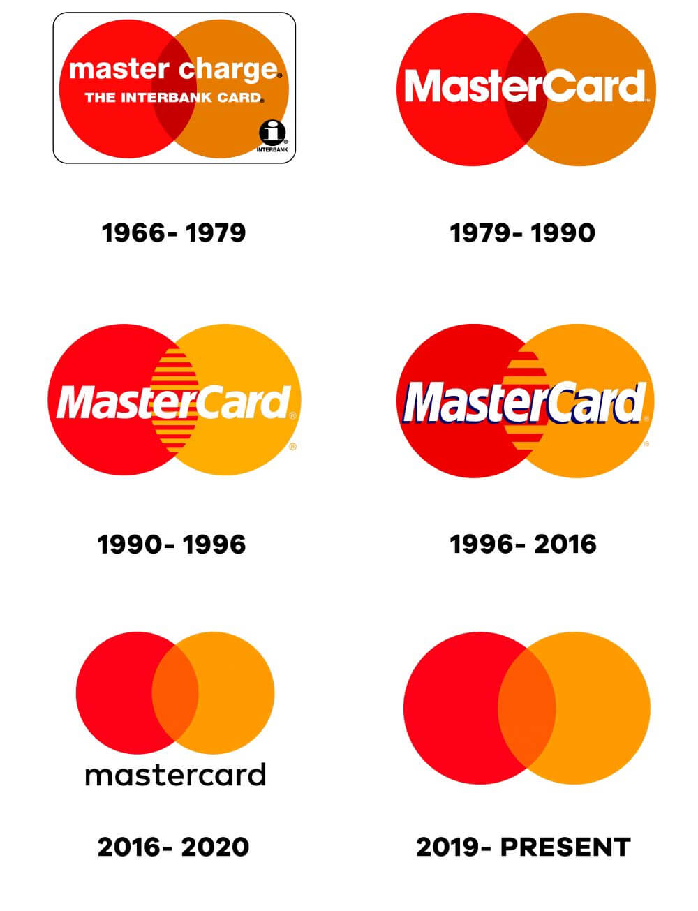
The first Mastercard logo was designed in 1966 and consisted of two overlapping circles, one red and one orange, with the company name “Master Charge” written in the center. The design was simple, yet bold, and conveyed the company’s focus on simplicity, efficiency, and convenience.
Evolution of the Mastercard logo over time
Over the years, the Mastercard logo has undergone several changes to reflect the company’s growth and evolving brand identity. Some of the significant changes include:
- In 1979, the company changed its name to “Mastercard,” and the logo was updated to reflect the new name. The two circles remained the same, but the company name was changed to “Mastercard” in bold letters.
- In 1990, the logo underwent a significant redesign. The two circles were modified to overlap at an angle, with the red circle representing the company’s focus on reliability and the orange circle representing its emphasis on innovation.
- In 1996, the company dropped its name from the logo altogether, choosing instead to focus on the iconic interlocking circles as the centerpiece of the brand.
- In 2006, the logo was updated once again, with the circles given a three-dimensional look and a gradient effect applied to the colours, giving the logo a more modern and dynamic appearance.
- In 2016, the company introduced a new version of the logo, which simplified the design even further. The overlapping circles were retained, but the colours were brightened, and the name “Mastercard” was added underneath the logo.
Explanation of the current Mastercard logo and its significance
The current Mastercard logo is a modern and minimalistic design that reflects the company’s focus on simplicity and innovation. The interlocking circles remain the centrepiece of the design, but the colours have been brightened and given a more vibrant, dynamic look. The addition of the company name “Mastercard” underneath the logo reinforces the brand’s identity and makes it easier for customers to recognize and identify the company.
Overall, the Mastercard logo has undergone several significant changes over the years, reflecting the company’s growth and evolving brand identity. The current design is a modern and dynamic take on the classic interlocking circles, emphasizing the company’s focus on simplicity, innovation, and customer satisfaction.
Shell
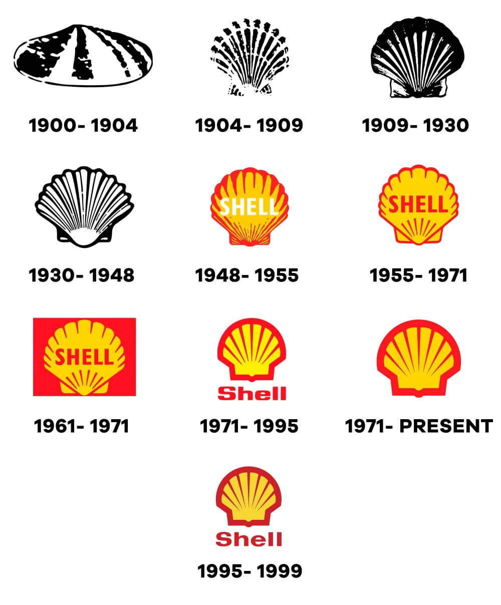
Shell is a multinational oil and gas company that has been in business since the 19th century. Over the years, the company has undergone several changes and modifications, including changes to its logo. In this section, we will discuss the history of Shell’s logo and its evolution over time.
The First Shell Logo and Its Meaning
The first Shell logo was introduced in 1901 and was a simple black and white image of a seashell. The seashell was chosen as the logo for the company because it was a symbol of the pilgrimage to the Holy Land, where the founder of the company, Marcus Samuel, had made a journey. The seashell was also a symbol of the oil industry because oil deposits were often found in areas where seashells had accumulated over time.
Evolution of the Shell Logo over Time
Over the years, the Shell logo has undergone several changes, with each change reflecting the company’s changing values and identity. Here’s a brief overview of the major changes:
- 1901: The original Shell logo featured a black and white image of a seashell with the word “Shell” written in bold lettering beneath it.
- 1930: The logo was updated to include the word “Shell” written in red and featured a more stylized seashell.
- 1948: The seashell was given a more three-dimensional appearance, and the colours were changed to red and yellow.
- 1961: The company introduced a new logo that featured a red and yellow seashell with the word “Shell” written in bold lettering.
- 1971: The word “Shell” was moved inside the seashell, and the font was changed to a more modern style.
- 1995: The logo was updated again, this time featuring a more abstract, geometric seashell in bright shades of red and yellow.
- 2021: The latest Shell logo features a simplified, minimalist version of the seashell, with the colours red and yellow remaining unchanged.
The Current Shell Logo and Its Significance
The current Shell logo, which was introduced in 2021, is a simplified, minimalist version of the seashell that has become synonymous with the company. The logo features a more abstract, geometric shape than previous versions, with a bold, red and yellow colour scheme that is instantly recognizable.
The new logo was designed to reflect the company’s commitment to sustainability and to emphasize its focus on the energy transition. It is also intended to be more adaptable to digital platforms, allowing the company to reach a wider audience and connect with customers in new and innovative ways.
Overall, the current Shell logo is a testament to the company’s long and storied history and its ongoing commitment to innovation and sustainability.
UPS
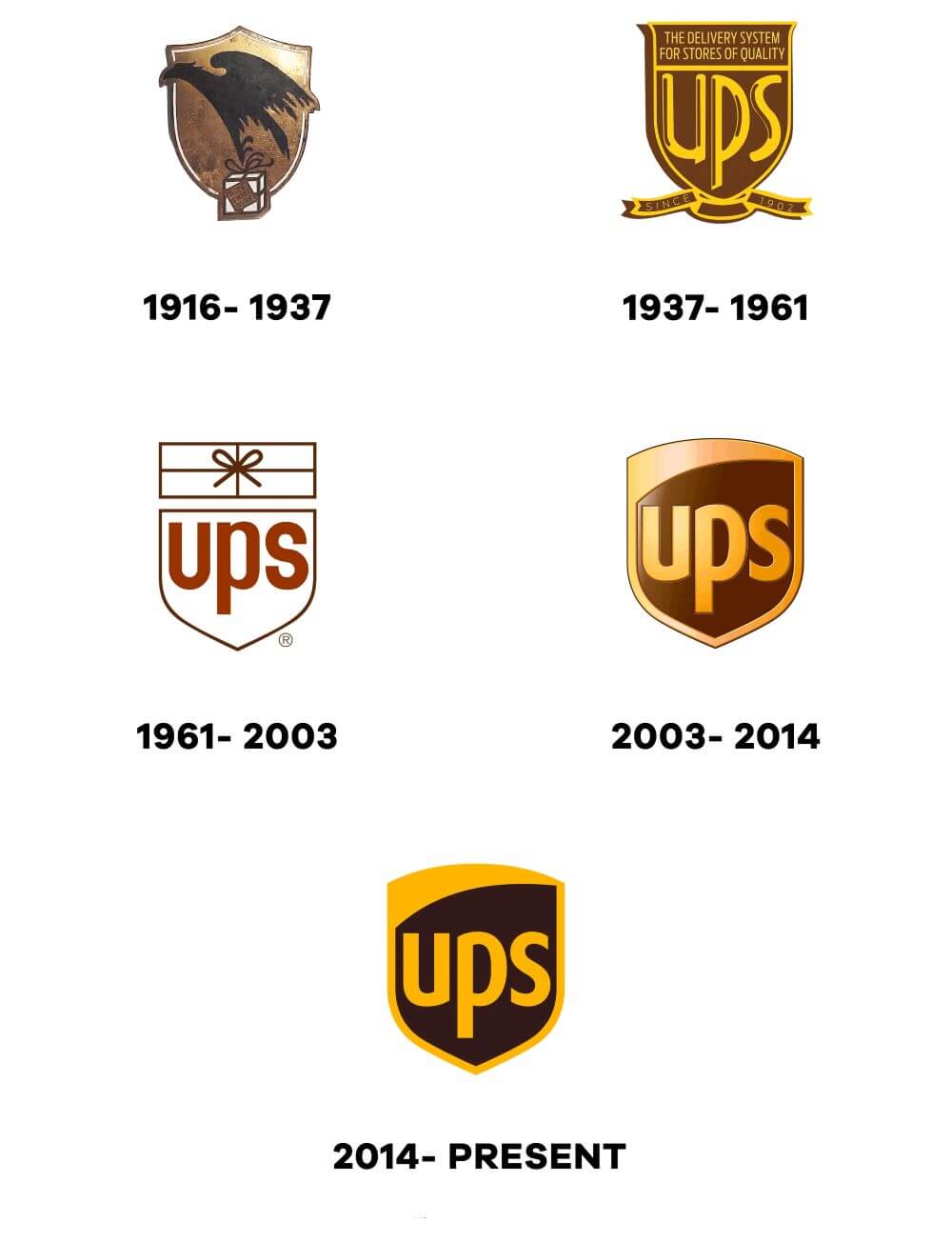
UPS, short for United Parcel Service, is a multinational package delivery and supply chain management company founded in 1907 in the United States. Over the years, UPS has become a household name across the globe, known for its reliable and efficient delivery services. In this section, we will take a closer look at the evolution of the UPS logo and its significance.
Explanation of the First UPS Logo and its Meaning
The first UPS logo was introduced in 1919 and featured a shield-shaped emblem with the company name “American Messenger Company” written in bold letters. The emblem was divided into three parts: a golden shield, a black shield, and a red shield. The golden shield featured an eagle with outstretched wings carrying a package in its talons, while the black shield featured the company name in gold letters. The red shield featured a depiction of Mercury, the Roman messenger of the gods, holding a caduceus, which symbolizes commerce.
Evolution of the UPS Logo Over Time
In 1937, the company changed its name to United Parcel Service and introduced a new logo that featured the company’s initials “UPS” in bold sans-serif typeface against a golden shield with a black border. This logo remained in use until 1961 when the company introduced a new logo that featured a shield with an eagle in flight and the company’s name written in a more modern sans-serif typeface.
In 2003, the company introduced a new logo that featured a stylized shield with a golden shield-shaped emblem on top and the company’s name written in dark brown letters. The emblem featured a package with a golden bow, symbolizing the company’s core business of package delivery. The new logo was designed to be more modern and simple, and it has since become a recognizable symbol of the company’s commitment to reliable and efficient delivery services.
Explanation of the Current UPS Logo and its Significance
In 2014, UPS introduced a new logo that featured the same stylized shield as the 2003 logo but with a darker shade of brown and a gradient effect that gives the logo a three-dimensional appearance.
The company’s name is written in a bold sans-serif typeface, and the package with the golden bow is placed to the right of the shield.
The new logo was designed to be more dynamic and adaptable to different applications, such as mobile devices and social media. It represents the company’s commitment to innovation and its ability to adapt to the changing needs of its customers. The new logo also reflects the company’s focus on sustainability and its efforts to reduce its carbon footprint by investing in alternative fuels and green technologies.
In conclusion, the UPS logo has evolved over the years to reflect the company’s growth and commitment to reliable and efficient delivery services. The current logo represents the company’s focus on innovation, adaptability, and sustainability, and it has become a recognizable symbol of the company’s brand identity.
BP
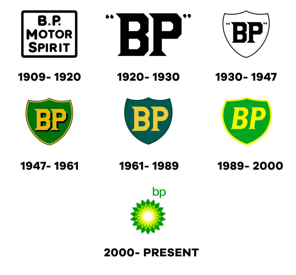
BP (British Petroleum) is a multinational oil and gas company headquartered in London, United Kingdom. The company has undergone several logo changes since its inception in 1909. In this section, we’ll take a look at the evolution of the BP logo and the meaning behind each logo design.
Explanation of the First BP Logo and its Meaning
The first BP logo was created in 1920 and featured a shield with the letters “BP” in white against a green background. The shield represented the company’s heritage and the white letters on a green background symbolized Britain’s national color.
Evolution of the BP Logo Over Time
Since the company’s inception in 1909, BP has had several logos. Here are some of the significant changes in the BP logo over the years:
- In 1930, the BP logo featured a shield with the letters “BP” enclosed in a red circle. The shield was retained to represent the company’s heritage, and the circle represented unity.
- In 1954, the BP logo was redesigned to feature a sunburst image, symbolizing the company’s expanding presence globally.
- In 1961, the logo was updated again to feature a green and yellow sunburst with the letters “BP” in white.
- In 1989, the logo was redesigned to a more simplified, green and yellow sunburst with the letters “BP” in bold, lowercase letters.
- In 2000, BP underwent a significant brand overhaul and introduced a new logo. The logo featured the BP letters in lowercase with a green and yellow sunburst behind them, symbolizing the company’s commitment to clean energy and sustainability.
- In 2008, the logo was modified to reflect the company’s focus on sustainability. The green and yellow sunburst was modified to resemble a sunflower, symbolizing the company’s focus on renewable energy.
Explanation of the Current BP Logo and its Significance
The current BP logo was introduced in 2008 and features the BP letters in lowercase with a green and yellow sunburst resembling a sunflower. The sunflower symbolizes the company’s focus on renewable energy and sustainability. The green and yellow colors represent the environment and energy, respectively. The color green represents the company’s commitment to a sustainable future, while yellow represents the energy they provide. BP’s current logo represents the company’s focus on clean energy and sustainable practices in the future.
IBM
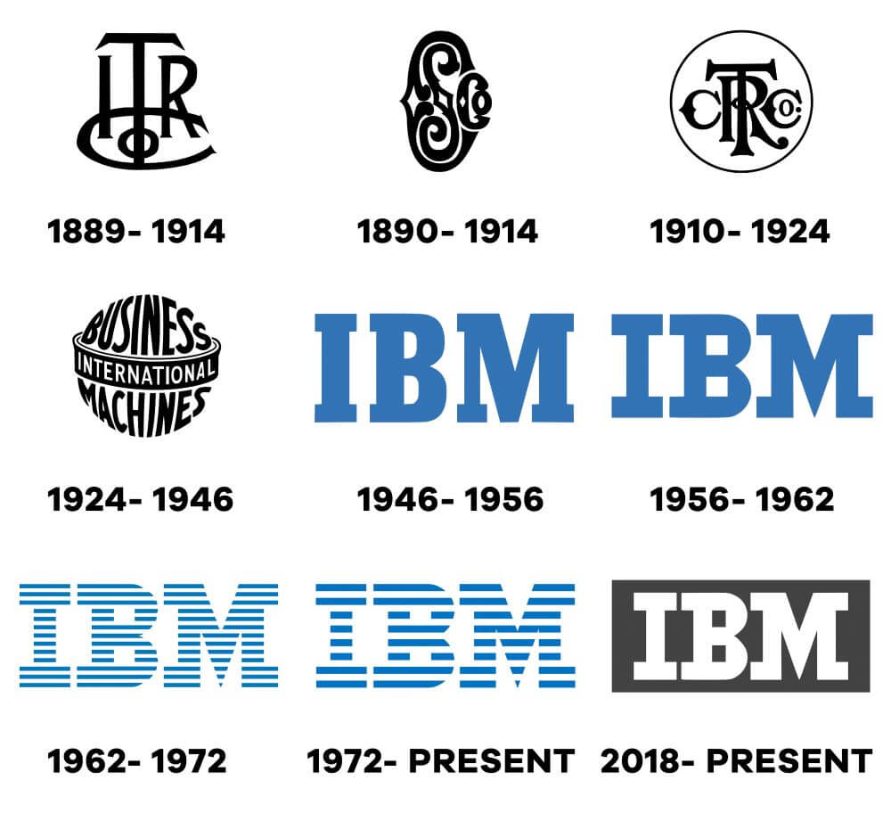
Explanation of the First IBM Logo and Its Meaning
The first IBM logo dates back to 1911 and was designed by the company’s founder, Thomas J. Watson Sr. The logo featured the company’s name, “Computing-Tabulating-Recording Co.” inside a simple, rectangular frame. The letters were set in a serif typeface, with the word “International” added to the company’s name in later versions of the logo.
The logo’s design reflected the company’s focus on tabulating and recording data, and its early success in the business machines market.
It was also intended to convey a sense of trustworthiness and stability, which was important to customers who were relying on these machines to keep accurate records for their businesses.
Evolution of the IBM Logo Over Time
Over the years, IBM’s logo has undergone several significant changes. In 1924, the company changed its name to International Business Machines and introduced a new logo that featured the letters “IBM” in a blocky, sans-serif font. This logo was used for many years and became a symbol of the company’s dominance in the computer industry.
In 1956, the company introduced a new logo that featured a simple, circular shape with the letters “IBM” inside. This logo was designed by renowned graphic designer Paul Rand and was intended to convey a sense of modernity and progress. The circular shape was meant to represent a “view of the world through a microscope,” highlighting IBM’s focus on innovation and technology.
In 1972, the logo was updated again, this time featuring horizontal stripes in various shades of blue. This design was intended to convey a sense of depth and dimensionality, and the different shades of blue were meant to represent IBM’s broad range of products and services.
The logo was updated once again in 2018, with the stripes replaced by eight horizontal lines in the colors of the rainbow. The new design was intended to represent diversity and inclusivity, reflecting IBM’s commitment to these values.
Explanation of the Current IBM Logo and Its Significance
The current IBM logo, introduced in 2018, features a simple, minimalist design with eight horizontal lines in the colors of the rainbow. The lines are meant to represent diversity and inclusivity, as well as the different divisions and services offered by the company.
The new logo is also intended to reflect IBM’s focus on innovation and technology. The use of a sans-serif font and clean lines gives the logo a modern, sleek look that is in line with the company’s image as a leader in the tech industry.
Overall, the evolution of the IBM logo reflects the company’s growth and evolution over the years, as well as its commitment to innovation and technology. The current logo is a reflection of the company’s values and its vision for the future.
Conclusion – Logo Evolution: How Famous Logos Evolved Over Time
There we have it – Logo Evolution: How Famous Logos Evolved Over Time. Logos have evolved significantly over the years and have become an essential aspect of a brand’s identity and recognition. In this post, we have looked at the evolution of logos of some of the world’s most famous logos and brands, including Apple, Nike, Coca-Cola, Pepsi, Amazon, Starbucks, FedEx, Mastercard, Shell, UPS, and IBM.
Each of these brands has a unique story behind its logo evolution, and we can see how they have adapted to changes in logo design trends and consumer preferences.
The evolution of logos shows that brands need to stay relevant and adapt to changes to stay ahead in the game.
Logos are essential for brand identity and recognition. They help consumers distinguish one brand from another and are often the first point of contact with a brand. A well-designed logo can convey a brand’s values, personality, and vision, leaving a lasting impression on consumers.
In conclusion, the evolution of logos is a testament to the importance of logo design and branding in the modern world. Brands need to stay relevant and adapt to changes in consumer preferences, design trends, and technology to stay ahead of the competition.
A well-designed logo is crucial for building a strong brand identity and recognition, and should be a top priority for any brand looking to succeed in today’s market.
Further Reading:
- 10 Examples of Powerful Global Branding
- Learning from the World’s Most Famous Logos
- Branding Beyond Borders: Elevating Your Global Presence through Impactful Logo Design
- Logo Design Trends to Watch Out for in 2023: Stay Ahead of the Curve!
- Most Expensive Logos In The World
- Every Good Logo Tells a Story! 40 Famous Brand Logos & Their Hidden Secrets
- Famous Logo Designers and Their Distinctive Style
- Using the Golden Ratio in Logo Design
- 20 Famous Brand Logos Constructed in Grid Systems
Join The Logo Community
We hope you enjoyed this article about Logo Evolution: How Famous Logos Evolved Over Time. If you would like more personal tips, advice, insights, and access to our community threads and other goodies, join me in our community. You can comment directly on posts and have a discussion.
*TIP – We use and recommend DesignCuts for all your fonts, mockups and design bundles.

