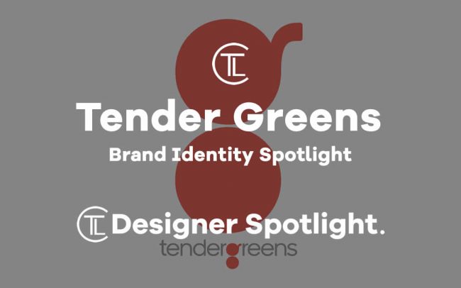
Today Designer Spotlight: Tender Greens Brand Identity Spotlight
Tender Greens is a restaurant chain the company currently has 24 locations in California and is preparing for an expansion to the East Coast, with its first New York restaurant set to open in early 2018. with locations in California such as Los Angeles, Orange County, San Diego, San Francisco and New York – Manhattan. Its a fast-casual restaurant that serves delicious, locally sourced, “farm-to-fork” cuisine prepared by professional chefs. Pentagram designed a new identity for the restaurant that helps position the brand’s unique chef-driven model as it begins to expand across the country.
Tender Greens is a fast-casual restaurant that serves delicious, locally sourced, “farm-to-fork” cuisine prepared by professional chefs. Pentagram designed a new identity for the restaurant that helps position the brand’s unique chef-driven model as it begins to expand across the country.
Founded in 2006 by a group of chefs with the mission to make fresh, high-integrity cuisine accessible to everyone, Tender Greens works in partnership with local purveyors and farms to offer the freshest meals possible, along with a line of packaged products from its chefs, and catering.
As they would describe themselves:
“Two chefs and a foodie set out to change the way people eat for the better. Our inspiration? The meals we had when our friends came over. The food. The pairings. The exploration. The energy. And the promise that on any given day we’d eat or drink something we wouldn’t find anywhere else. So we opened Tender Greens in 2006 and started a food revolution. Welcome to our kitchen.”
They appointed Pentagram to design them a new brand identity, Pentagram said:
“The Tender Greens brand identity answers several challenges. The Tender Greens name has great equity with the restaurant’s existing following, but does not accurately convey the menu, which goes well beyond salads and includes steak, chicken and fish. As Tender Greens grows, it wanted to showcase this wide variety of offerings to new customers. The identity also needed to establish a cohesive structure that would allow for differentiation across the various locations, which each feature their own menu, daily specials and products.
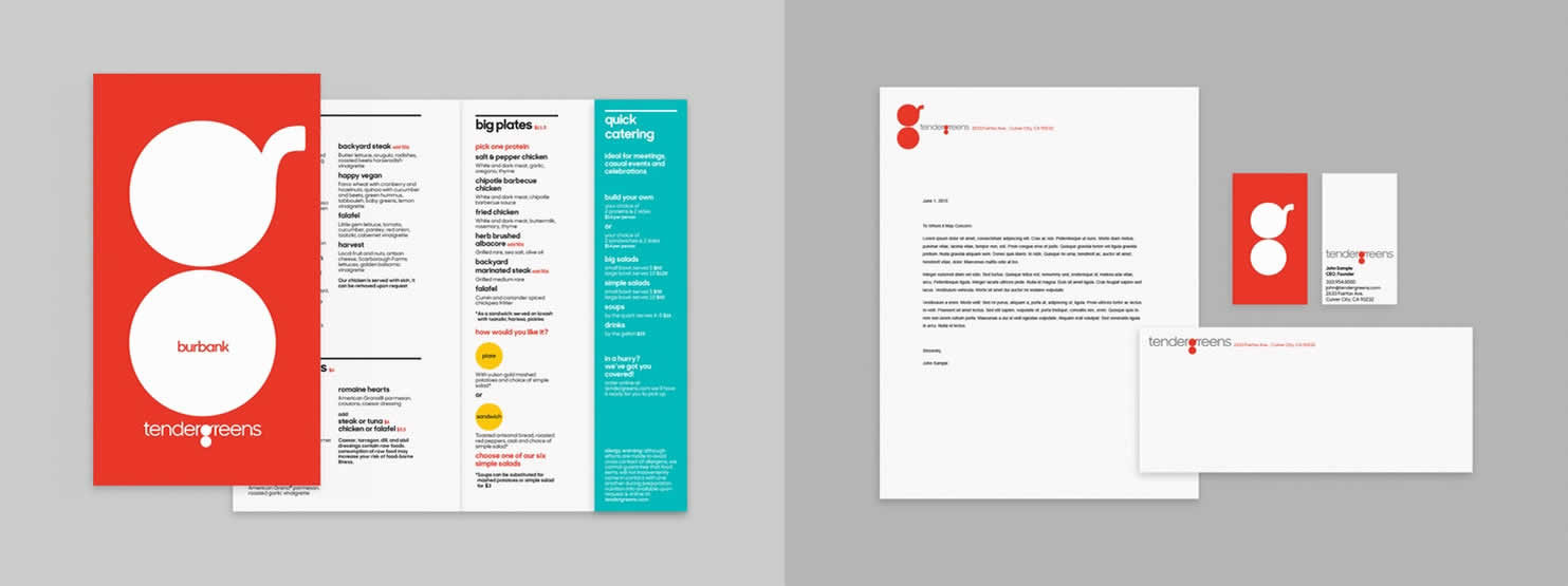
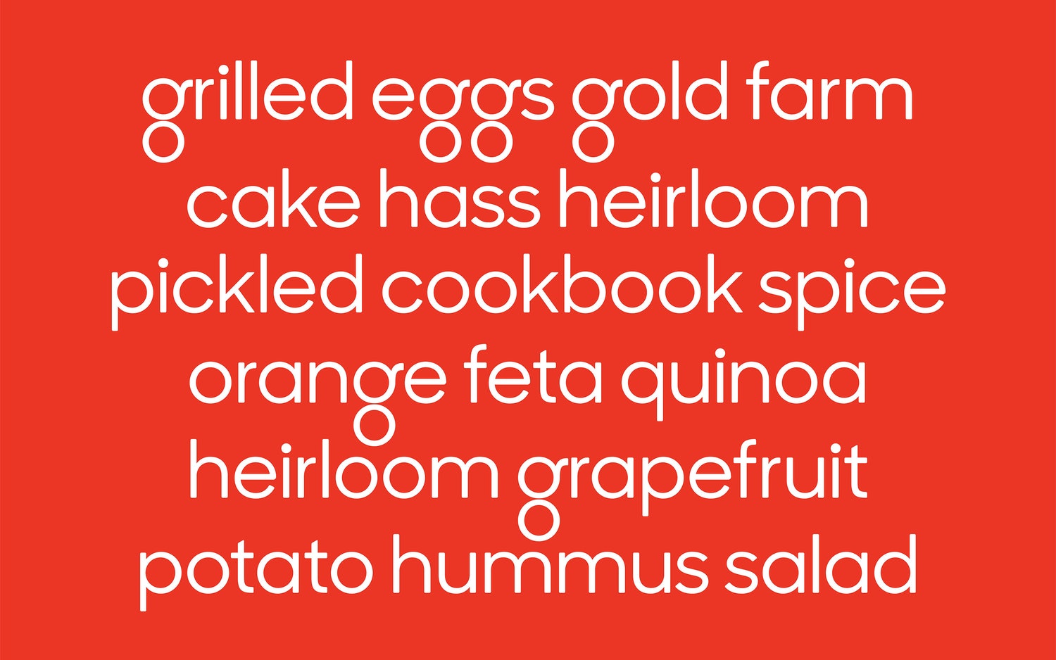
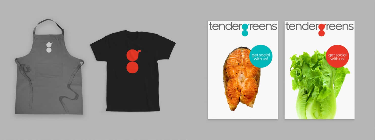
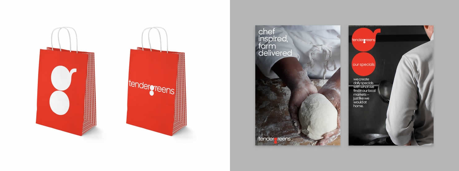
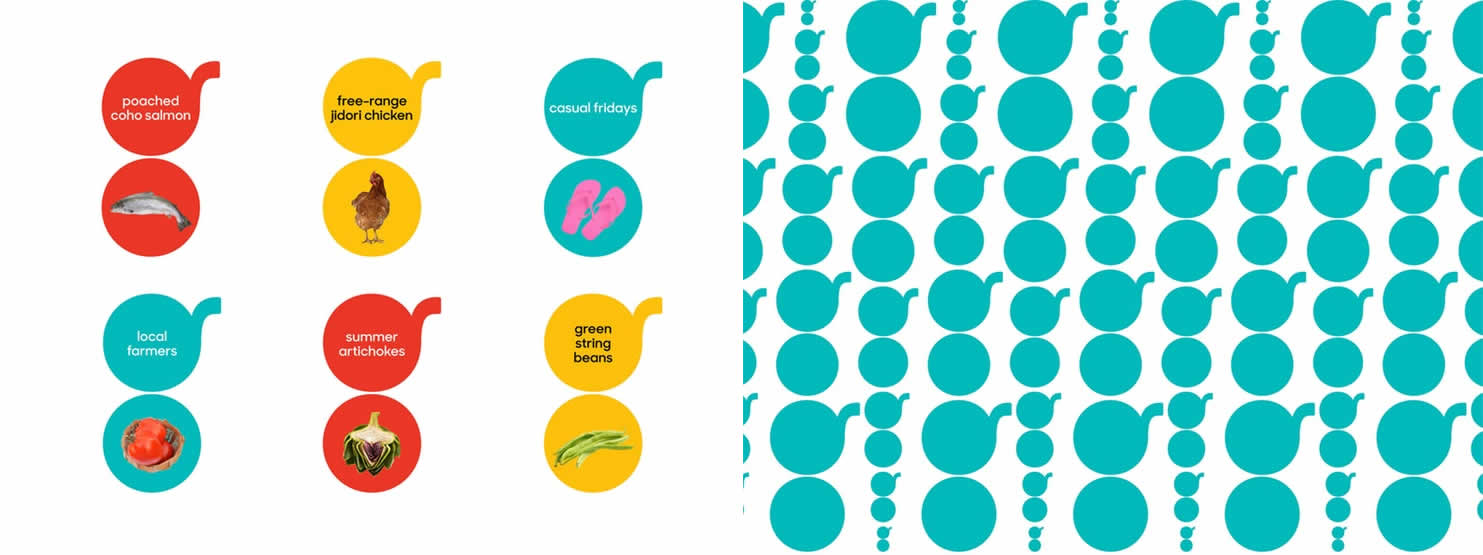
The designers developed an iconic and instantly memorable logo––a distinctive lowercase “g” built of shapes that evoke a pan and plate. The round spaces of the “g” can be filled with colour, or feature images of meals and food. The “g” can appear on its own as a symbol, or accompanied by the full word-mark, which is set in a customised version of the typeface Sharp Sans (with the “g” redrawn with round counters). The treatment of the “g” helps shift the focus away from the name as a whole and puts the emphasis on the food, where it should be. At the same time, the modern typographic approach helps set the brand apart in its category.
The contemporary colour palette is used to distinguish different locations or menu types. The graphic program is accompanied by a new program of interior design for the restaurant, with signage that features digital displays, where the “g” showcases Instagram-ready photos of the delicious daily specials.”

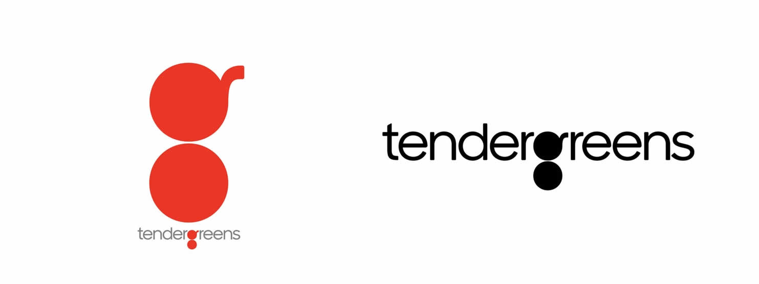
“The logo evokes a pan and plate, putting the emphasis on the cooking and the food, where it should be.”