Today Designer Spotlight: Helseutvalget Brand Identity Spotlight
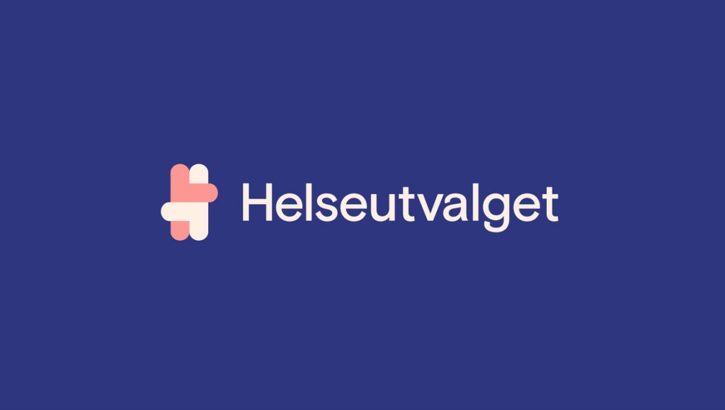
The Health Committee has updated visual identity, website, and printed material, following a need to collect all of its offers under the same profile.
#Identity #design for Helseutvalget by Bielke&Yang #branding #GraphicDesign https://t.co/79UNFmBJum pic.twitter.com/Not9UNoOdk
— The Logo Creative™ (@thelogocreative) October 23, 2017
The Health Committee wanted a more modern, comprehensive expression that appears to be inclusive and attentive, and lowers the threshold to contact.
“Because we work on sexual health and themes that can be perceived as very personal, it is important that our offers are relevant also for those who do not necessarily live openly as gays or lesbians,” says Aksel Overskott , communications adviser in the Health Committee.
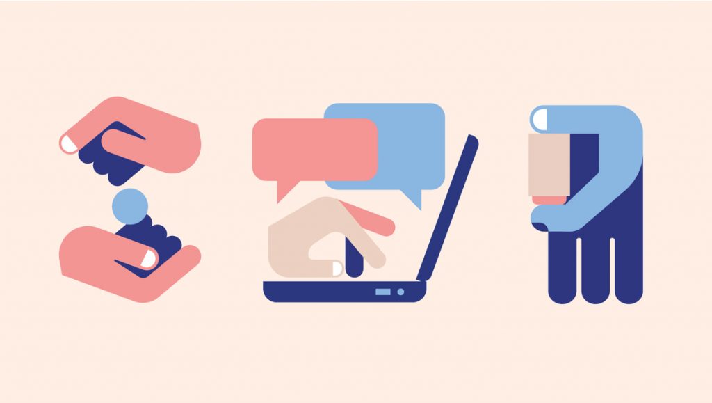
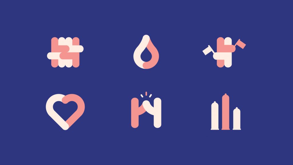
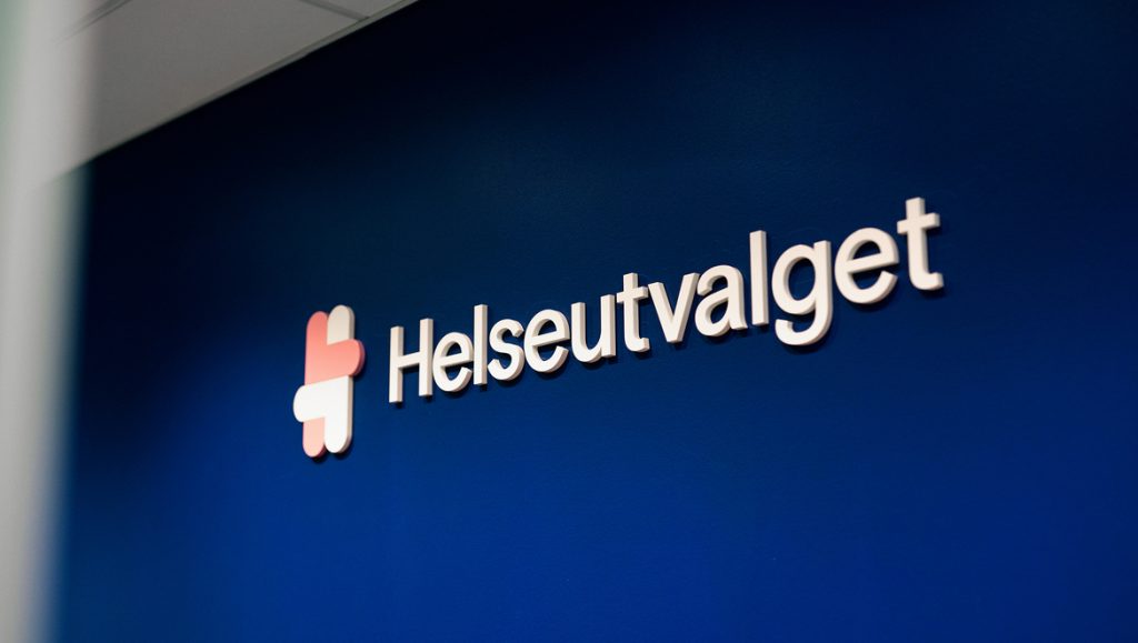
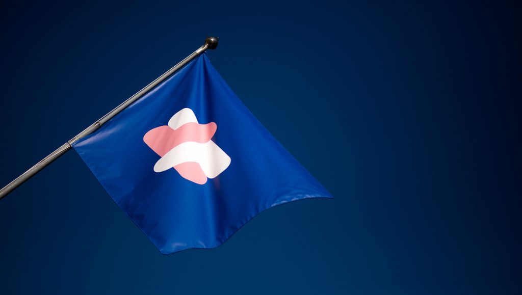
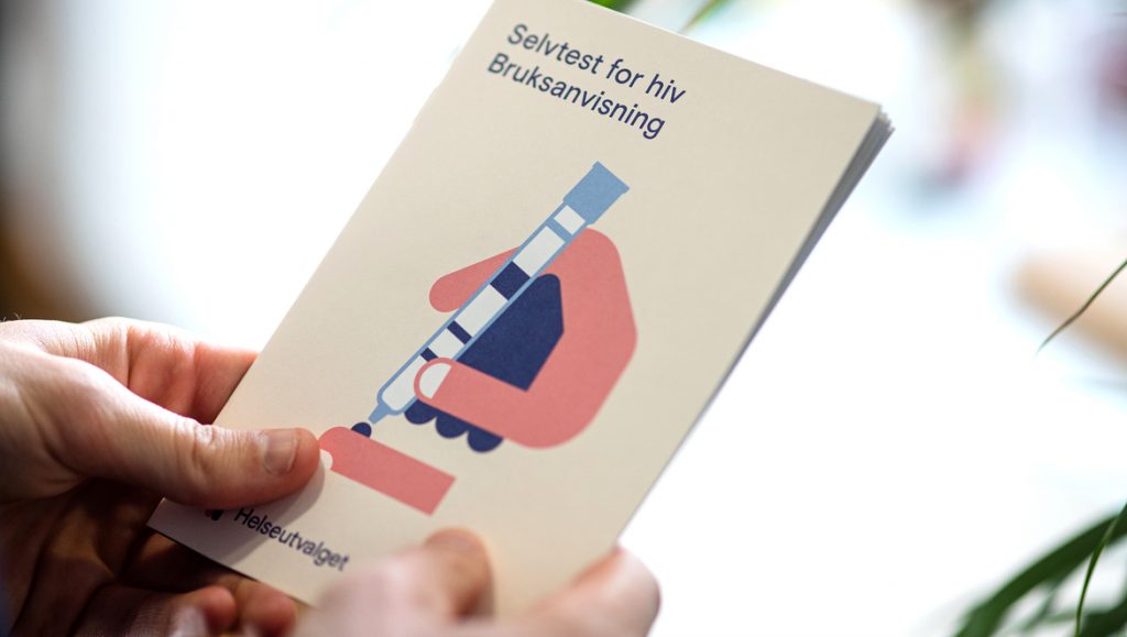
The new logo symbol consists of two people who show care and love for each other, while forming an H for the Health Committee. This visual expression has been further developed in the form of secondary icons and animations, and it worked closely with Dutch illustrator Hedof to illustrate the different steps for the Health Committee’s new HIV test. The use of illustration adds to a playfulness that compromises some of the content that can be experienced as difficult and personal.
Flexible solution
There have been many factors to take into account in the development of the visual identity. Previously, the Health Committee had its own identities for each individual project within the foundation, so one of the most important has been to gather all the offers under an overall system, thus clarifying the Health Committee’s message. At the same time, the new identity is flexible with the many opportunities that the Health Committee needs, whether it is a feature of the parade under Oslo Pride, or in a report to the health authorities. The goal was to reach their existing target audience while attracting a larger audience by creating an inclusive and friendly expression.
Do-it-yourself test
The Health Committee’s new DIY HIV test, a free and anonymous home test that is easy to use, is a brand new product for the Norwegian market. In the first week after the launch, they received over 1000 orders for the HIV test.
– The Health Committee’s trial project with an HIV test for home use has been a key part of the work on the new visual identity. The hope is that those who rarely or never before have taken an HIV test should order one from our new website, says Overskott.
Identity should work as well on printed as digital surfaces, and the implementation of the identity is well underway; everything from the typical flats like business cards, carrier networks and t-shirts to the more unusual like condoms and HIV test instructions. The website will act as a knowledge portal where you will be able to find information about sexual health, order an HIV test or chat with volunteers from the Health Committee.
The website has been developed in close cooperation with Værsågod, Kimm Saadtvedt has taken pictures and captured the great thrill of the target group.
“The work with the Health Committee has been both educational and challenging. It has been a fruitful process where we have ended up with a result we are proud of, and as we hope can make a difference to the target audience, designers tell Martin Yang and Christian Bielke.

See more of Bielke&Yang | Bielke&Yang