Today Designer Spotlight: Marvel Brand Identity Spotlight
In this spotlight Paul Von Excite takes you trough his process of building the new custom logotype for Marvel, from the very beginning starting from sketch right through to the final product.
Table of Contents
Introduction
Marvel is a design, prototyping an collaboration application based in London, UK.
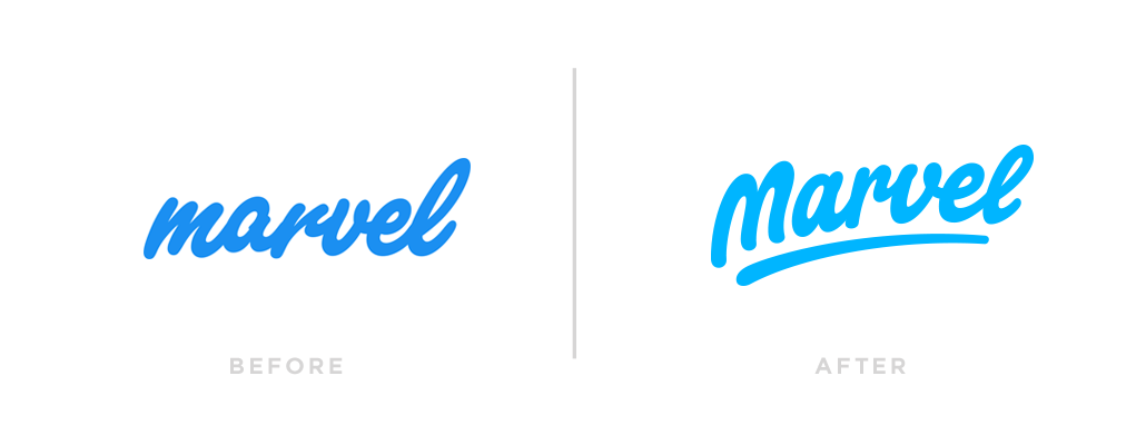
Marvel’s co-founder Murat Mutlu contacted Paul for a logotype refresh. Paul said he liked the old logo and it was awesome, Murat was pretty clear in his intend for style direction and after a phone call Paul was excited to get started. The goal for the final outcome was very clear, the new typeface needed to resemble a friendly, fun and professional character with lots of personality and energy. The Marvel typeface also needed a stand-alone “M” character for smaller display usage.
Exploration
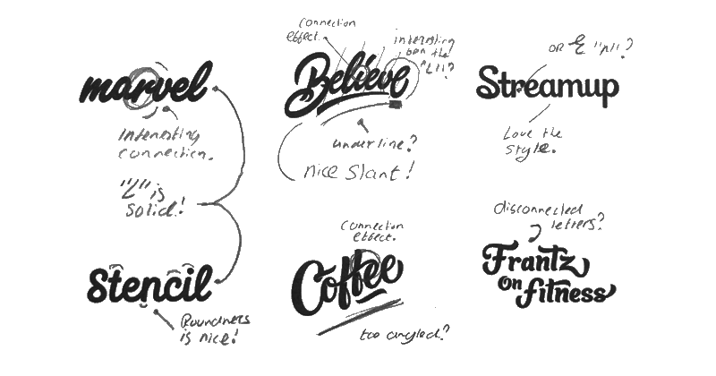
Paul said that the search for inspiration was much easier as the project goals where made very clear by the client. He had a clear view in his mind on how the first sketches would look, the image below was used as a reminder while sketching. Work included from Nick Slater, Sergey Shapiro, Mark Caneso, Leo Gomez and Paul himself.
Sketching
Paul explained that he did actually take a lot of inspiration from the previous Marvel type logo as he did like this, especially the “r-v” and “v-e” connection were interesting to explore further.
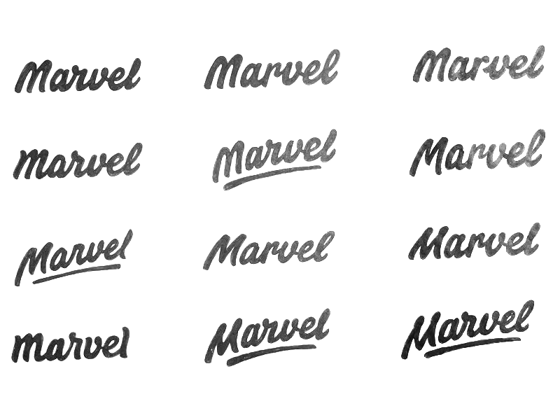
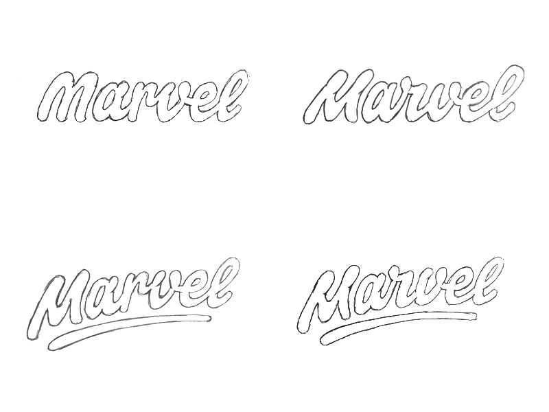
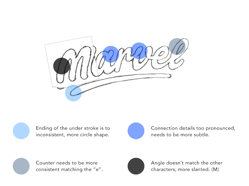
Marvel’s co-founder Murat really liked the angled versions as it resembled an energetic character and feel. In the following image it was time to reflect on the type and see what needed improvement. The top left “M” was favourite over the bottom left “M”, he used Photoshop to combine the two together.
Final Sketch
At this point it was time to improve the reflections of the sketch above and build the final sketch. With the above sketch underneath I used tracing paper to model the final sketch.
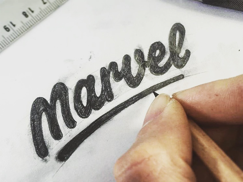
Paul explained that the counters of the “e” and “l” turned out alittle too small but he left it as it was and decided to go digital from here and refine it in Illustrator later.
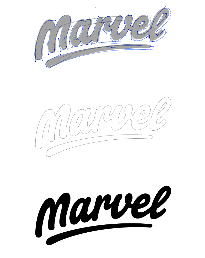
Digital Version
Below is a screenshot of the final sketch with the vectoring lettering on top. To position the characters correctly along the curved underline he started the tracing with the underline and used the underline as grid. The finished trace has a slightly less slanted curve angle, coming closer to an arch. Other aspects like kerning, stroke width and corners were also digitally refined.
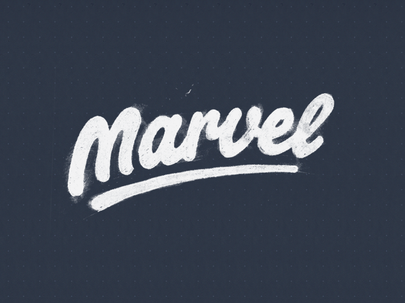
Alternate Version
With the full logotype complete he still needed to design a stand-alone “M”, Paul explained that this particular one was tricky to use because it was so slanted and angled. This caused Paul to explore back and forth between different “M’s” but after all he maintained the original “M”.
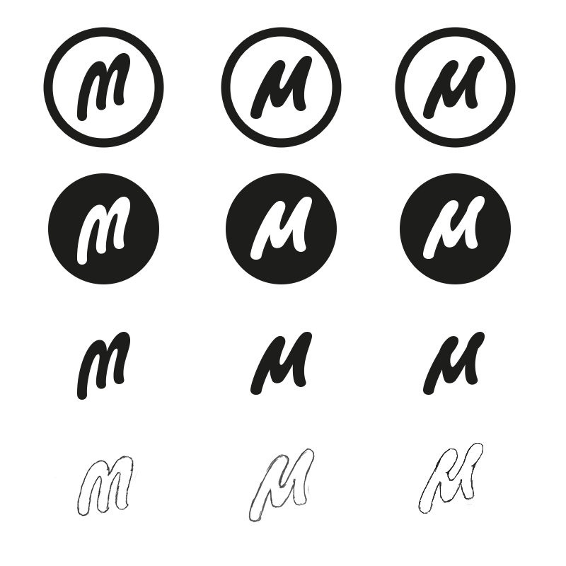 The stand-alone “M” will only be used at the smallest display’s, on small to medium and above sizes the full Marvel type will be used most. Paul modified the original “M” from the word-mark to make it fit better within smaller sizes and make it look more extinct.
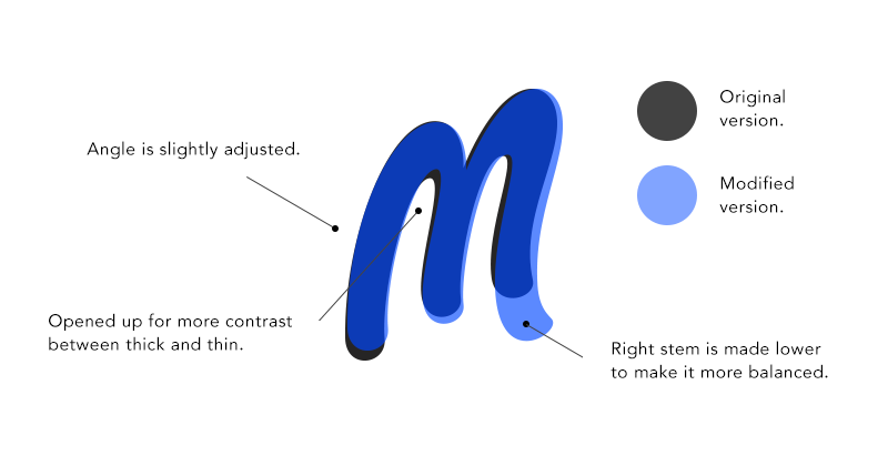
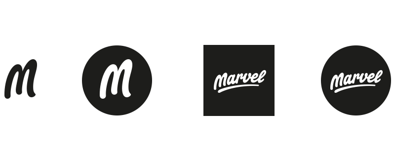
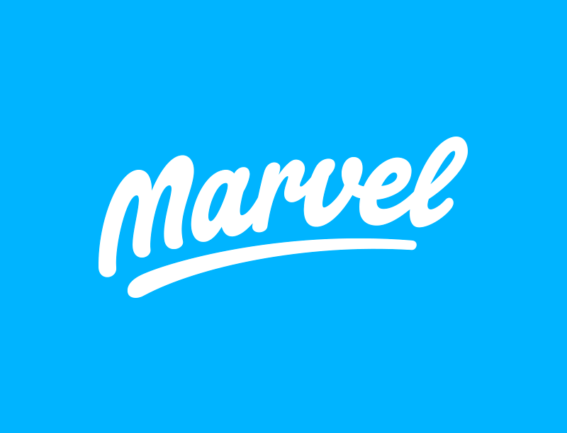
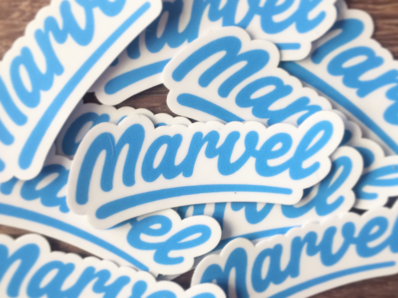
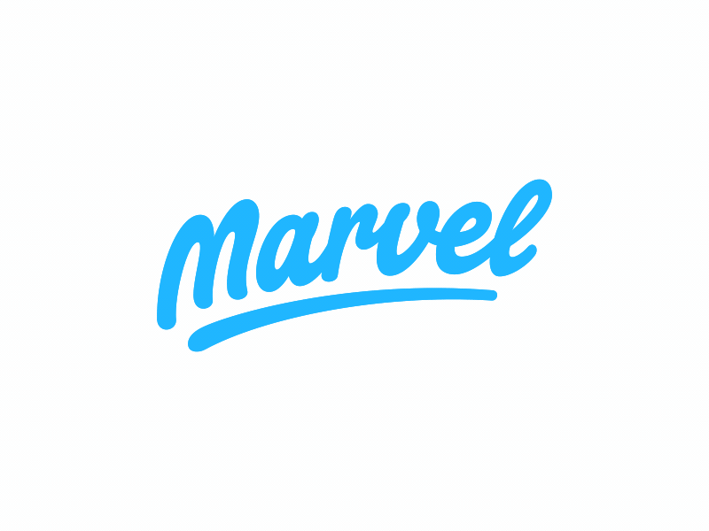
The Final Result
Paul explained that he had a fantastic experience working together with Murat on the new Marvel logotype and he was really satisfied with the final result and how it turned out. Paul Von Excite is scheduled to appear in our designer interview series so keep your eyes peeled for that one. Paul is an excellent hand letter artist and i love his work I think it was awesome for him to share his process of the Marvel logotype identity design.

You can see more of Paul Von Excite’s work here and keep your eye’s peeled for his upcoming interview in our designer interview section