Today Designer Spotlight: YouTube Brand Spotlight
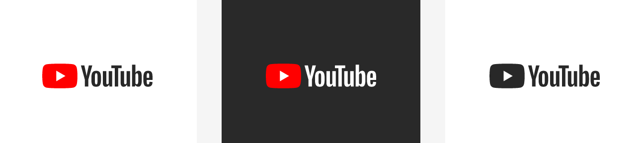
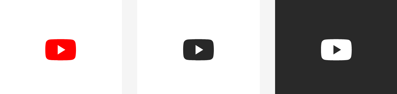
Yesterday, YouTube introduced a significant update across its multi-platform presence, the brand is getting its biggest aesthetic makeover ever. The YouTube logo is being refreshed, shifting the emphasis away from the word “Tube” and onto the familiar play button which has already become an iconic shorthand for the company. The service is also getting a new typeface, colour scheme, and a bunch of major changes to the look, feel, and functionality of its desktop and mobile app.
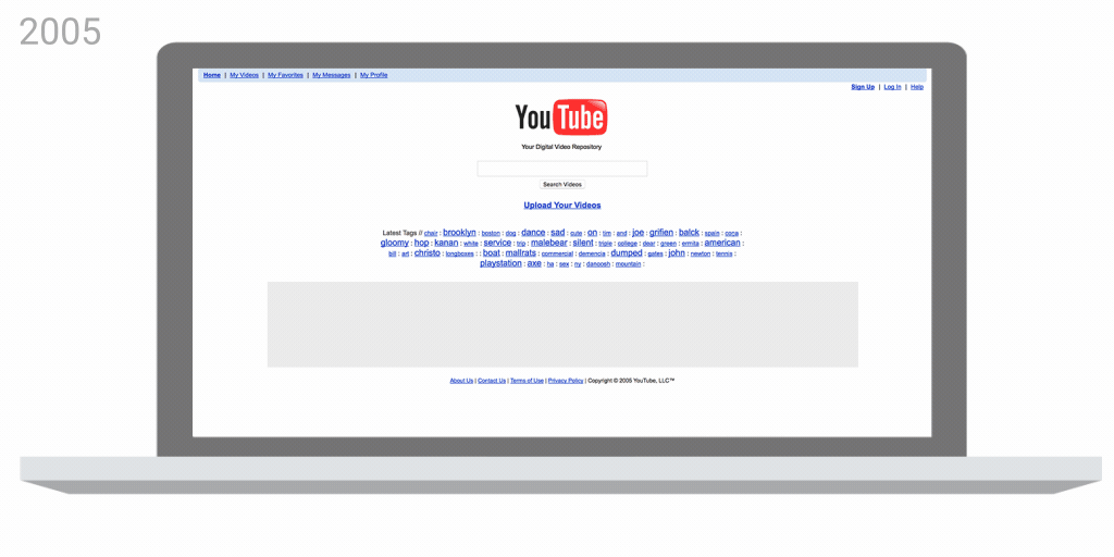
YouTube has evolved massively since it first launched in 2005 and this is the first unveiling of a new logo for the first time in 12 years.
According to the company,
“The new logo allows for a more flexible design that works better across a variety of devices, even on the tiniest screens. This is because when space is limited, for instance on smartphones, the brightened icon can be used as an abbreviated logo, which can be seen more easily and read more clearly. You’ll see the new Logo and Icon roll out across mobile and desktop today, and across all our other apps and services soon.”
In my personal opinion i think its a brilliant move and excellent redesign as it makes the companies branding across all sizes allot more consistent, and it remains just as identifiable as the old logo which wasn’t bad at all.
![]()
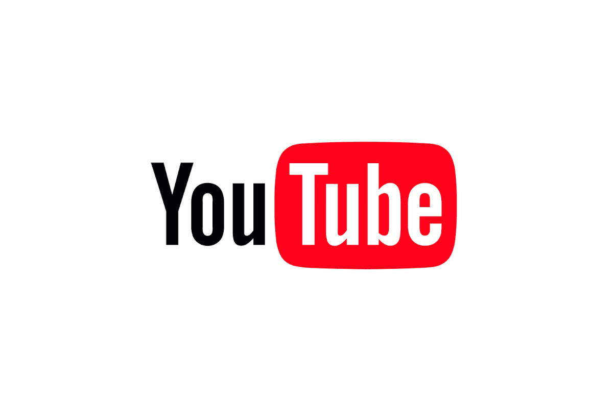
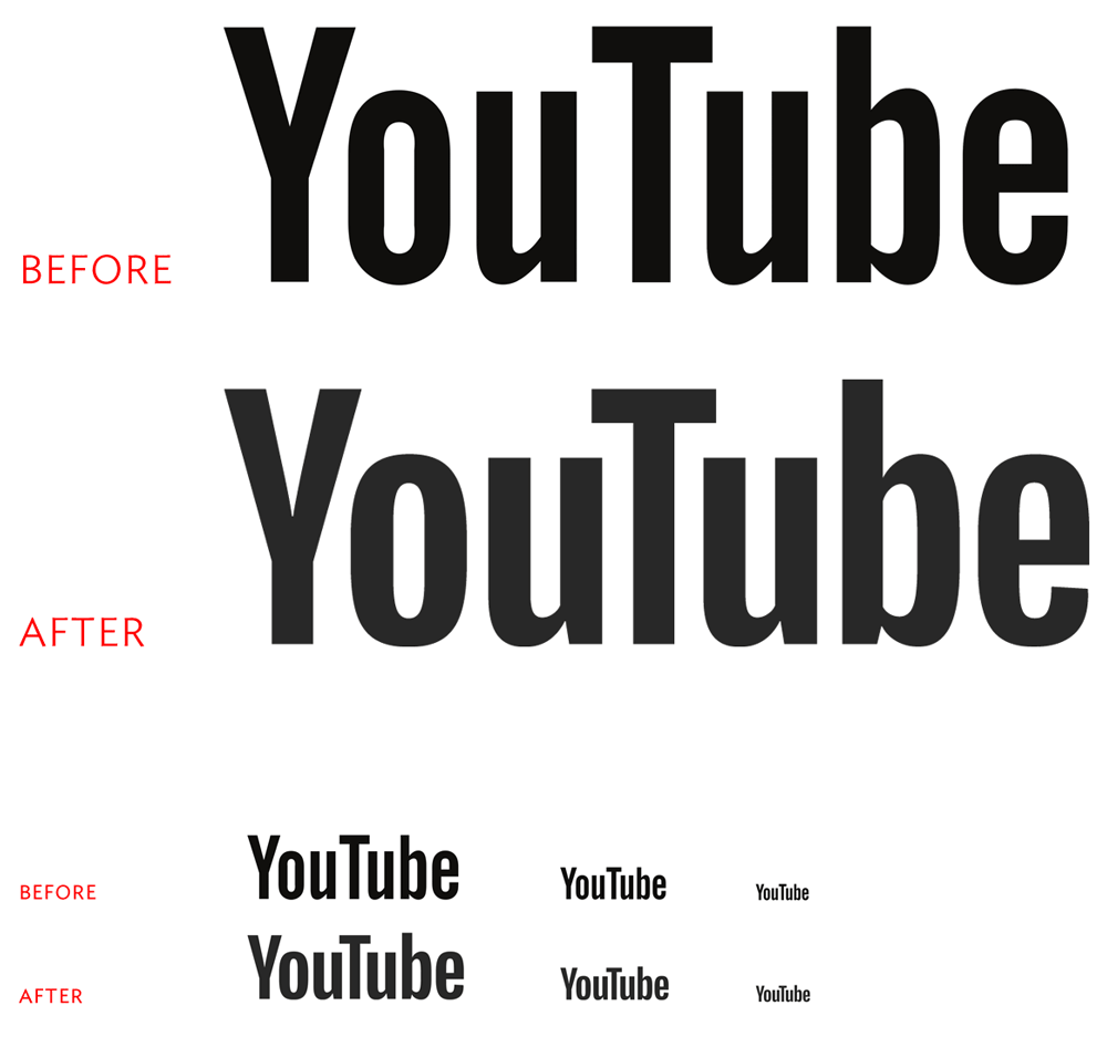
They have designed a lovely workmark by improving the old lettering, it’s more rounded and visually pleasing you need to look closely you can see the improveents on the “u” and “b” and the letter spacing has been improved. The wider opening of the letter “Y”, with rounder sides of the “o” and “e”, the contrast in thickness and thinness. Also, the kerning its fantastic it just brilliant.
YouTube UI
As YouTube details in its blog post,
“We’ve also been experimenting with new ways to display all videos in the best possible way. Soon, the YouTube player will seamlessly change shape to match the video format you’re watching, such as vertical, square or horizontal. That means you’ll always get the best viewing experience automatically – including vertical videos with no black bars on the sides!”
The main layout of the website is remaining intact, but the entire look is simpler, flatter and cleaner than ever before — something that should come as no surprise if you’ve used Google’s other websites or Android apps lately.
The big focus here is making YouTube simple and approachable for all, with visuals that don’t distract you from the main reason you’re there: and that is to enjoy watching videos. YouTube can historically seem busy or confusing to casual users, and this redesign should hopefully help solve that issue. It also brings a visual consistency to Google’s other properties, which is always important.
Perhaps the best thing regular YouTube users will find about this redesign is the inclusion of a complete dark theme, which will dramatically cut down on eye strain when watching videos at night. All you have to do is toggle it on through the account menu, and the entire interface goes dark permanently.