Skip to content
Home
Menu Menu
  • Home
  • About
    • The Logo Creative
    • Logo Design
    • Our Process
    • What’s Included
    • Testimonials
    • FAQ
    • Terms of Service
  • Contact Us
    • General Enquiry
    • Hire Me
  • Case Studies
    • Logo Portfolio
  • Blog
  • Community
    • Contribute & Advertise
    • Mindful Creative Insights
    • Logo Design Resources
    • Shop
    • Designer Interview
    • LogoTalk Podcast
    • Book Review: Logo Design
    • Designer Spotlight
    • Freelance & Marketing
    • Brand Spotlight
    • Famous Logos
    • Instagram
Shimada Co. Ltd Brand Identity Spotlight

Shimada Co. Ltd Brand Identity Spotlight

  • 22/09/201704/03/2018
  • by The Logo Creative
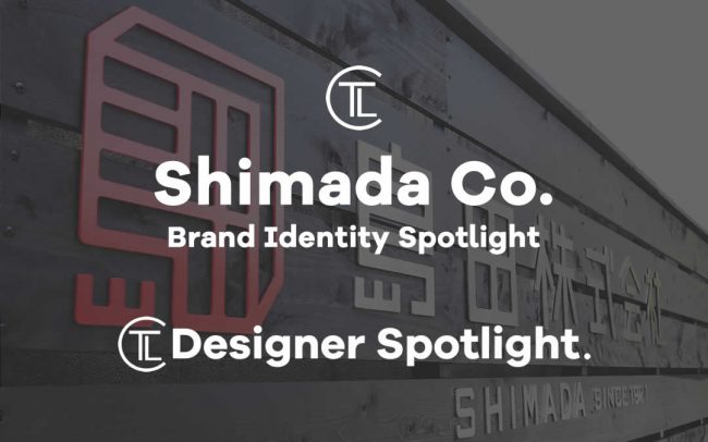
  • Today Designer Spotlight: Shimada Co. Ltd Brand Identity Spotlight

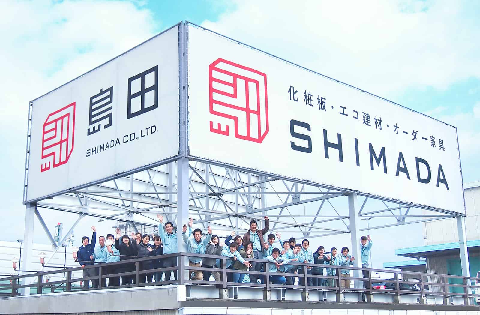
    Shimada Co. Ltd. is an old firm established in 1921 that’s based in Nishiyodogawa-ku Osaka city, they sell furniture and interior materials, they also make furniture.

    Shimida Corporation #identity #design & #Branding by Masaomi Fujitahttps://t.co/4ZFMUmk4WX pic.twitter.com/TW1hvpETSd

    — The Logo Creative™ (@thelogocreative) September 5, 2017

    Masaomi Fujita said:
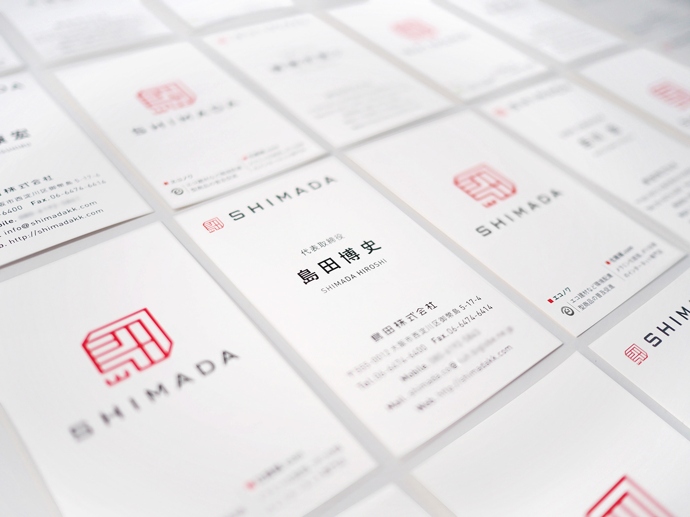
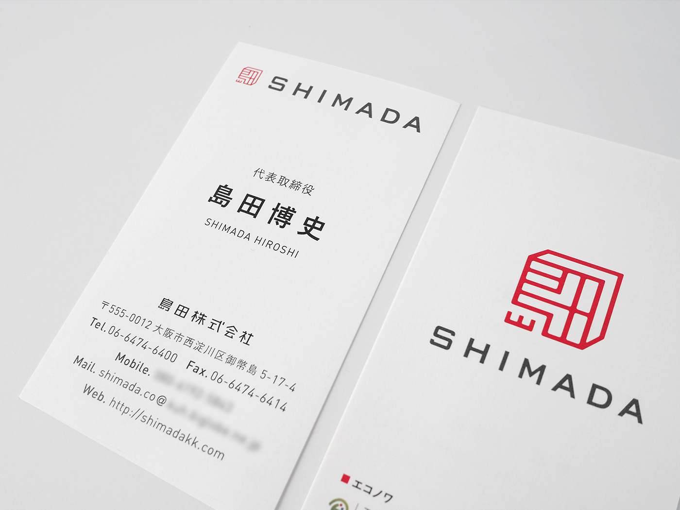
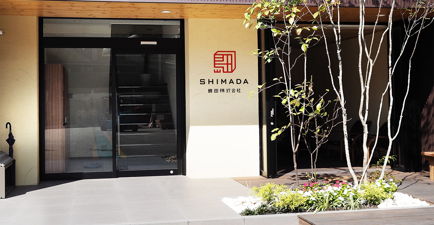
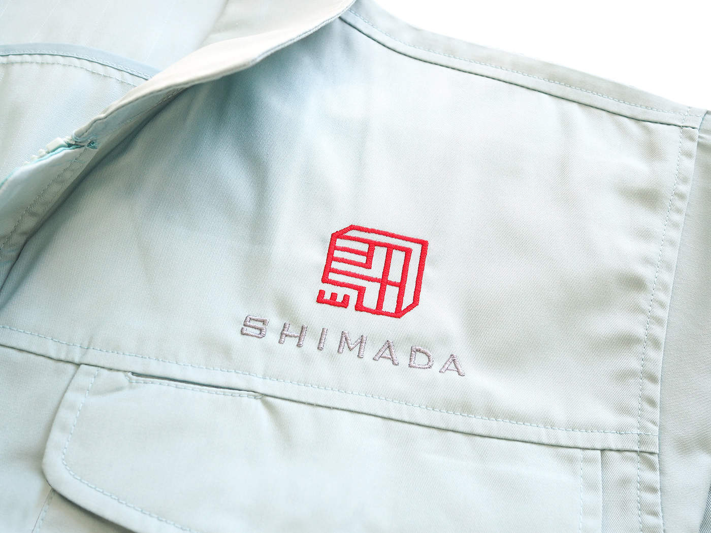
    In response to the company’s consultation regarding CI renewal upon the office relocation, tegusu established CI and a guideline for use of it and designed signatures and business cards.
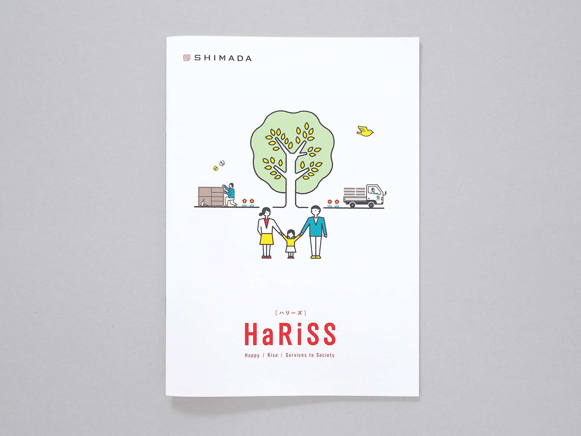
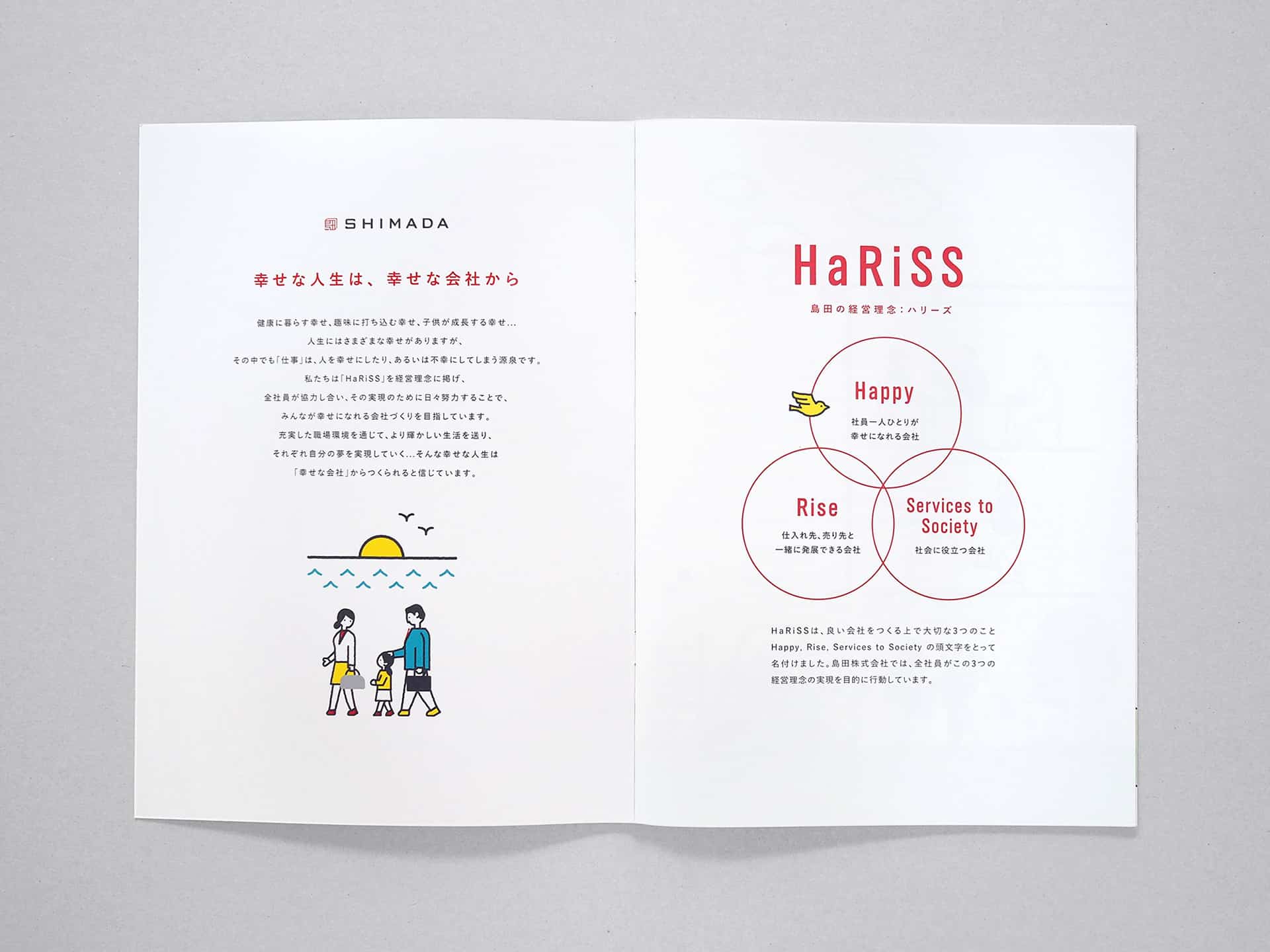
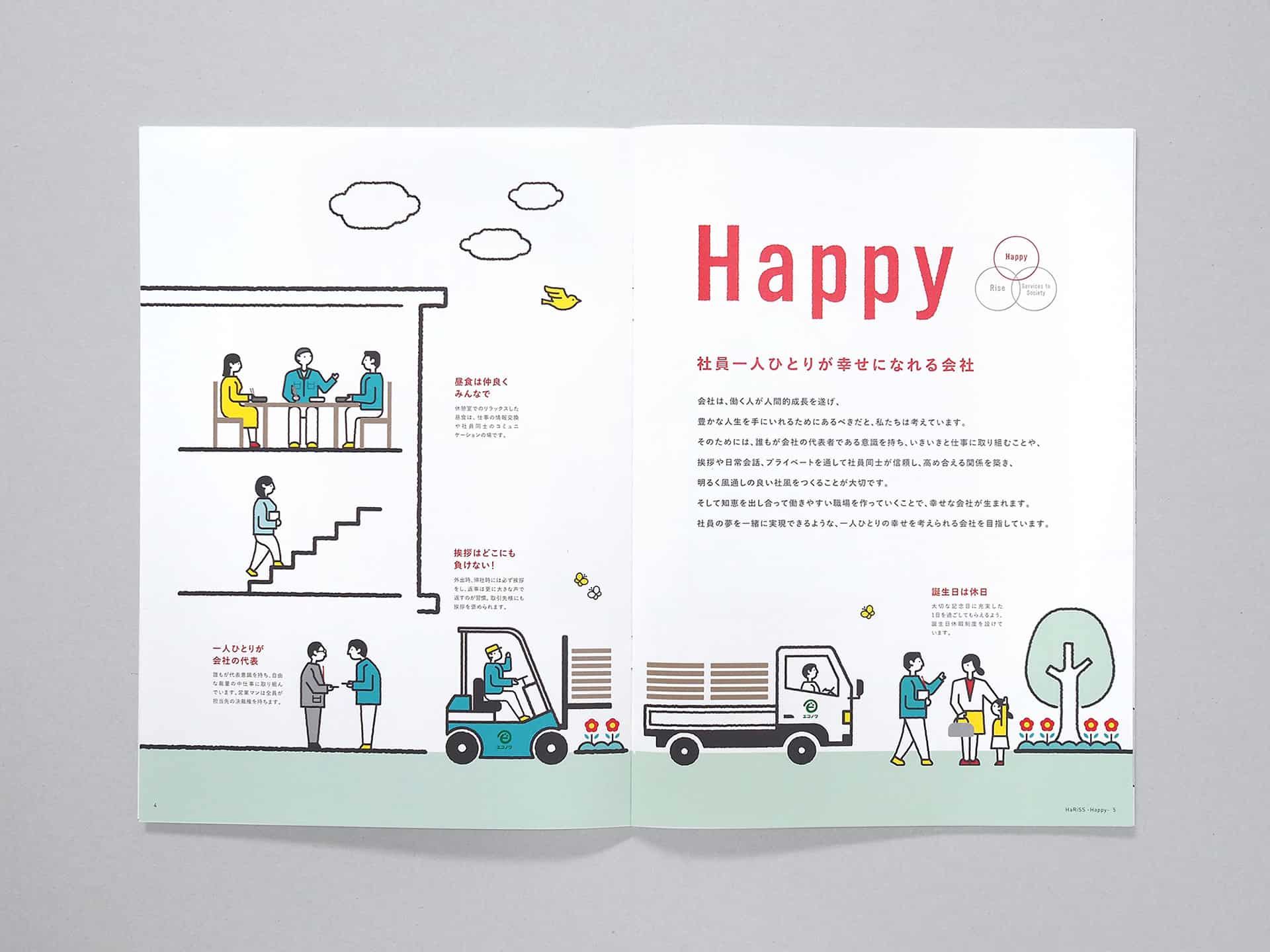
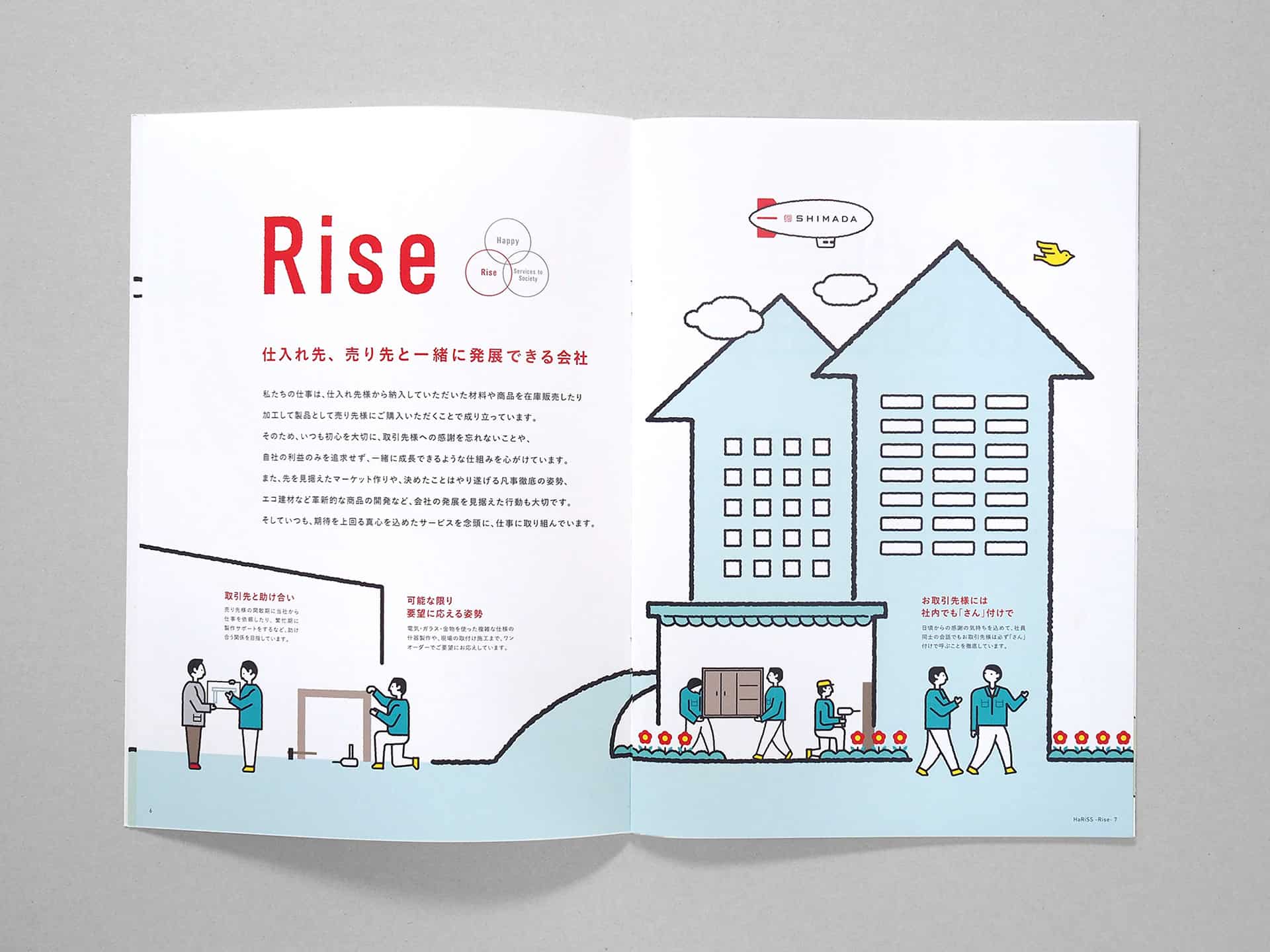
    The inspiration behind the basic concept was inspired by the company’s following three policies
    • Provide every employee with a feeling of happiness.
    • Grow with customers and affiliates to offer innovative services.
    • Always contribute to society.
    These reflect the president’s honest personality and company-wide sincere attitude, which led us to the key words including“confidence”, “conscientious”, “partnership”, “history and tradition” and “experience.” Based on these key words, two specific motifs were embedded into the identity of design. 

    Shimada Co. Ltd Brand Identity Spotlight

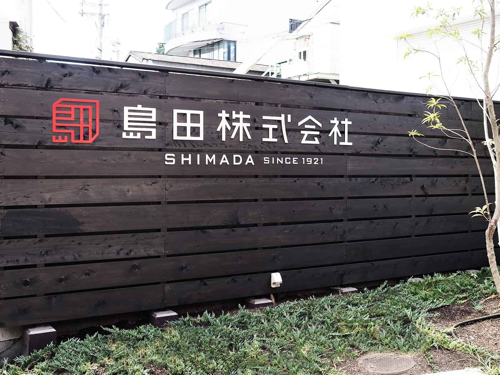
    First is “seal and signature.”  As is called “Hanko (seal) society”, Japan has traditionally used a seal to express that a document, both business and public, or a bankbook is authorized.  Thus, a seal can be said as a symbol of “credit” and “trust”. This inspired us to design Shimada’s succession of almost 100-year history and determination to achieve the three policies with a forward-looking attitude in the motif of a seal.
    Second is “a structural object such as box or frame“. tegusu chose frames and white boxes subject to design, because these are associated with an idea that decorative laminate and furniture materials offer “new value” and “colors” to a space or décor, and that motif suggests that the company “quickens something incomplete”.
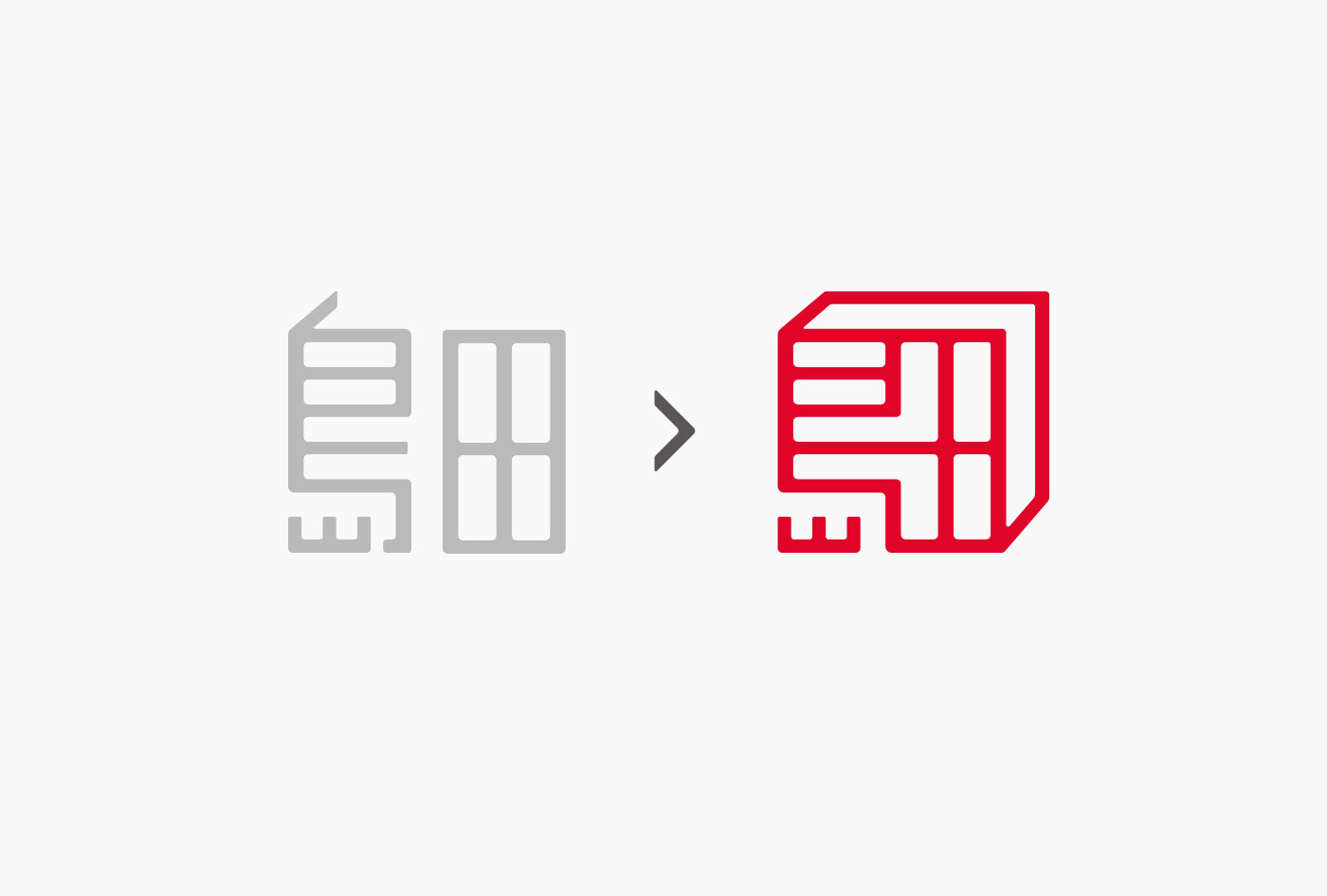
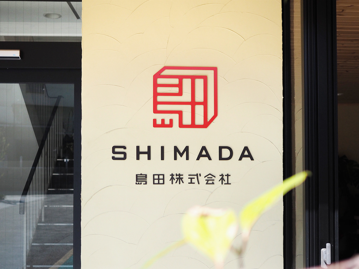
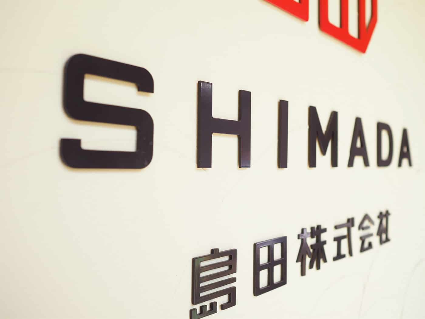
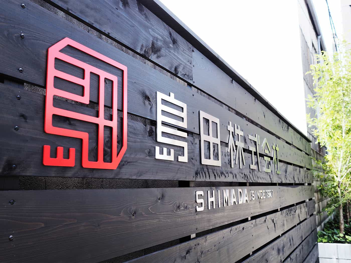
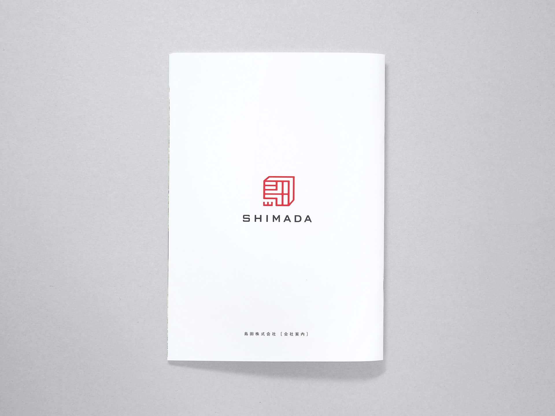
    The symbol we created consists of the combination of the above and arranged Chinese characters for “Shimada” (島田) . 

    Shimada Co. Ltd Brand Identity Spotlight Shimada Co. Ltd Brand Identity Spotlight Shimada Co. Ltd Brand Identity Spotlight Shimada Co. Ltd Brand Identity Spotlight Shimada Co. Ltd Brand Identity Spotlight Shimada Co. Ltd Brand Identity Spotlight

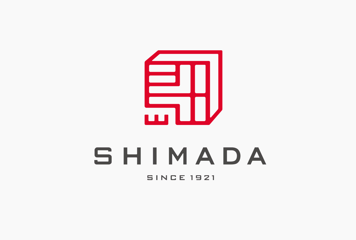
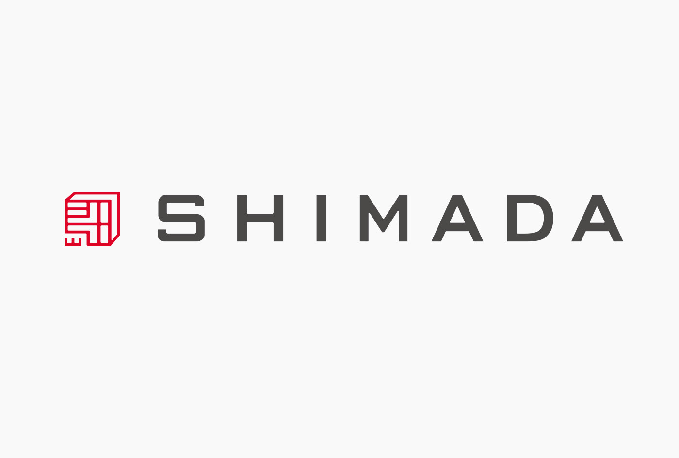
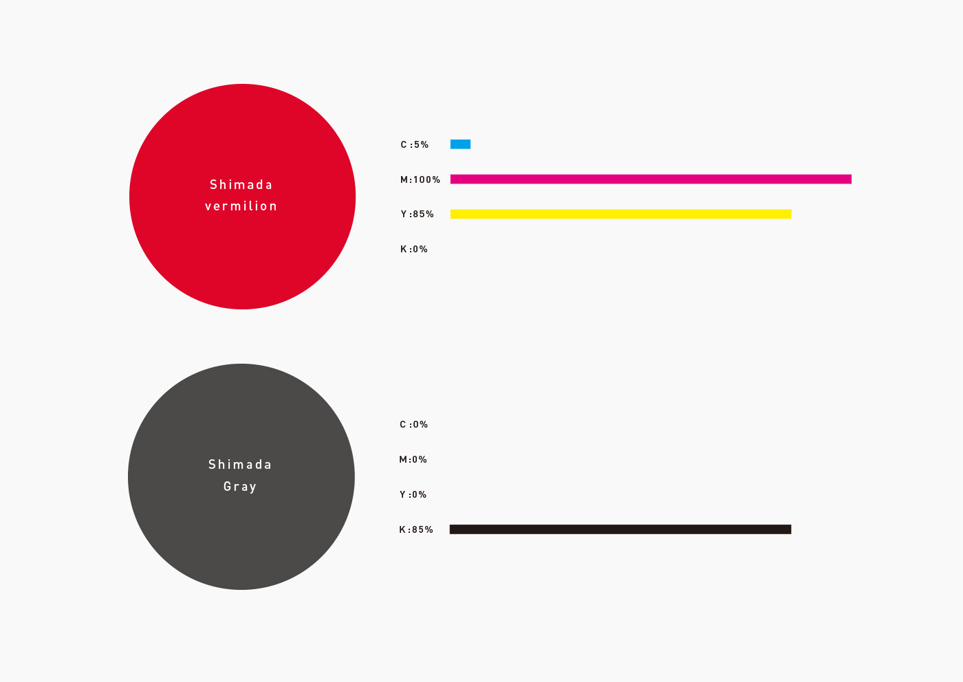
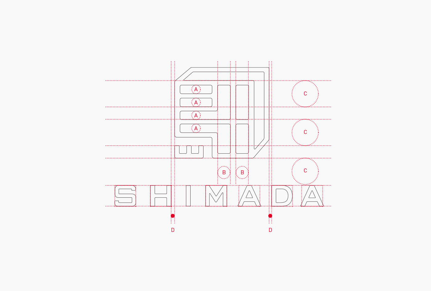
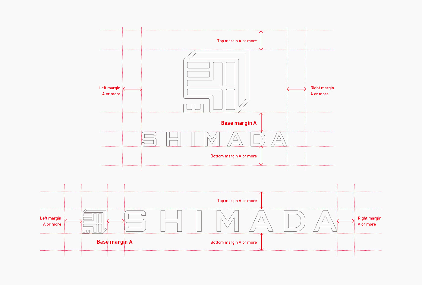
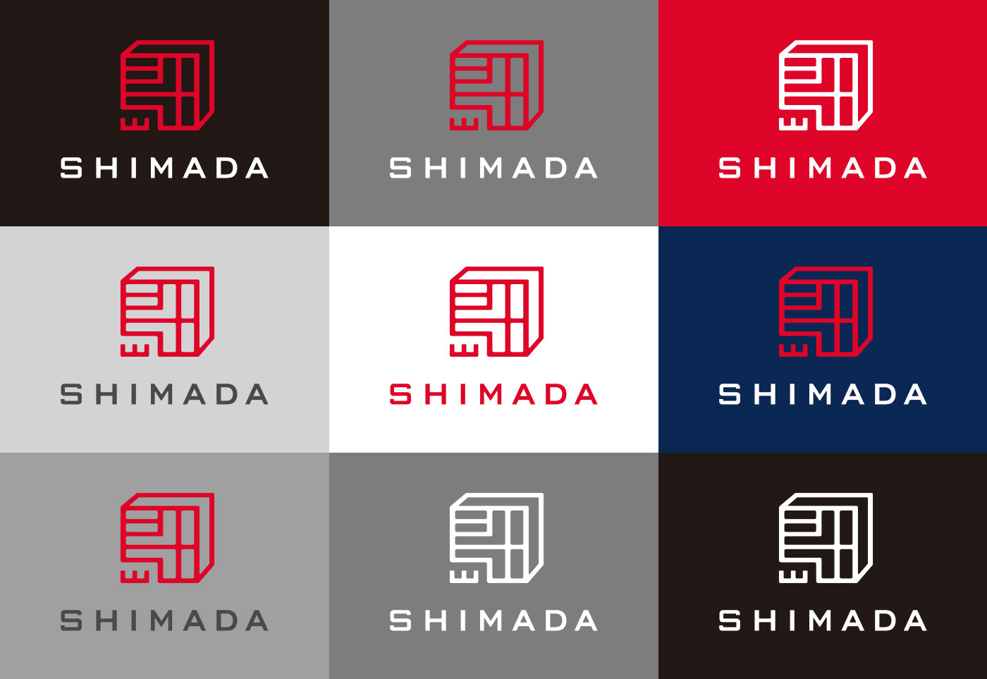
    The logo forms an impression of a square seal, a typical shape of corporate seals, having all characters including alphabets fit inside the square. The guideline specifies the margins to be secured when the logo is used and all samples of color patterns to be used other than its basic color, to unify the corporate image.

    Shimada Co. Ltd Brand Identity Spotlight

    Shimada Co. Ltd Brand Identity Spotlight

    Shimada Co. Ltd Brand Identity Spotlight

    Shimada Co. Ltd Brand Identity Spotlight

    Shimada Co. Ltd Brand Identity Spotlight

    Shimada Co. Ltd Brand Identity Spotlight

    Shimada Co. Ltd Brand Identity Spotlight

    Shimada Co. Ltd Brand Identity Spotlight

    Shimada Co. Ltd Brand Identity Spotlight

    Shimada Co. Ltd Brand Identity Spotlight

    Shimada Co. Ltd Brand Identity Spotlight

    Shimada Co. Ltd Brand Identity Spotlight

    Shimada Co. Ltd Brand Identity Spotlight

    Shimada Co. Ltd Brand Identity Spotlight

    See more of Masaomi Fujita work | Tegusu


    Posted in Designer Spotlight, Inspiration
    BrandBrandingDesignDesignerdesigner spotlightGraphicgraphic designidentityLogoLogo DesignLtdMasaomi FujitapackagingPrint DesignShimada Co.tegusuTypographyvisual

    Post navigation

    The History of the Logo
    Kakinokinoshita Brand Identity Spotlight

    Categories

    Interactive Email With Insights

    Weekly Blog Digest


    Best Logo Design Blogs

    Best Branding Design Blogs

    LOGO DESIGN NEWS

    Tweets by thelogocreative

    Video Converter

    mazzine.com


    The Logo Creative - International Strategic Logo and Brand Identity Design Studio

    The Logo Creative™
    Logo & Brand Identity Studio

    Part of The AJR Group™

    International Design Studio
    info[at]thelogocreative.co.uk
    Phone: +44 (0) 7807 085 003

    INSIGHTS FROM THE BLOG

    • Is Your Tech Undermining Your Brand? IT Fixes You Can’t Ignore 10/05/2025
    • What Is DLP And Why Should Your Brand Care In 2025 09/05/2025
    Copyright © 2025 The Logo Creative | International Logo Design & Branding Studio | ♡ In Loving Memory Dad (Ray Marriott) | The Logo Creative.
    Scroll to top
    Interested In Writing an Article To Be Featured On The Logo Creative™ ? Contribute!
    Coming Soon - Designer Interview With Von Glitschka View Previous Interviews