Skip to content
Home
Menu Menu
  • Home
  • About
    • The Logo Creative
    • Logo Design
    • Our Process
    • What’s Included
    • Testimonials
    • FAQ
    • Terms of Service
  • Contact Us
    • General Enquiry
    • Hire Me
  • Case Studies
    • Logo Portfolio
  • Blog
  • Community
    • Contribute & Advertise
    • Mindful Creative Insights
    • Logo Design Resources
    • Shop
    • Designer Interview
    • LogoTalk Podcast
    • Book Review: Logo Design
    • Designer Spotlight
    • Freelance & Marketing
    • Brand Spotlight
    • Famous Logos
    • Instagram
Kakinokinoshita Brand Identity Spotlight

Kakinokinoshita Brand Identity Spotlight

  • 25/09/201704/03/2018
  • by The Logo Creative
  • Today Designer Spotlight: Kakinokinoshita Brand Identity Spotlight

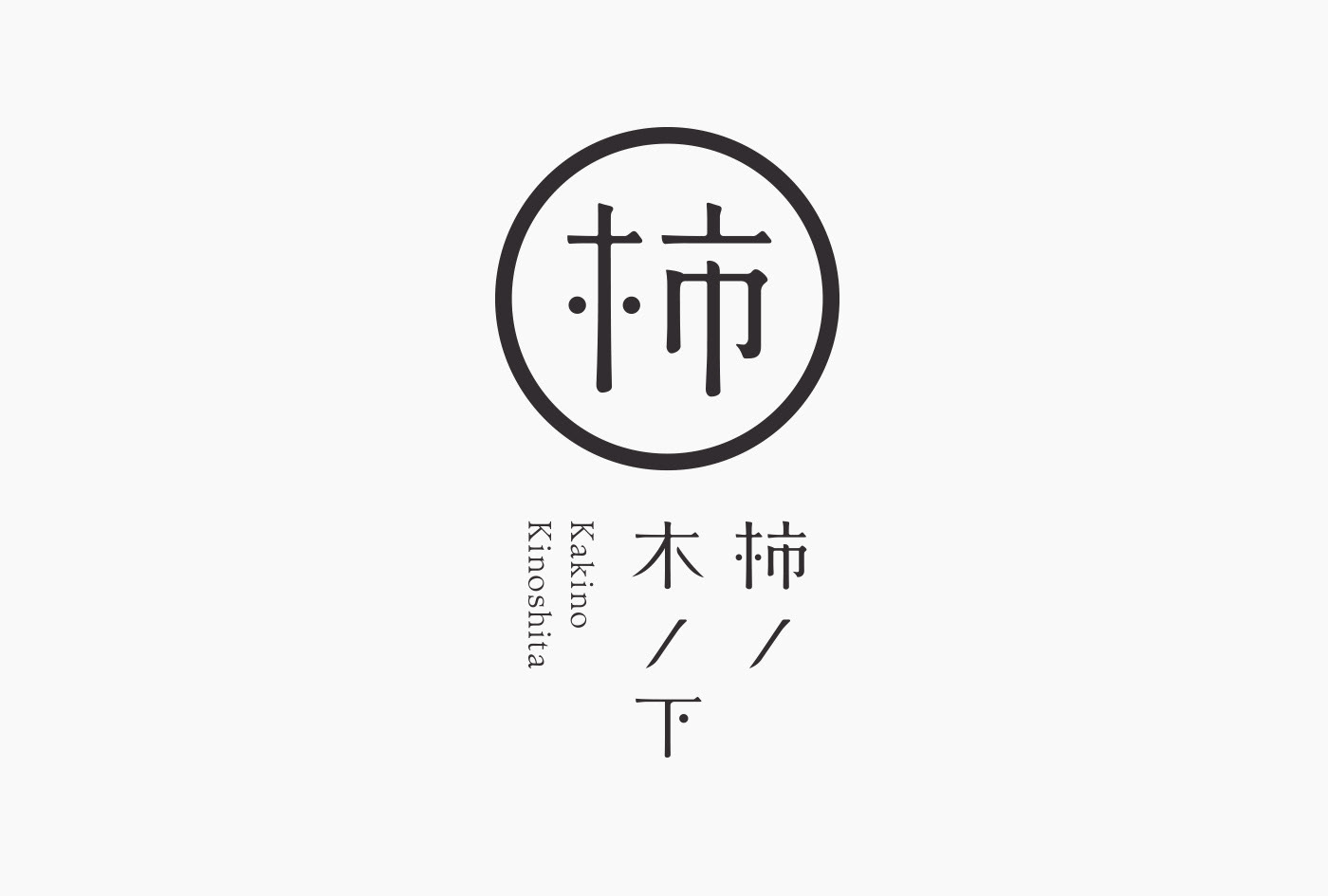
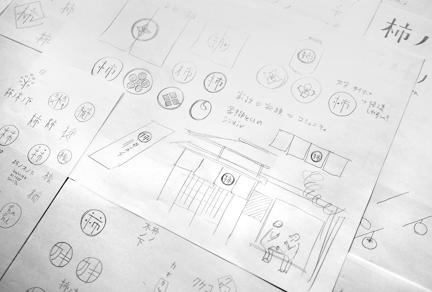
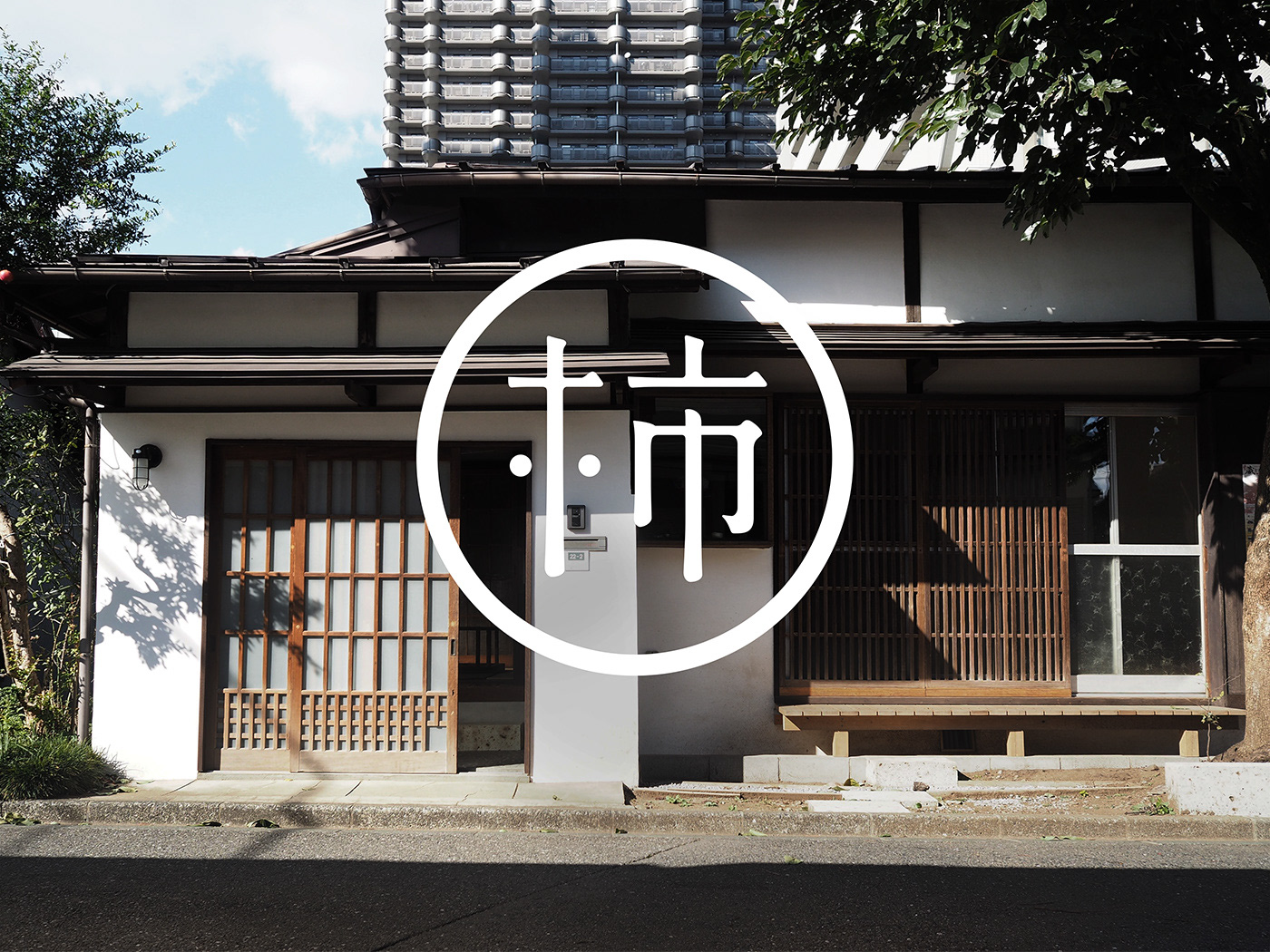
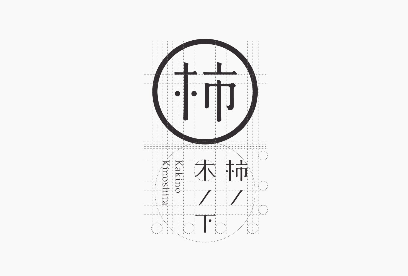
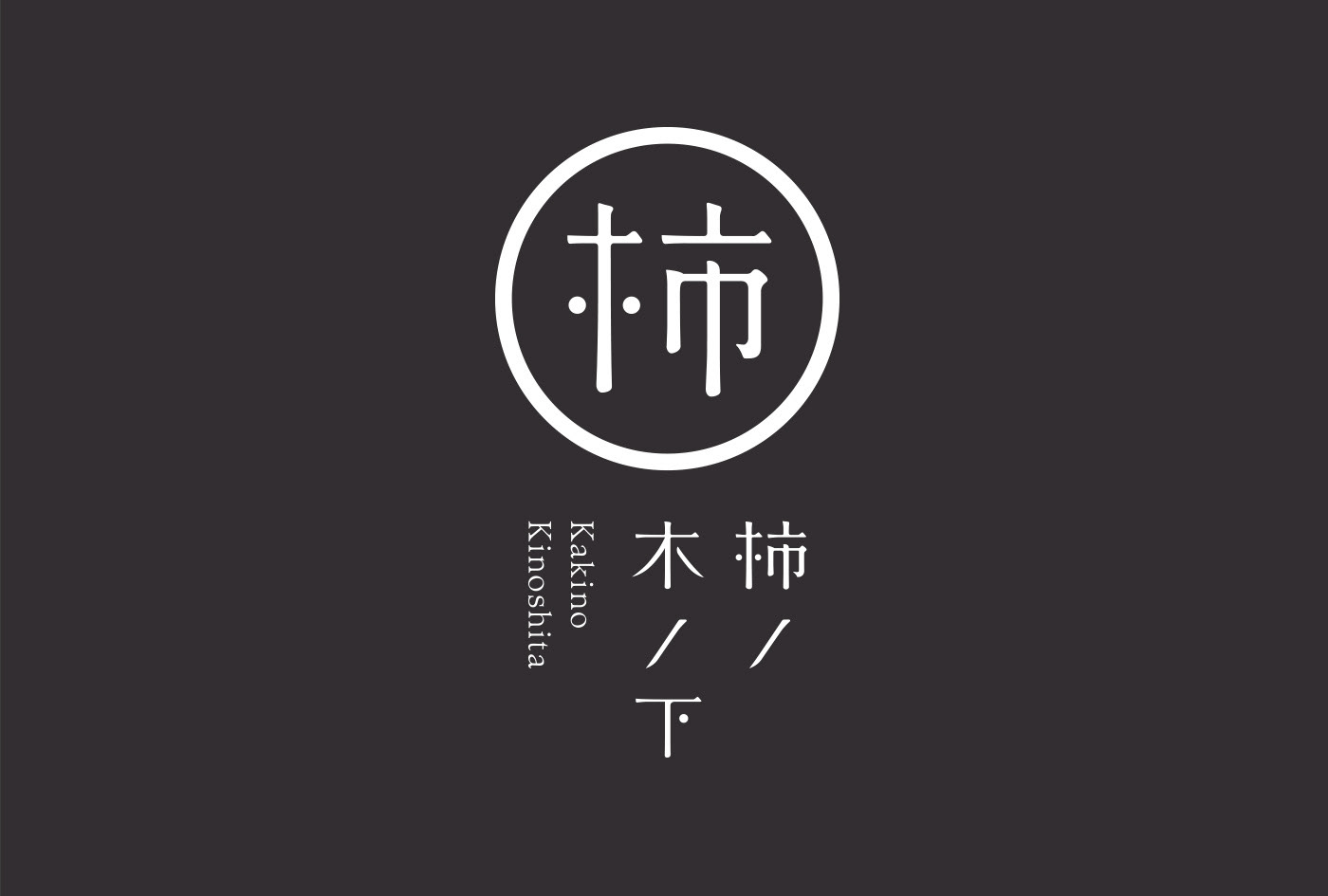
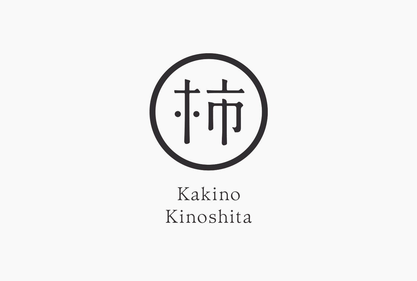
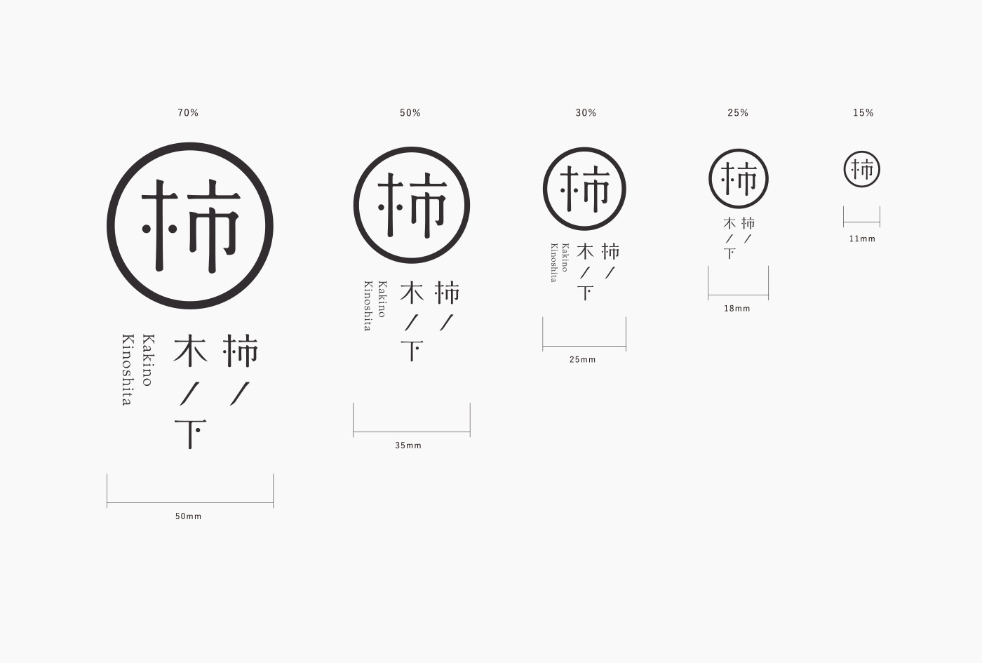
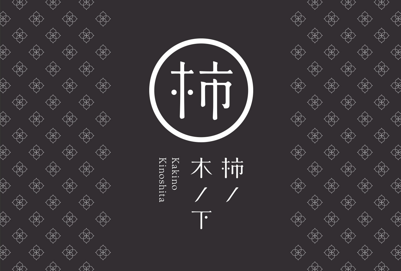
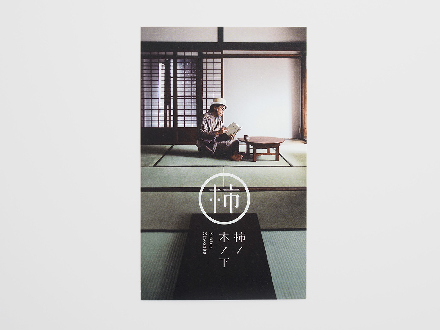
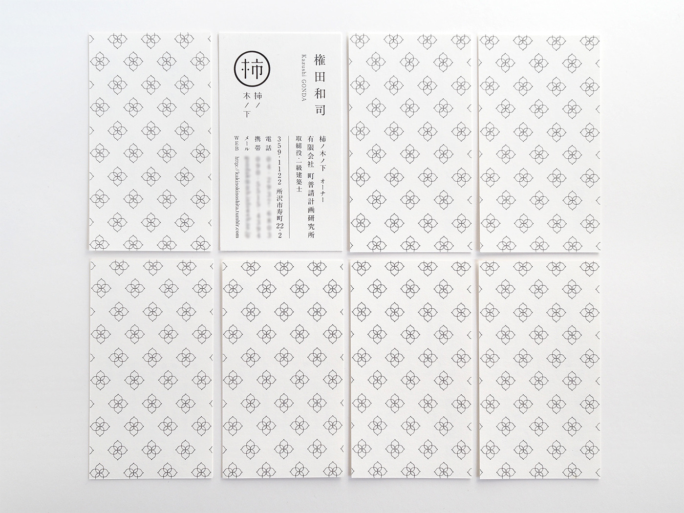
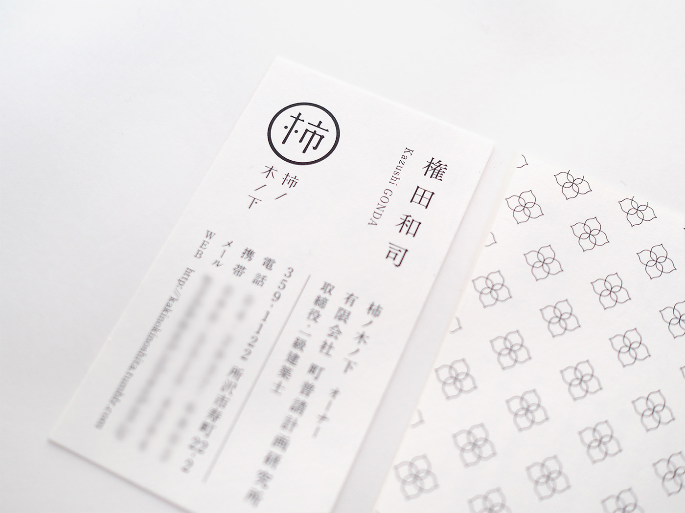
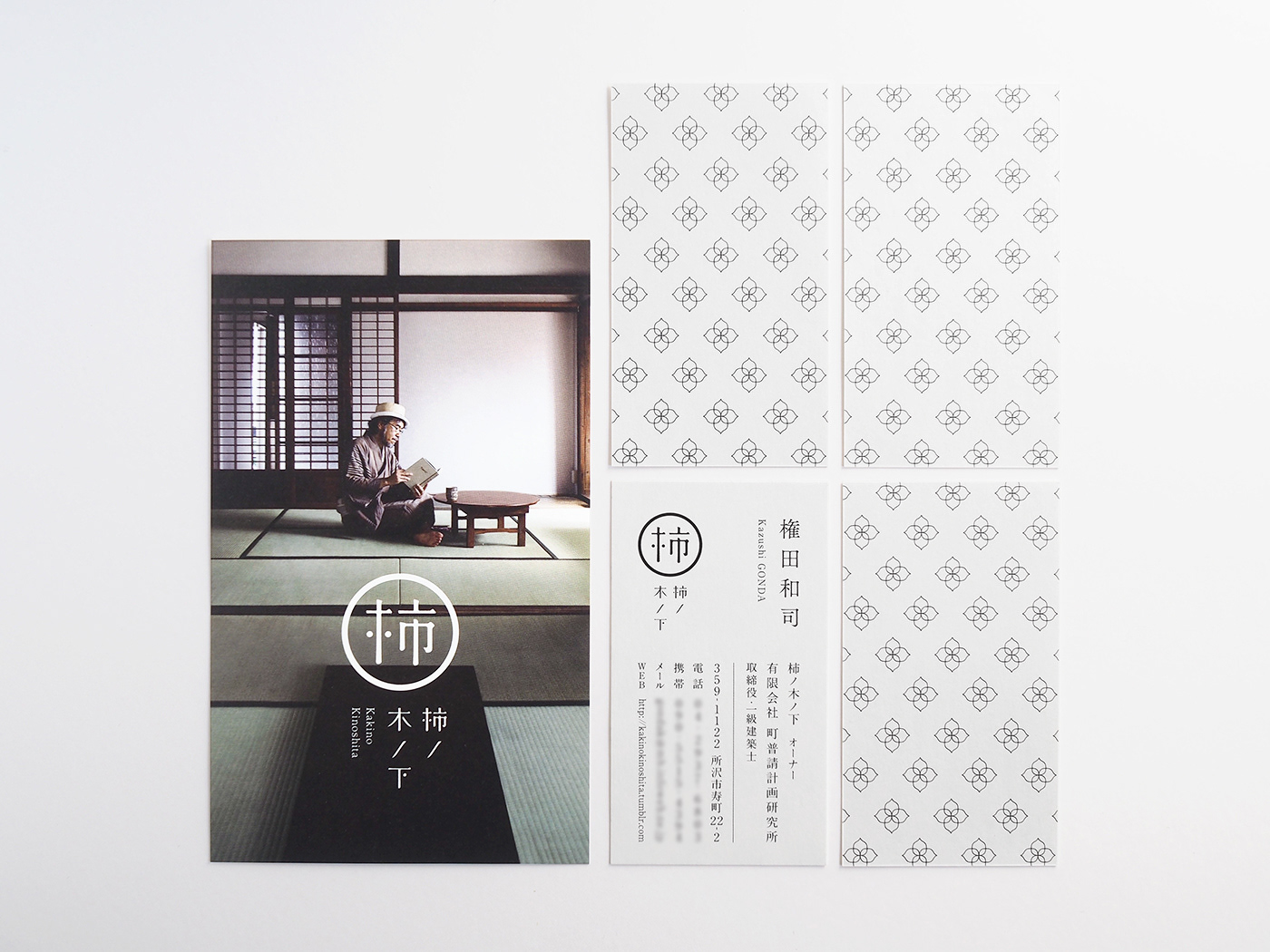
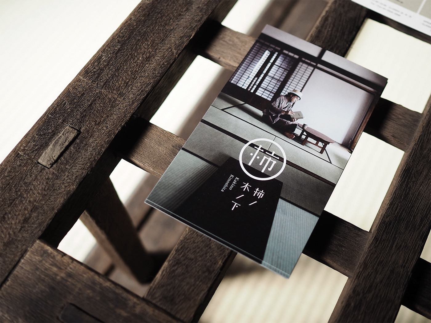
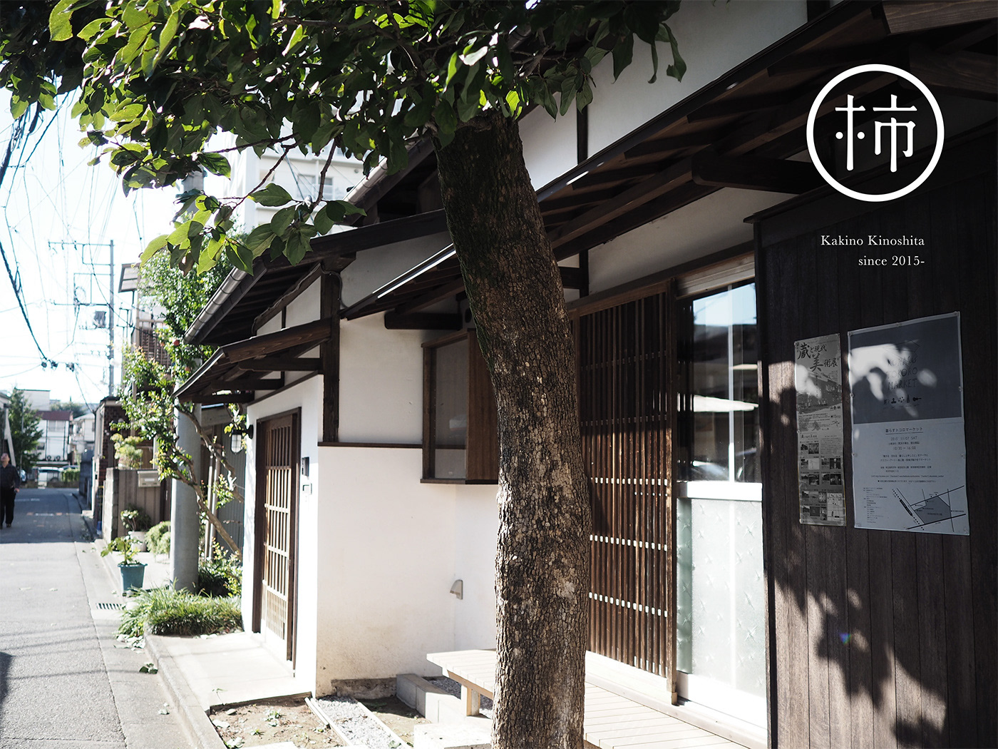
    Kakinokinoshita is an art gallery in Tokorozawa, Saitama, that was transformed from an 80-year-old folk house. At tegusu, we designed a symbol, logotype, leaflet and business card for the gallery. We also created guidelines for the gallery owner and gallery users so that they can adjust the logo design according to their needs.

    Another nice mark by Masaomi Fujita#identity #design for Kakinoshita art gallery by Shizuoka studio tegusu https://t.co/rEpEVZKueZ pic.twitter.com/aHPuXaFMCv

    — The Logo Creative™ (@thelogocreative) September 15, 2017

    Kakinokinoshita Brand Identity Spotlight

    Kakinokinoshita Brand Identity Spotlight

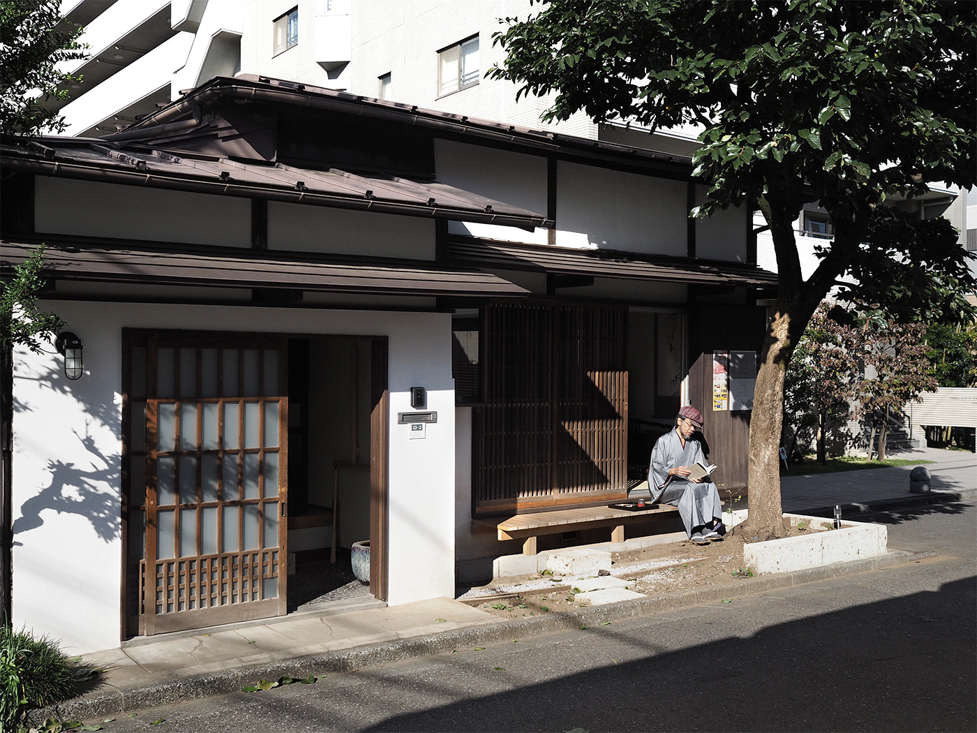
    The amount of tall apartment buildings around Tokorozawa Station has been increasing rapidly over the years, the main streets in the area are crowded with stores. Mr. Gonda, who had been seeing the neighborhood change other those years, decided to remodel an 80-year-old Japanese-style old folk house into a gallery/office in an attempt to preserve the cultural and artistic aspects of the area.

    Kakinokinoshita Brand Identity Spotlight

    Masaomi Fujita said:
    “Kakinokinoshita is a “revived house” that helps create a “community” among local people, artists who use the gallery and gallery visitors. For the house, we developed a gallery logo based on traditional Japanese family crests that represent family trees and pedigrees. 
    There is a huge persimmon tree in front of the gallery and, when it starts to bear fruits in autumn, many people gather under the tree to pick persimmons. Since the gallery is also a place where people gather, for the gallery symbol, we placed a large “柿 (kaki)”, the kanji that means “persimmon” in Japanese, in the center to emphasize the friendly nature of the place. 
    *The name of the family that used to live in the house is Kinoshita, and it is where the gallery name, Kakinokinoshita, came from”

    Kakinokinoshita Brand Identity Spotlight

    Kakinokinoshita Brand Identity Spotlight

    Kakinokinoshita Brand Identity Spotlight

    Kakinokinoshita Brand Identity Spotlight

    Kakinokinoshita Brand Identity Spotlight

    Kakinokinoshita Brand Identity Spotlight

    Kakinokinoshita Brand Identity Spotlight

    Kakinokinoshita Brand Identity Spotlight

    Masaomi Fujita said:

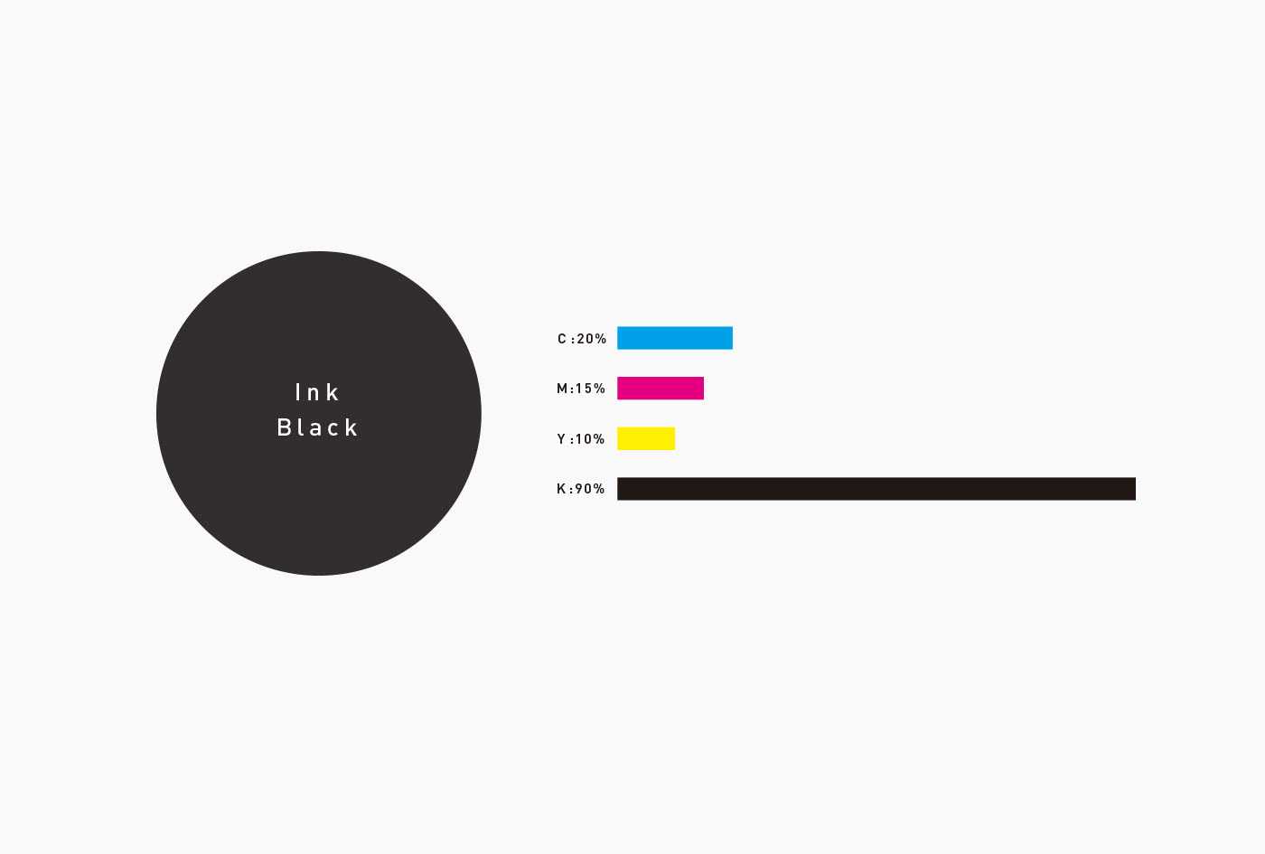
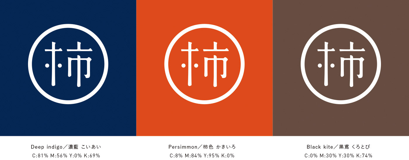
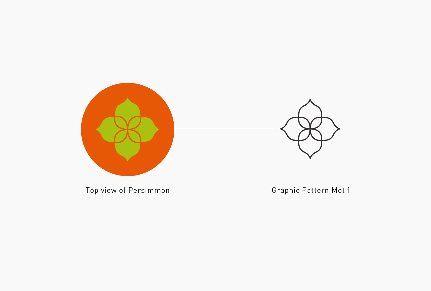
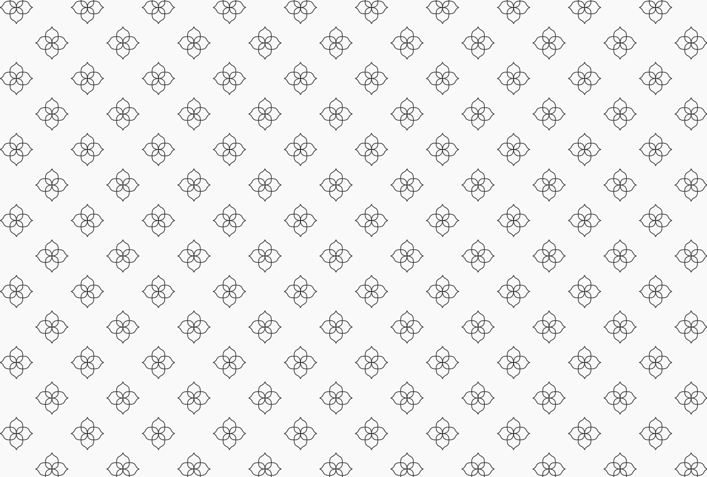
    “We also expanded our designs into multiple versions using the traditional Japanese color scheme and created a persimmon-calyx background pattern in order to make it easier for the gallery to design their original towels, curtains and tools in the future.”

    Kakinokinoshita Brand Identity Spotlight

    Kakinokinoshita Brand Identity Spotlight

    Kakinokinoshita Brand Identity Spotlight

    Kakinokinoshita Brand Identity Spotlight

    Kakinokinoshita Brand Identity Spotlight

    Kakinokinoshita Brand Identity Spotlight

    Kakinokinoshita Brand Identity Spotlight

    Kakinokinoshita Brand Identity Spotlight

    Kakinokinoshita Brand Identity Spotlight

    Kakinokinoshita Brand Identity Spotlight

    Kakinokinoshita Brand Identity Spotlight

    See more of Masaomi Fujita work | Tegusu


    Posted in Designer Spotlight, Inspiration
    BrandBrandingDesignDesignerdesigner spotlightGraphicgraphic designidentityKakinokinoshitaLogoLogo DesignMasaomi FujitapackagingPrint DesignTypographyvisual

    Post navigation

    Shimada Co. Ltd Brand Identity Spotlight
    Growth Rings Brand Identity Spotlight

    Categories

    Interactive Email With Insights

    Weekly Blog Digest


    Best Logo Design Blogs

    Best Branding Design Blogs

    LOGO DESIGN NEWS

    Tweets by thelogocreative

    Video Converter

    mazzine.com


    The Logo Creative - International Strategic Logo and Brand Identity Design Studio

    The Logo Creative™
    Logo & Brand Identity Studio

    Part of The AJR Group™

    International Design Studio
    info[at]thelogocreative.co.uk
    Phone: +44 (0) 7807 085 003

    INSIGHTS FROM THE BLOG

    • Breaking Down the Best Skate Shoe Logos (And Why They Stick) 06/06/2025
    • From Prompt to Profit: Behind the Scenes of a One-Person AI-Run Marketing Agency 05/06/2025
    Copyright © 2025 The Logo Creative | International Logo Design & Branding Studio | ♡ In Loving Memory Dad (Ray Marriott) | The Logo Creative.
    Scroll to top
    Interested In Writing an Article To Be Featured On The Logo Creative™ ? Contribute!
    Coming Soon - Designer Interview With Von Glitschka View Previous Interviews