Skip to content
Home
Menu Menu
  • Home
  • About
    • The Logo Creative
    • Logo Design
    • Our Process
    • What’s Included
    • Testimonials
    • FAQ
    • Terms of Service
  • Contact Us
    • General Enquiry
    • Hire Me
  • Case Studies
    • Logo Portfolio
  • Blog
  • Community
    • Contribute & Advertise
    • Mindful Creative Insights
    • Logo Design Resources
    • Shop
    • Designer Interview
    • LogoTalk Podcast
    • Book Review: Logo Design
    • Designer Spotlight
    • Freelance & Marketing
    • Brand Spotlight
    • Famous Logos
    • Instagram
Growth Rings Brand Identity Spotlight

Growth Rings Brand Identity Spotlight

  • 25/09/201704/03/2018
  • by The Logo Creative
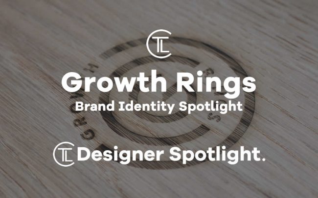
  • Today Designer Spotlight: Growth Rings Brand Identity Spotlight

    Growth Rings was created by London based design agency Lantern. I have to say it’s a well-crafted monogram that’s simple and works really well. In today’s design world simplicity is at a high and this mark for Growth Rings pulls off that minimalistic approach with great effect making it another identity that can be iconic for many years to come. Growth Rings said:


    Growth Rings #identity #design by Lantern @lanterntweetshttps://t.co/SO2VFzfVpl pic.twitter.com/5lbiZMZi8C

    — The Logo Creative™ (@thelogocreative) September 21, 2017

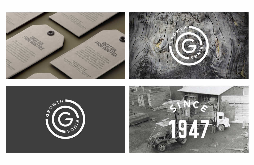
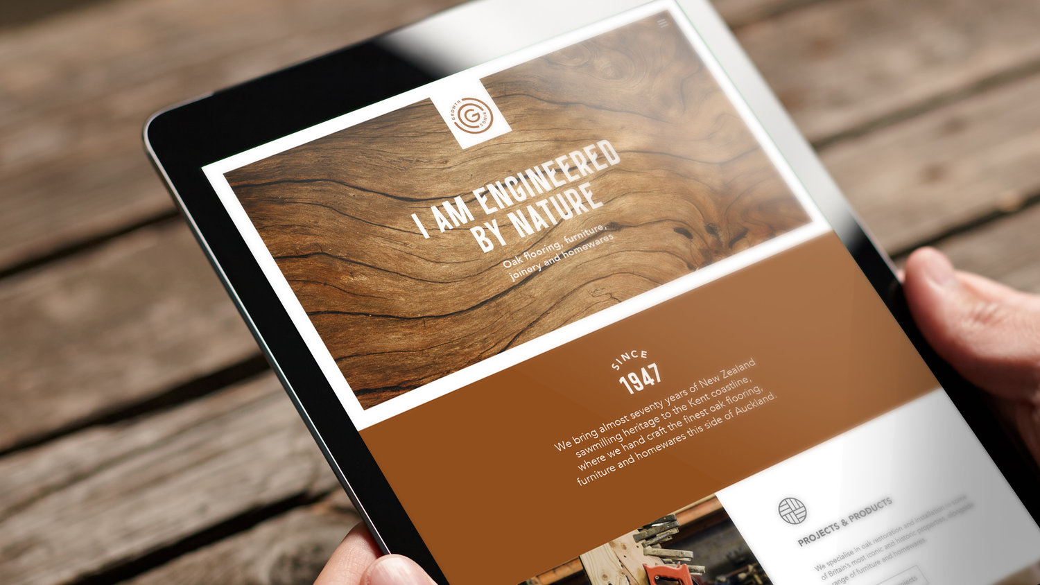
    “Branding an oak flooring, furniture and homewares business that’s gone against the grain since 1947. Growth Rings is a proud, pioneering social enterprise.”

    Growth Rings Brand Identity Spotlight

    Building of The Brand

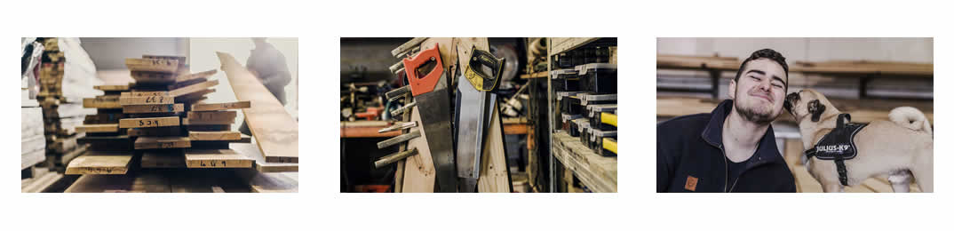
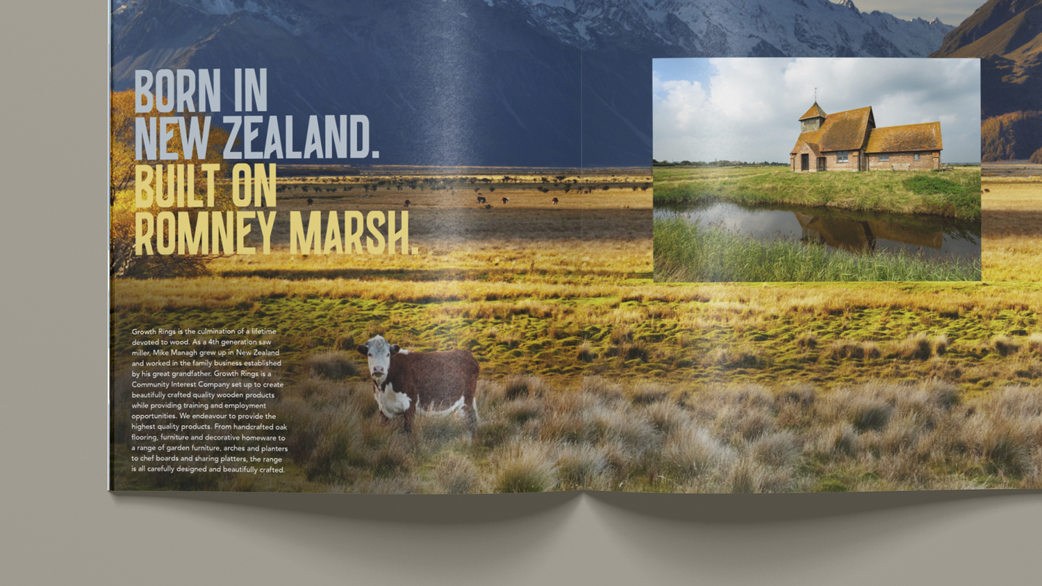
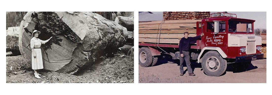
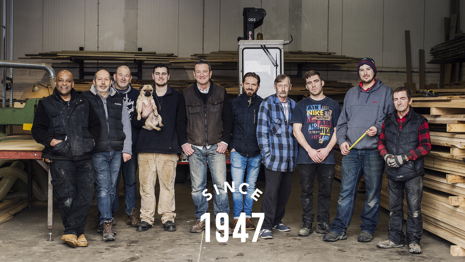
    Groth Rings brought 70 years of the New Zealand sawmilling heritage to the coastline of Kent. This is where they handcraft some of the finest oak flooring  and furniture. They also provide people who have barriers to gaining employment education and training. Lantern helped business paretners Mike Managh and Carl Adams rebrand their business by providing strategic and creative thinking, this helped them transition transform their traditional woodworking workshop to an oak lifestyle business.

    Growth Rings Brand Identity Spotlight

    Growth Rings Brand Identity Spotlight

    The Brand Expression

    Lantern Said:

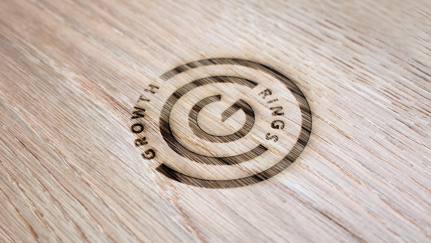
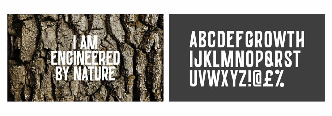
    “A new identity was introduced to visually represent the concept of growth rings found on tree trunks. The ‘G’ at the heart of the design was angled to reflect the quarter-sawn technique often used to slice oak timber, also providing a unique attribute to the design.

    The identity is underpinned with a compelling visual and verbal style, designed to celebrate the imperfections of the timber and trainees that are so integral to the Growth Rings story. The creative messaging looks beyond the surface of the company’s oak – and its folk – to personify the strength, history, character, and personality that lies within.”

    Growth Rings Brand Identity Spotlight


    This slideshow requires JavaScript.

    Growth Rings Brand Identity Spotlight

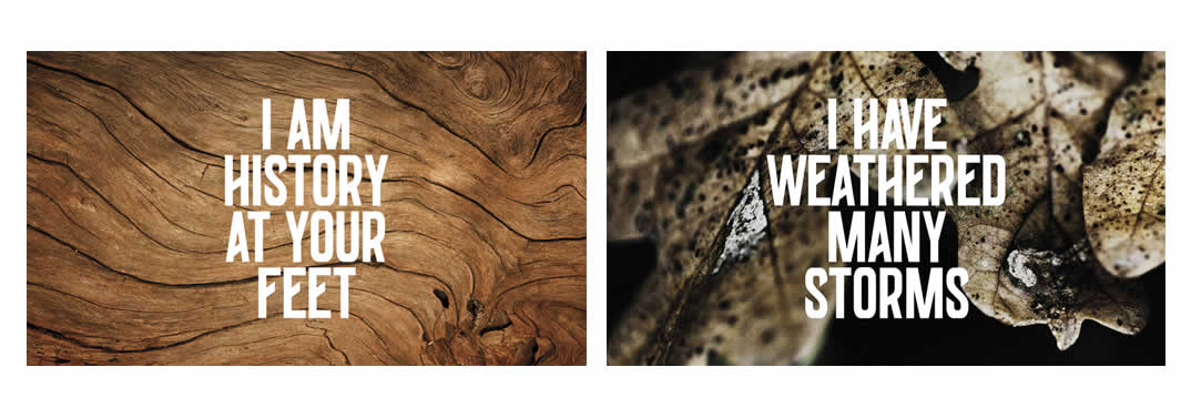
    From bullet holes to bomb damage, their hand selected, heritage oak is shaped by its environment and history. Today, the trainees work tirelessly to craft these stories of yesterday into the products of tomorrow. This sentiment is again captured through creative messaging and the use of a wealth of heritage photography, from the brand’s near seventy year history.

    This slideshow requires JavaScript.

    Growth Rings Brand Identity Spotlight

    Growth Rings Brand Identity Spotlight

    Growth Rings Brand Identity Spotlight

    Growth Rings Brand Identity Spotlight

    Growth Rings Brand Identity Spotlight

    See More Of Lantern Work | Lantern

    Posted in Designer Spotlight, Inspiration
    BrandBrandingDesignDesignerdesigner spotlightGraphicgraphic designGrowth RingsidentityLanternLogoLogo DesignpackagingPrint DesignTypographyvisual

    Post navigation

    Kakinokinoshita Brand Identity Spotlight
    Yii Brand Identity Spotlight

    Categories

    Interactive Email With Insights

    Weekly Blog Digest


    Best Logo Design Blogs

    Best Branding Design Blogs

    LOGO DESIGN NEWS

    Tweets by thelogocreative

    Video Converter

    mazzine.com


    The Logo Creative - International Strategic Logo and Brand Identity Design Studio

    The Logo Creative™
    Logo & Brand Identity Studio

    Part of The AJR Group™

    International Design Studio
    info[at]thelogocreative.co.uk
    Phone: +44 (0) 7807 085 003

    INSIGHTS FROM THE BLOG

    • Top 7 AI-Powered Logo Makers That Do the Designing for You 19/05/2025
    • Is Your Tech Undermining Your Brand? IT Fixes You Can’t Ignore 10/05/2025
    Copyright © 2025 The Logo Creative | International Logo Design & Branding Studio | ♡ In Loving Memory Dad (Ray Marriott) | The Logo Creative.
    Scroll to top
    Interested In Writing an Article To Be Featured On The Logo Creative™ ? Contribute!
    Coming Soon - Designer Interview With Von Glitschka View Previous Interviews